I love pastel shades. At the same time soft, comforting and luminous, I find that they offer beautiful bucolic notes to every interior. In addition, depending on the other colors, materials, textures and volumes associated, the pastel kitchen transforms the universe of a room at a glance. Indeed, pearl gray and curvature for a Scandinavian effect or black metal, copper and brick for an industrial atmosphere, pastel lends itself to every desire. It counterbalances the other colors and thus harmonizes the entire interior decoration.
So between vintage, Californian, Scandinavian, country or industrial atmospheres, come and discover the wonders of pastel decor in the kitchen.
1. Fresh and vegetal look
Once the painted walls option has been selected, it is now time to choose between plain tones or combination of tones. By opting for colored walls, then prefer accessories and furniture in neutral and natural tones in order to balance everything. The soft colors will thus further enhance the pastel walls.
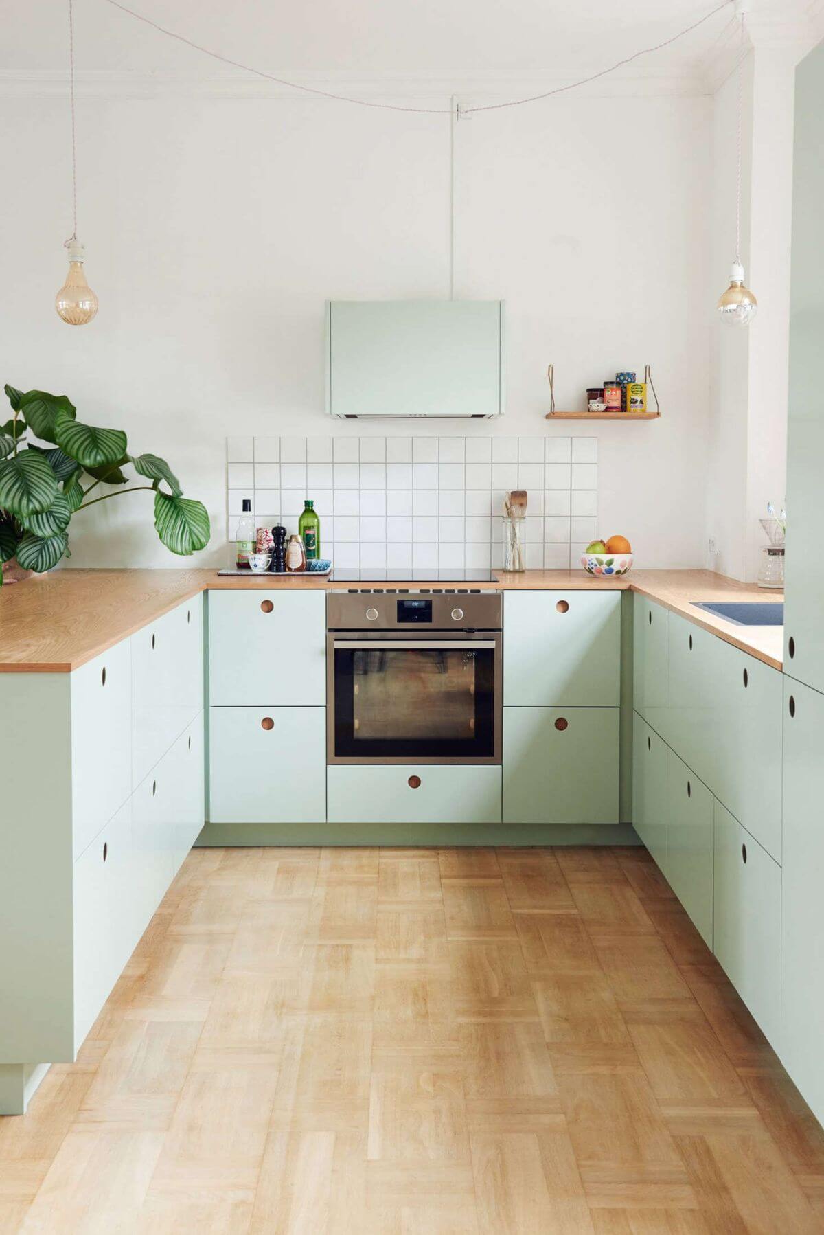
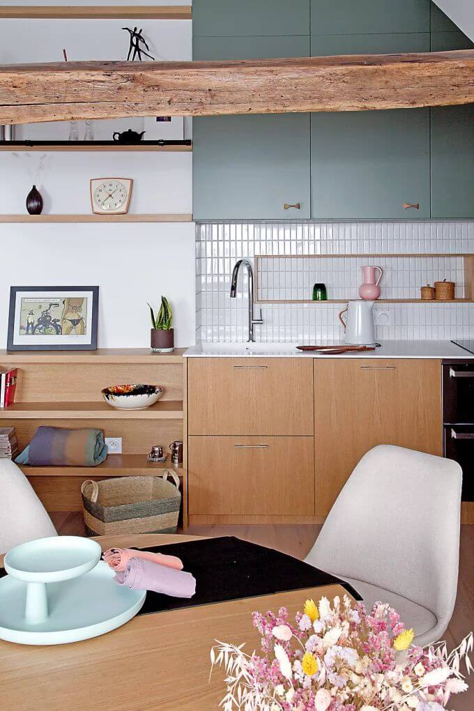
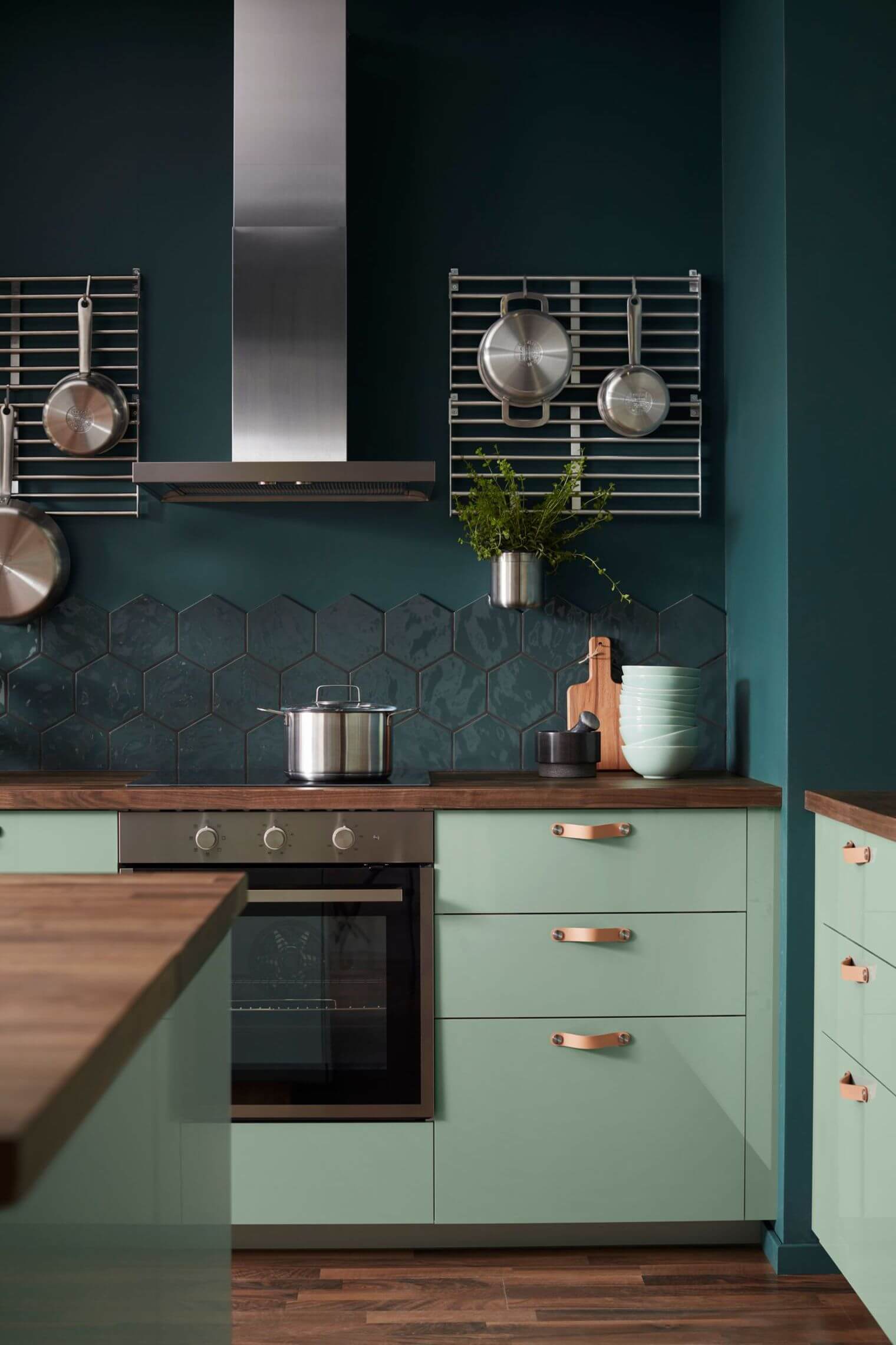
Here is a first example perfectly illustrating the above remarks. The jade green, mint green, sea green or celadon green are green shades pastel bright. They diffuse a sublime burst of freshness in all the rooms. In addition, with the help of its soft hues, the color lends itself to any room. Bedroom, living room or kitchen, each space is entitled to its little touch of freshness. I love this first kitchen. The natural light is wonderfully reflected on the white walls and sea green furniture. Finally, the decorators opted for a wooded floor and worktops. Both luminous and minimalist, the interior decoration thus closely resembles the Scandinavian style.
2. A trendy and bucolic look for a pastel kitchen
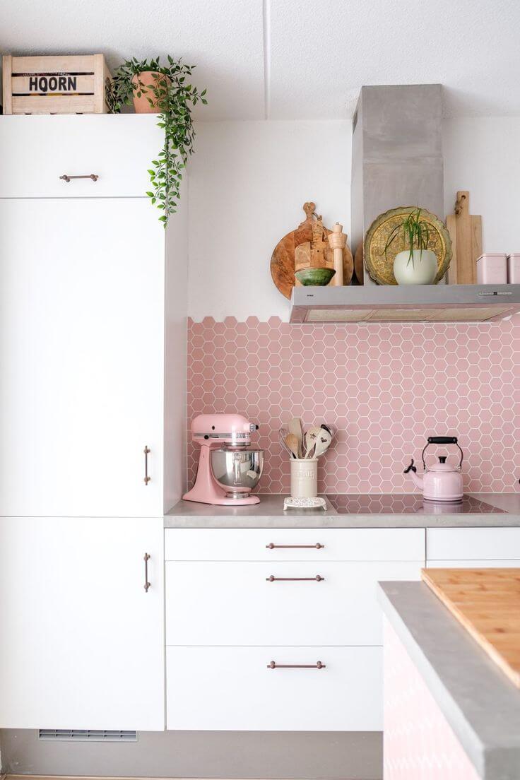
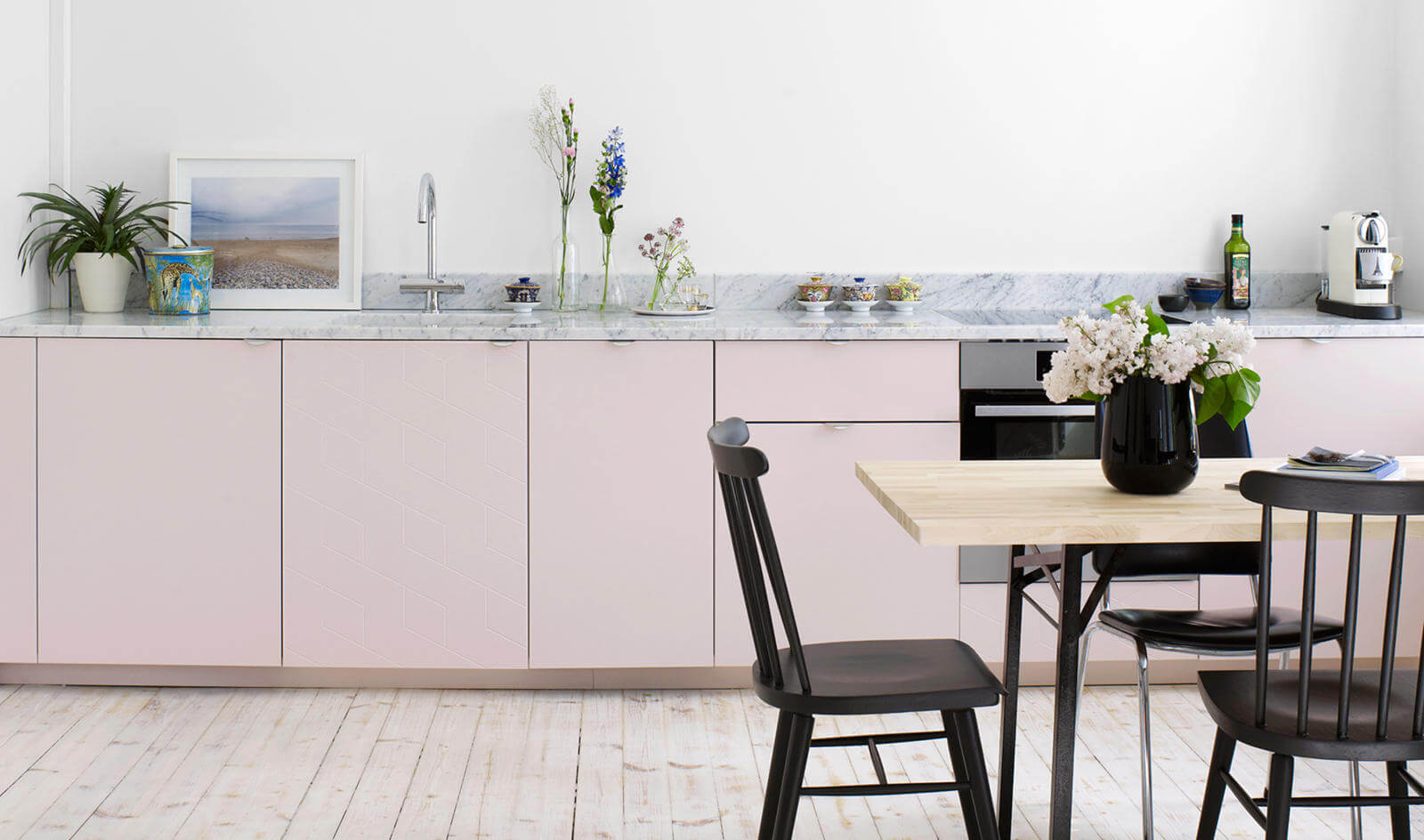
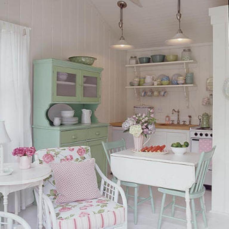
In addition, the second flagship color, pastel pink, powder pink or even blush pink, are iconic in pastel cuisine. They bring a soft, bucolic and romantic atmosphere. For more authenticity and originality, there are multiple tile imitations. In the form of repositionable wallpaper or vinyl, the splashback adds more subtlety and texture to a room. Here, I find that the rendering is very successful. The geometric wallpaper, the retro kitchen utensils as well as the wooden parquet plunge us into a light and poetic atmosphere.
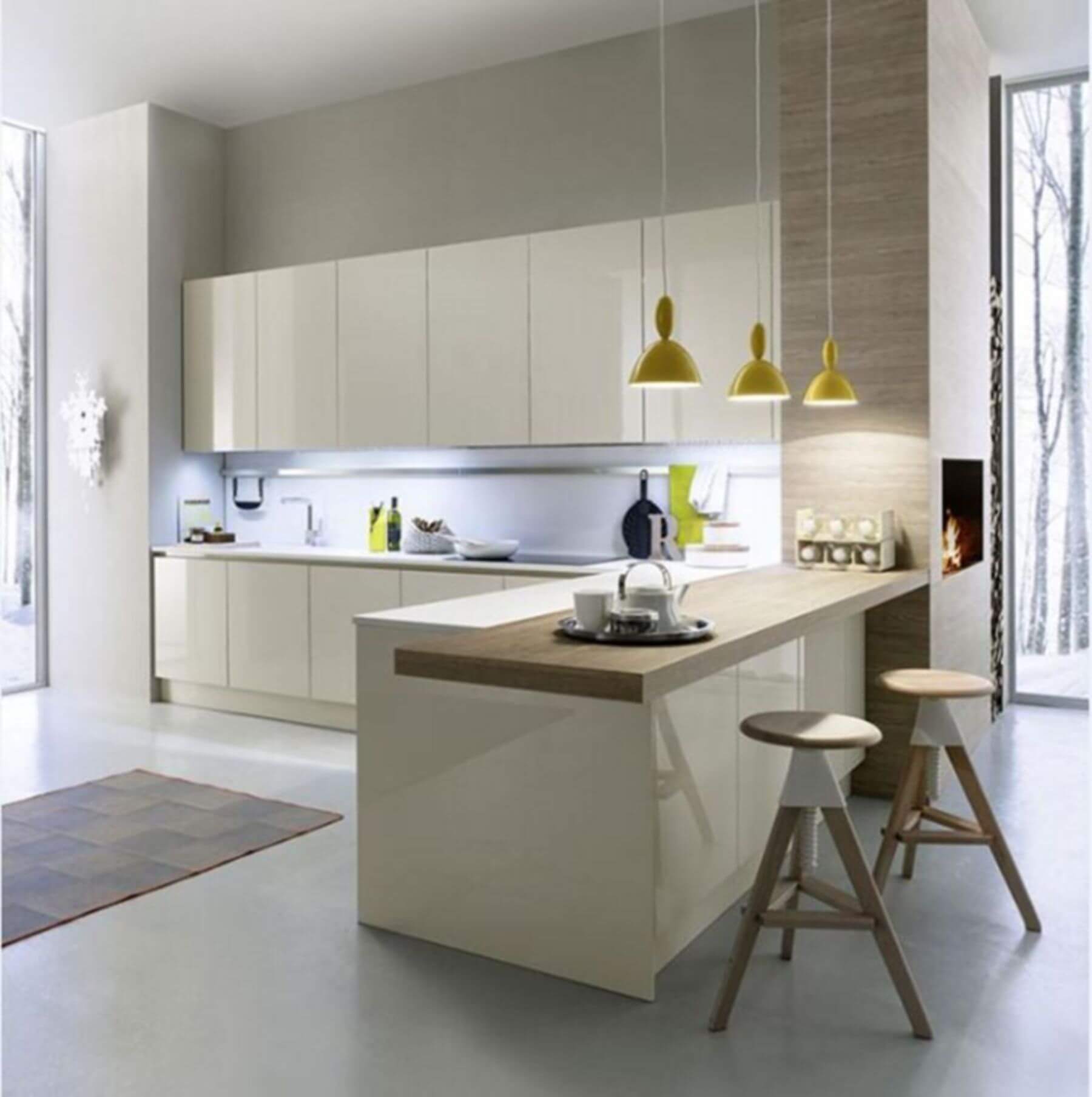
3. Bring some pep to your interior
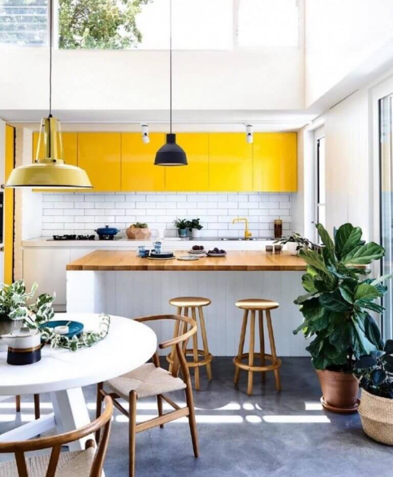
Finally, less common than pink, green or pastel blue, yellow is also part of the palette. Unlike other colors, yellow will offer a more sparkling and summery look. The idea is then to dress part of a wall or furniture in this shade in order to make your interior shine. Then, it’s up to you to measure and juggle the different shades of yellow.
4. Mix the nuances for a sparkling cuisine
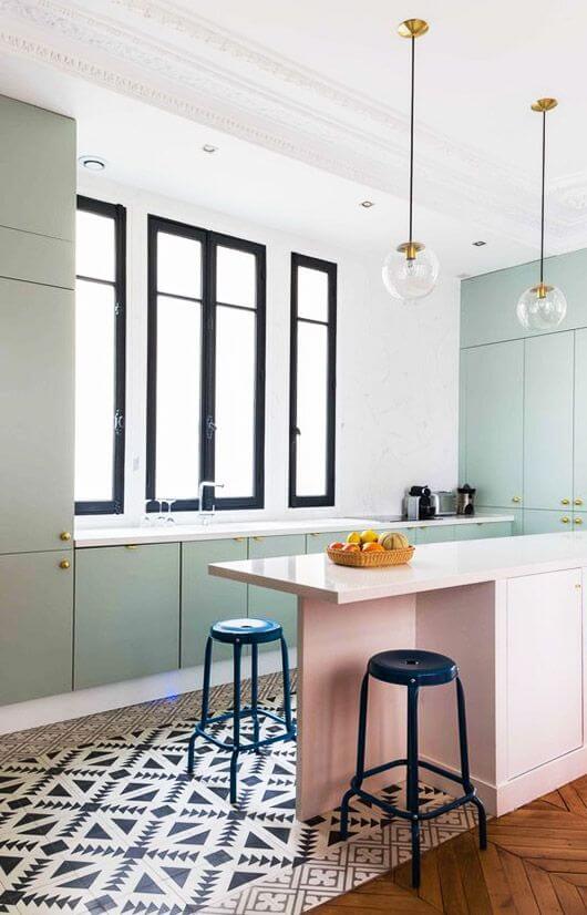
In addition to the solid colors, the mixtures are just as ideal. However, be careful to respect the golden rule of decoration: no more than three colors per room. Yes, be sure to balance the colors well to avoid the carnival atmosphere. So, for a subtle harmony, adopt neutral and natural furniture, such as wood for example. In terms of association, one of the most common is pink and pastel green or even pink and blue. Then it’s up to you to select the wedding that suits you best. Blue and pink, being more flashy and imposing, are perfectly suited to a pastel kitchen in search of singularity.
Unlike the union of pink and blue, green and pastel pink are much more discreet. Indeed, the tones blend more into the environment, thus offering a more sober and elegant look, while adding a touch of exoticism.
5. A pastel kitchen with bright accessories
Now let’s move on to a slightly more different decor. Instead of repainting the walls or changing your furniture, it is possible to give your kitchen a makeover by simply adding a few accessories. Indeed, carrying out work can take time. Therefore, if you have a neutral white kitchen, in this case you can bring pastel-colored utensils. Arranged here and there, they will immediately give life to your new pastel kitchen.
6. A flagship color for a unique kitchen
As we have seen previously, you have the choice to opt for a flagship color or to mix several, for a more Californian effect. Trendy retro, country, Scandinavian or industrial, polish your decor using pastel utensils. They will bring a little pep.
7. Merge the colors for a Californian atmosphere
The association of colors in the decorative elements. Here, as we opt for color in the accessories, the rule of three colors is relaxed. Indeed, by playing between trends, colors and materials, the accessories will appear like small blooming flowers. These colorful and vitamin notes will wonderfully illuminate your interior. These colorful notes will also help break the monotony and lividity of a room.
8. A white and pastel kitchen
Kitchen without top cabinet for this Scandinavian apartment which has chosen the pearl gray “Basis” model from the Reform brand.
9. A black and pastel pink kitchen
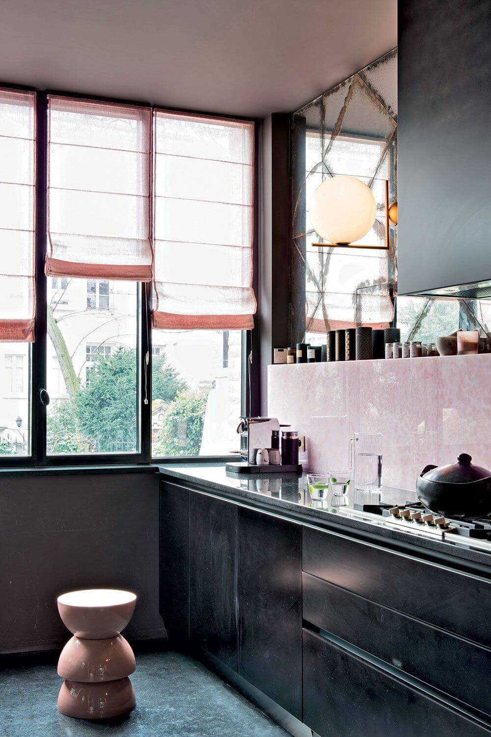
A kitchen in contrast to confirm that black in the kitchen goes perfectly with a pastel pink splashback.
10. A pastel and wood kitchen
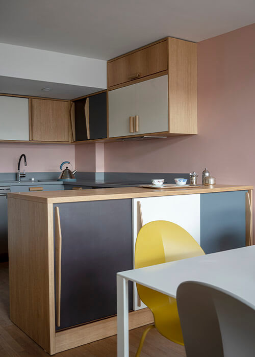
Kitchen with a mischievous set of pastel by Charlotte Perriand in an apartment.
11. A small kitchen with a pastel splashback
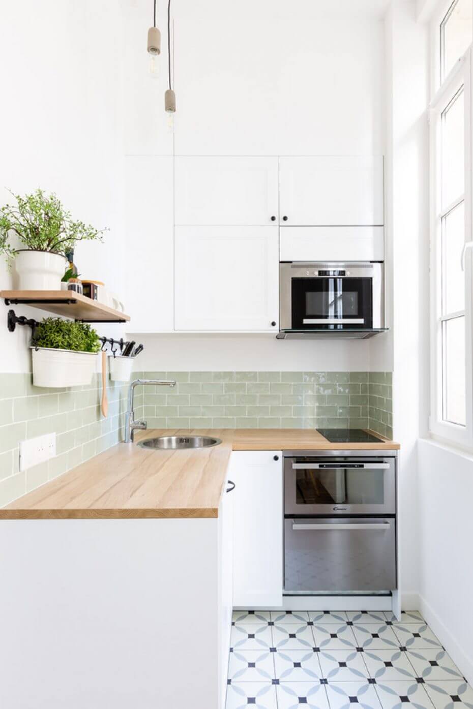
Small kitchen with pastel splashback in a studio created by architect Margaux Carnevali.
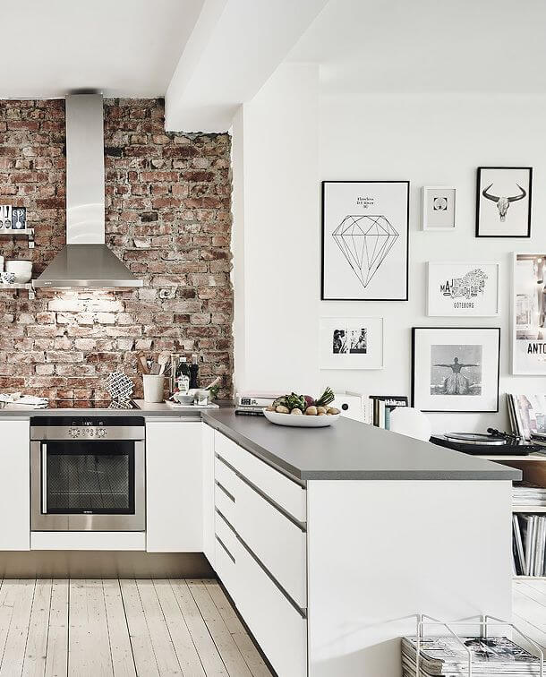
12. A kitchen with a pastel pink wall
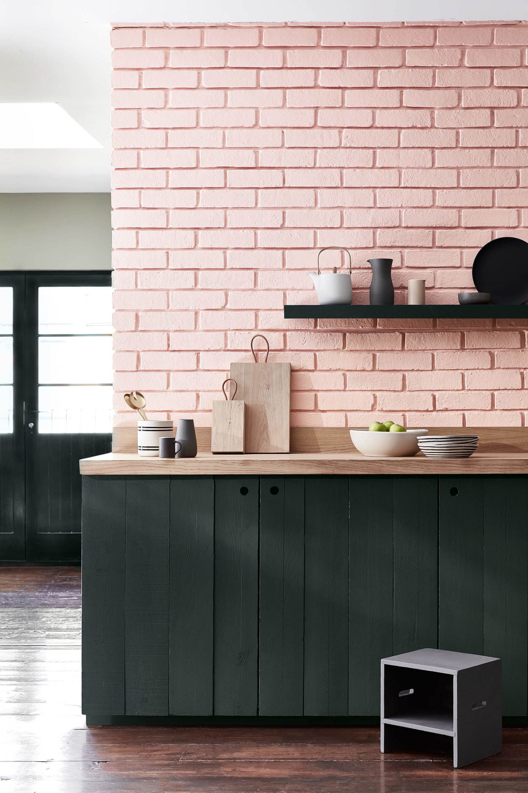
An industrial style kitchen with a brick wall revisited by a soft pastel pink from Little Greene.
13. A wood and pastel kitchen
In a studio with soft shades, the pastel and wood kitchen corner gently fits into this space with shared functions.
14. A modern pastel kitchen
An IKEA kitchen awakened by the pastel facades of the Superfront brand.
15. A kitchen with a section of pastel blue wall
A pastel blue signed Benjamin Moore on the wall to awaken the wisdom of white furniture in a modern and discreet kitchen.
16. A pastel and marble kitchen
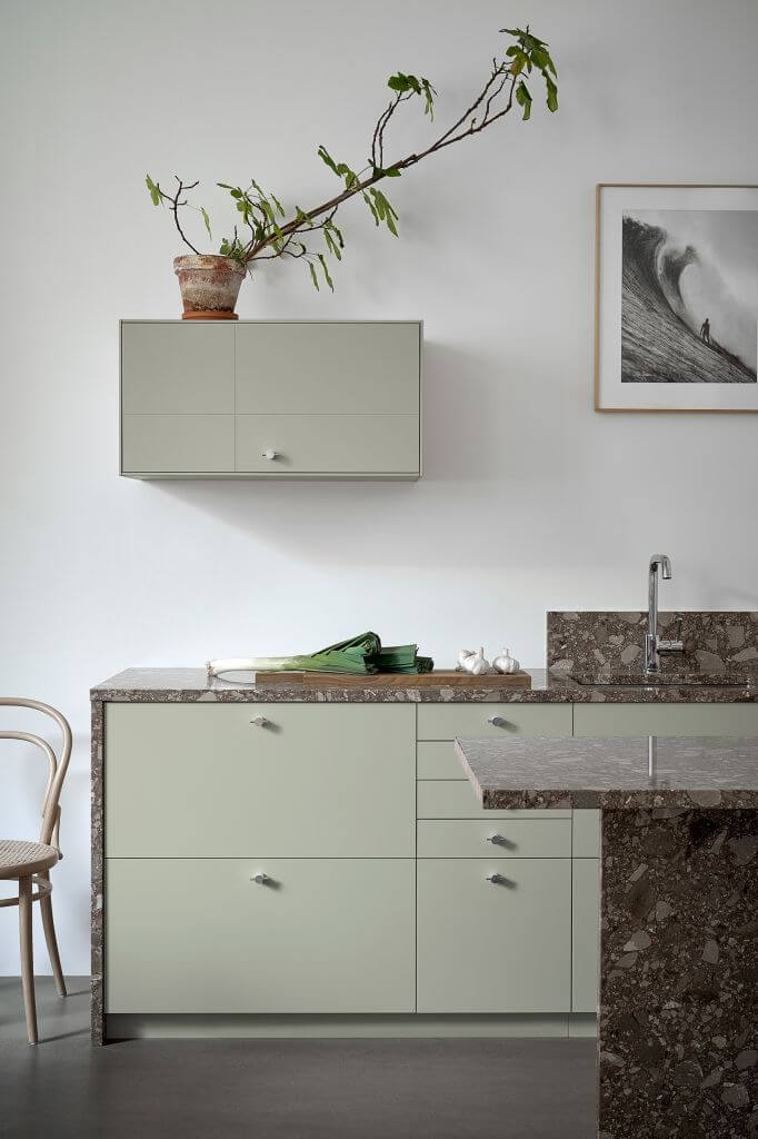
At the crossroads of pastel green and pearl gray, this Superfront kitchen sublimated by marble is clearly out of the ordinary.
17. A kitchen with pastel furniture
In the pastel series and dark colors go hand in hand, this kitchen is a successful example!
18. Pastel green and white
Matching snow white with pops of pastel green brings a totally fresh and natural look to this already gorgeous and relaxing kitchen. The color arrangement is perfectly distributed for a clean and neat overall appearance, reinforced by the charm of pastel green.
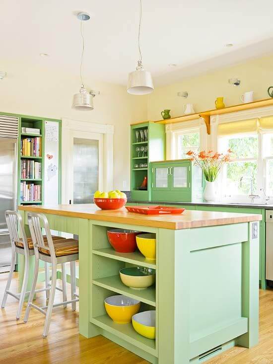
19. Pastel green and yellow
The play of colors between the pastel mint of the kitchen island and the pastel sunny yellow of the walls; it is indeed a play between hot and cold colors which creates a refreshing and soft atmosphere in this interior. White gives a certain sense of balance as a background color.
20. Pastel green and vintage prints
The vintage setting and country style of this kitchen calls for pastel colors. The pastel green pantry looks really stunning. It stands out as a focal point and reflects a relaxed and fresh vibe. The pastel mint colored chairs contribute to the very charming and romantic appearance.
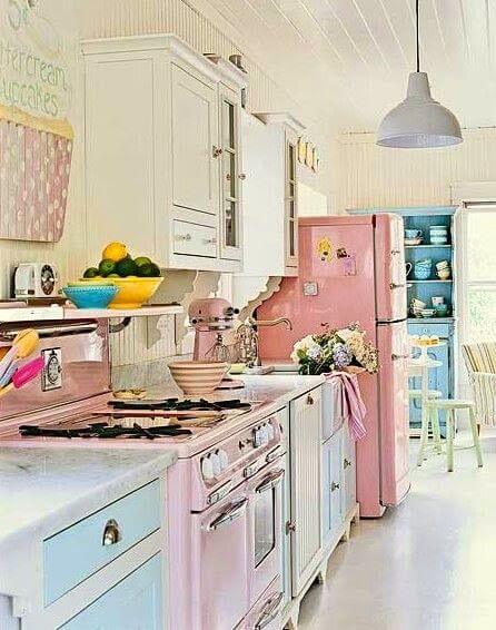
21. When the kitchen reminds you of cupcakes!
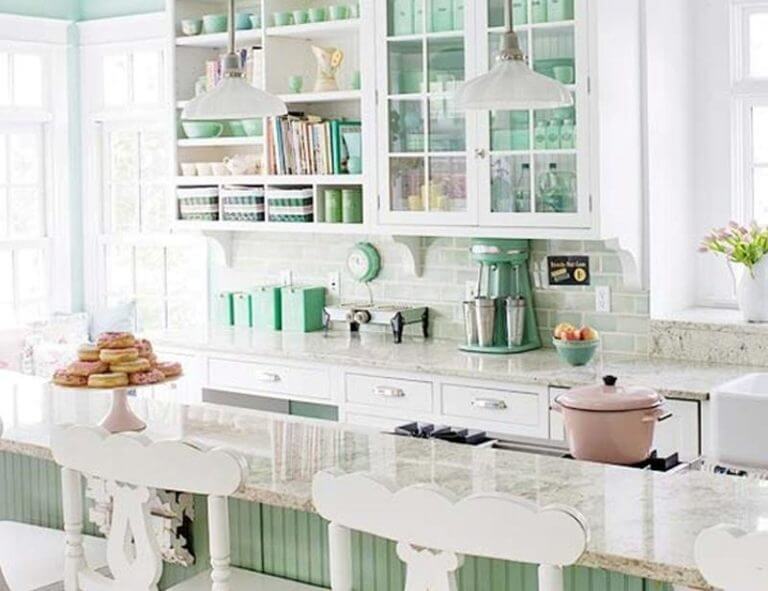
This kitchen looks like pretty cupcakes! The pastel green contrasts with the white color to offer a soft and fresh atmosphere in this place decorated in farmhouse style. The pastel blue wall adds a wave of freshness, a jovial and relaxed air.
22. Pastel colors and other brighter colors
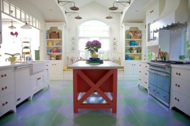
First of all, we love the layout of this kitchen so spacious and bright, but we also love the color distribution. The play of colors between pastels and warm red patterns is impressive. The pastel red kitchen island stands out against the pastel green and purple floor tiles and provides a really interesting and fun vibe.
23. Pastel colors and natural wood color
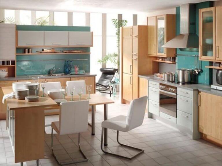
Here we can notice a wonderful combination of the pastel blue color and that of natural oak. This blend reflects a very clean and elegant appearance. White used as the base color creates a perfect balance and provides this kitchen with a bright air, while pastel blue and oak brings softness and warmth to it at the same time.
24. Pistachio green and creamy white
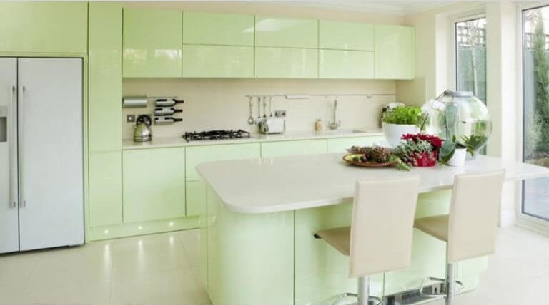
The pastel pistachio green mixed with a creamy white is a perfect combination for a very soft and modern look. The designer of this kitchen applied these pastel colors with such simplicity.
25. A small kitchen enlivened by pastel tones
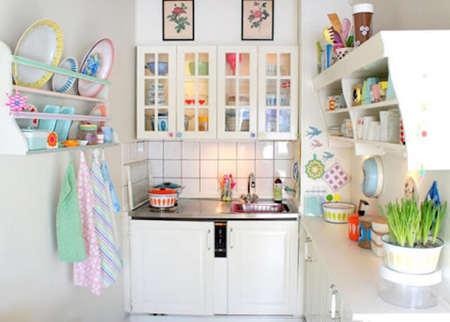
Here, it’s not the size that matters. This rather small kitchen, decorated with patterns and details in pastel colors, applied on a white base reflects a colorful, lively and cheerful appearance.