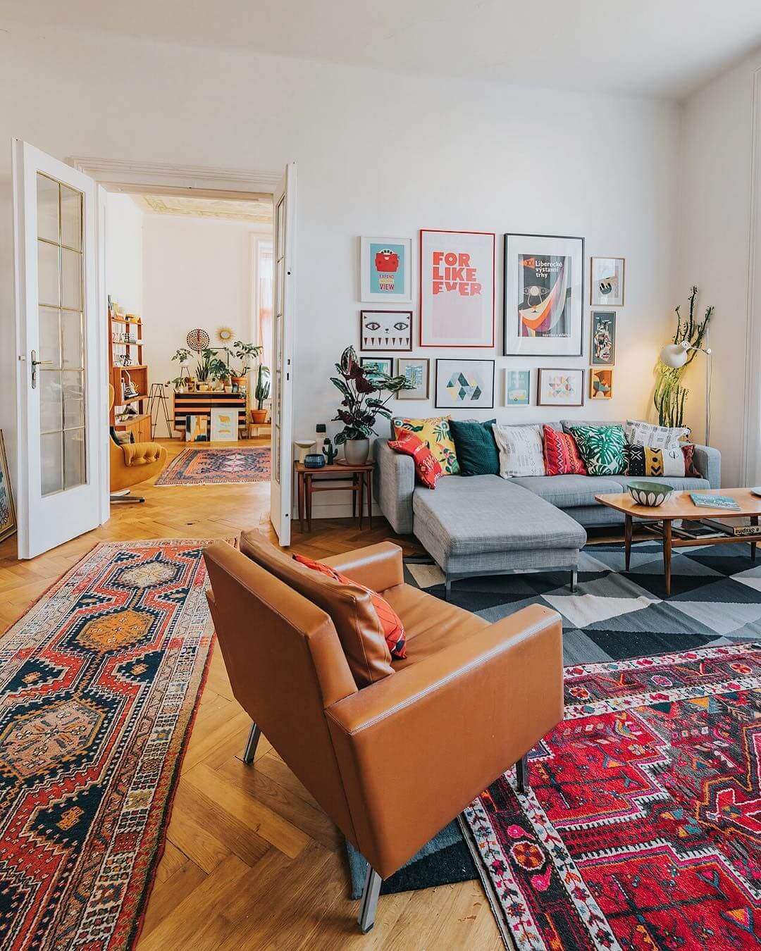
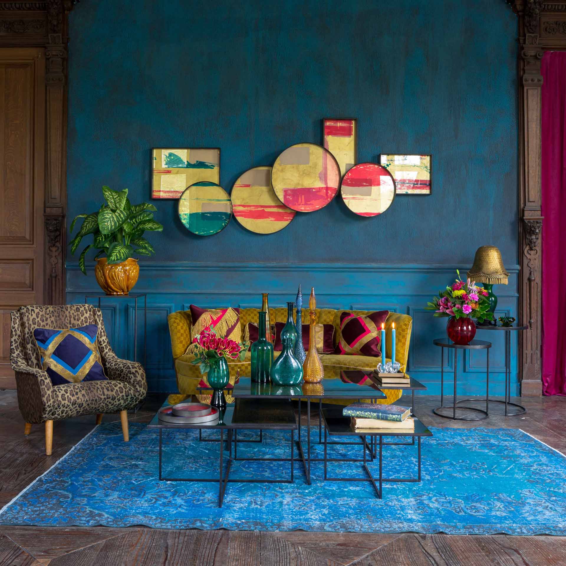
If you want to bring dynamism to your living room, opt for the arty style: a clever mix of cheerful colors and psychedelic prints, it brings the decor of the 70s up to date and brings out old pop art prints and objects. The colorful arty style living room is downright quirky and doesn’t take itself seriously.
1. Colorful walls
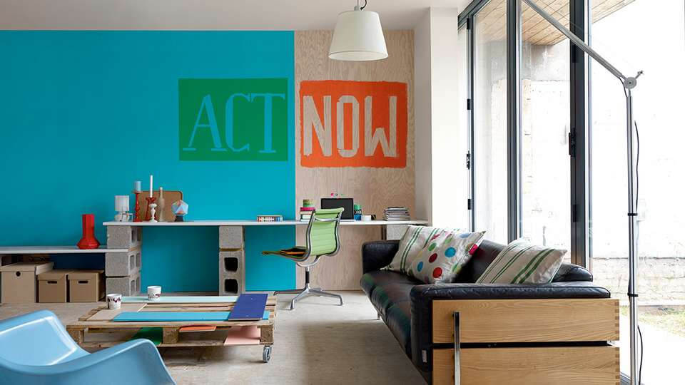
The arty style gives pride of place to color, and the walls are no exception. Regardless of the material chosen, we are inspired by trendy galleries to revamp our living room. Each wall can have its own color, but the ideal is to respect a certain harmony. Electric blue and yellow , orange, red and tangy green or fuchsia and turquoise blue are to be applied in generous touches. Black, white and silver also find their place on a living room walljust like the giant stickers representing certain cultural symbols like the famous Marilyn Monroe by Andy Warhol. Or better yet because less formatted, the canvases of young artists accessible to all budgets. For a successful arty style, a single watchword: we indulge ourselves without limit by letting our wildest impulses express itself.
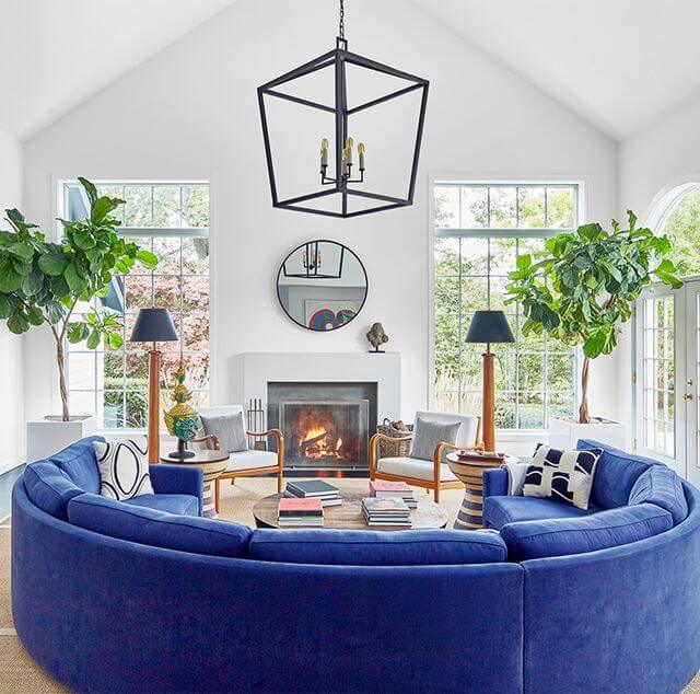
2. Blue
Representative of peace and infinity, it brings a touch of elegance and softens the space, especially in a crowded room. Able to marry with all colors, blue is endowed with a reflective power and puts the decorative objects in value. It also improves concentration.
3. Pink
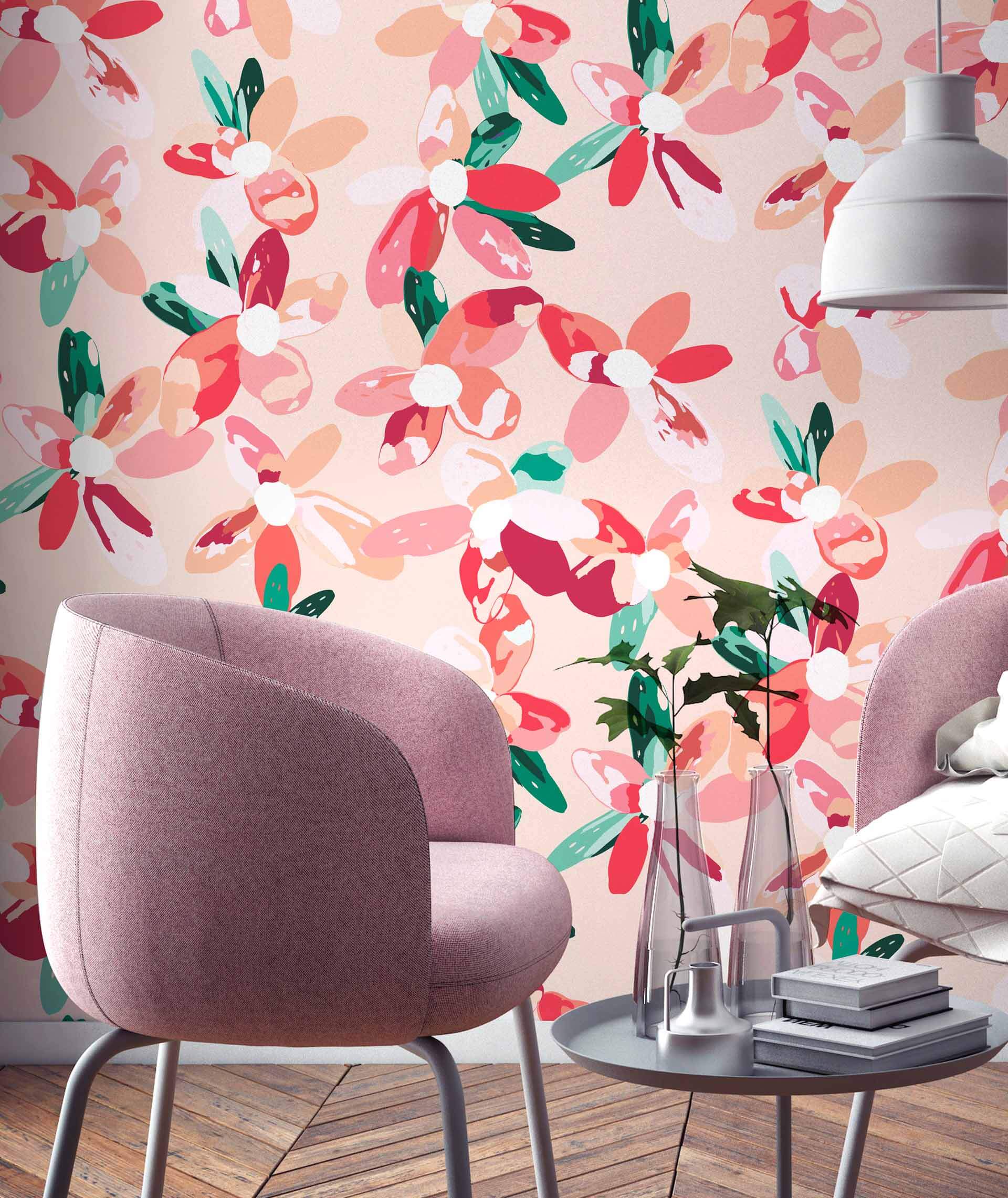
Pink baby, old pink, fuchsia or neon, this trend color brings a touch of the living room. Warm and reassuring, it represents calm, serenity and provides comfort. If the pastel color establishes a Scandinavian style decor, powder pink is ideal for dressing furniture (such as the sofa) and decorative accessories. Pink can be combined with light shades such as cream or white for a soft and harmonious finish.
4. Mint green
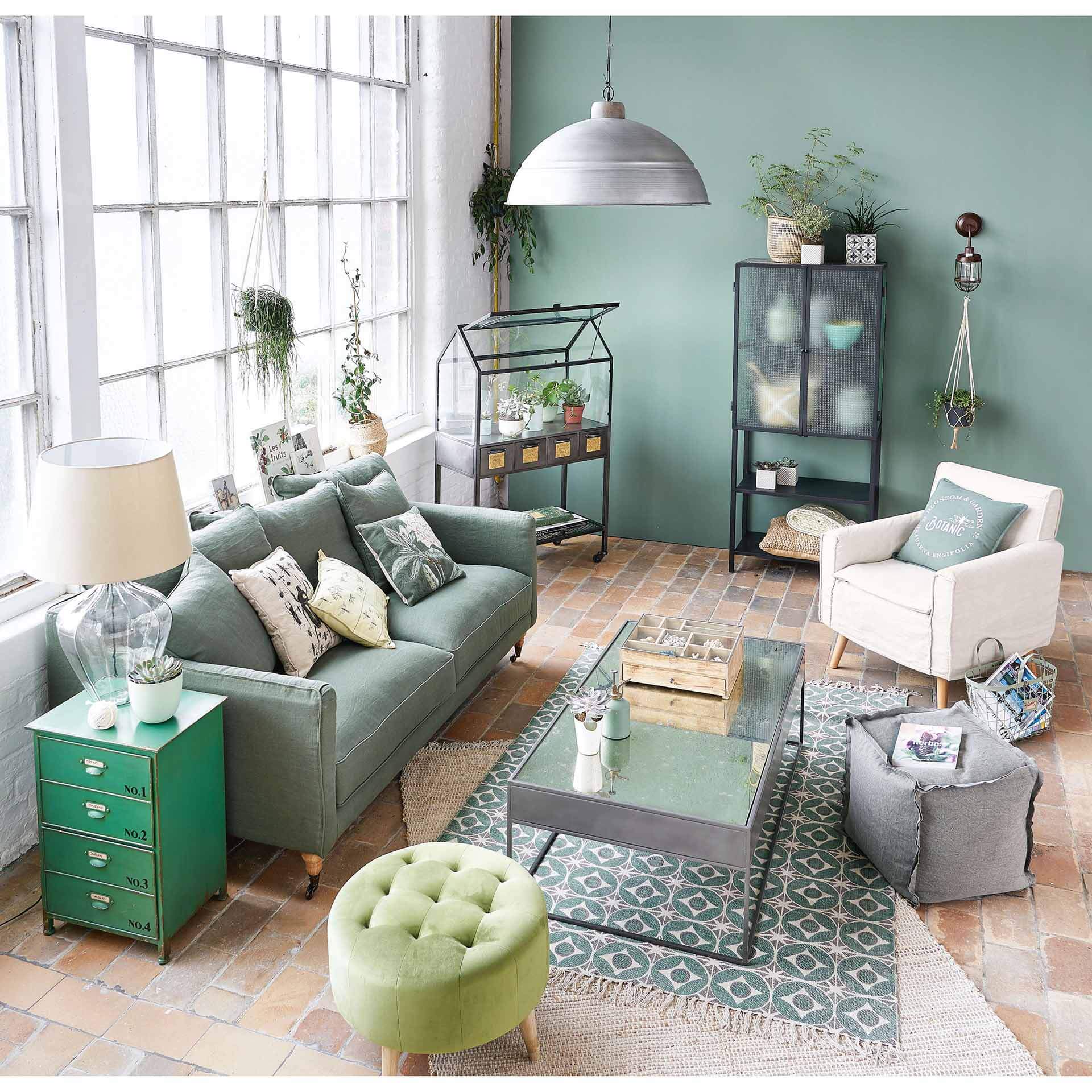
Soft, it suits any decor and can be combined with red. Symbolizing vitality and enthusiasm, this soothing color is ideal for a place of relaxation (such as the living room).
5. Hazelnut
Soothing, it gives an impression of volume and creates a relaxing atmosphere, especially in a room which is decorated with plants. Like brown, it is noble, refined and can be combined with fuchsia or lime green for more dynamism.
6. French vanilla
Neutral, this shade optimizes the lighting in the living room thanks to its luminous power. With enlargement effects, this color is ideal for a narrow or closed room (with few openings) and goes well with neutral tones such as white, gray, cream, black or brown.
7. Purple
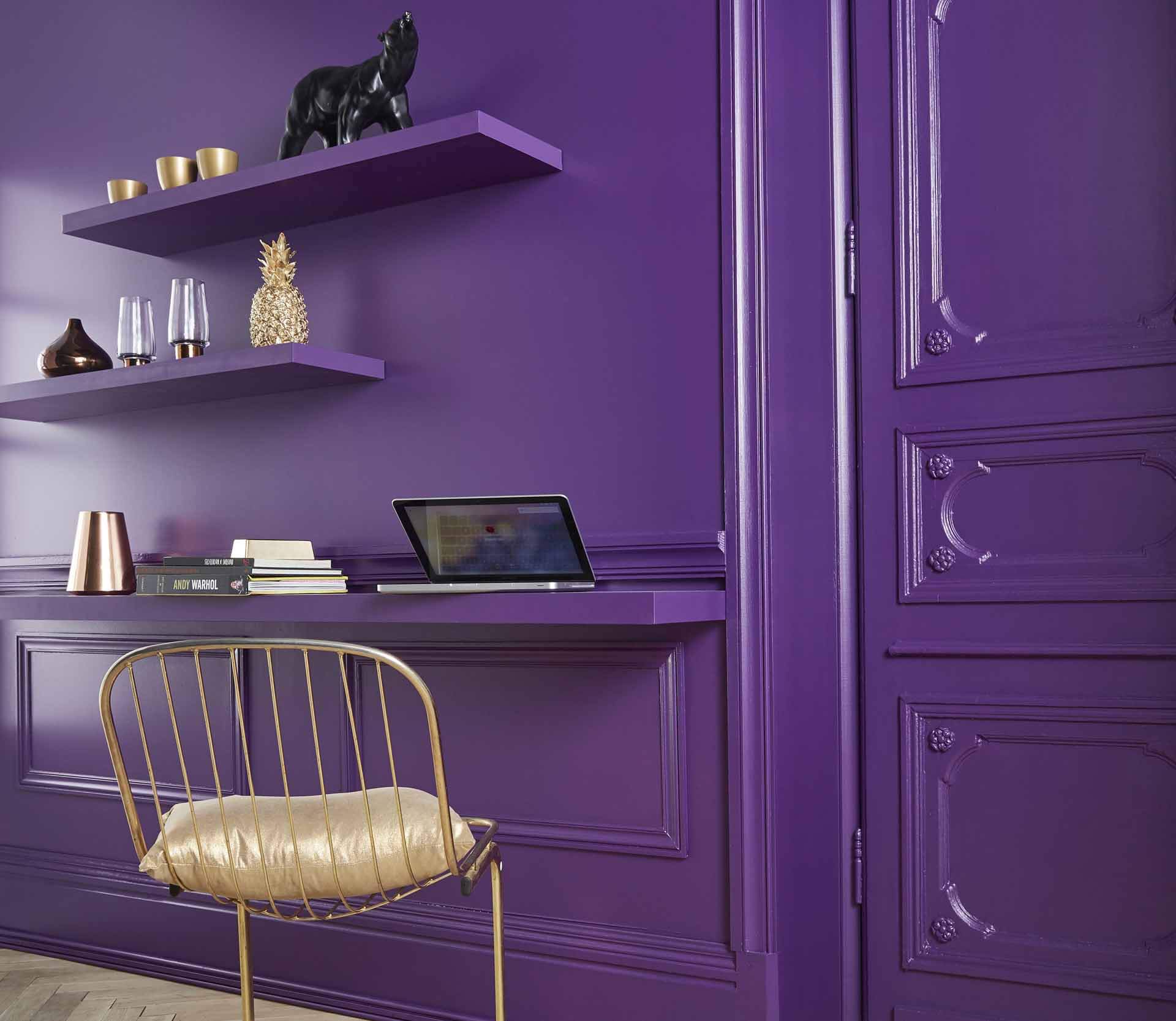
Trendy and refined, it finds its place in a contemporary style living room and offers a dynamic rendering. Complementary to yellow, it is ideal for dressing cushions, sofas or rugs. Purple helps create a sophisticated atmosphere. Associated with blue, it creates a romantic atmosphere.
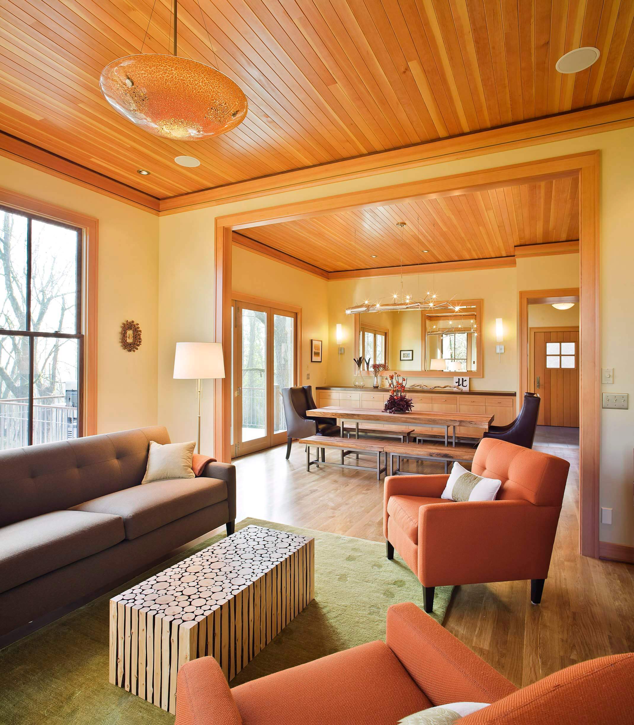
8. Orange
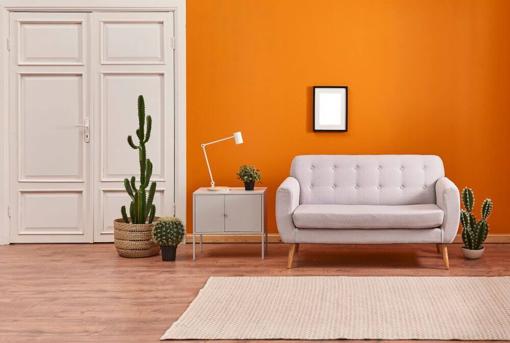
Mixture of yellow and red, it illuminates the living room to make it more convivial. Symbolizing friendships, orange is ideal for a place of sharing. Its overwhelming effect can be reduced by white or cream.
9. Mustard yellow and gray
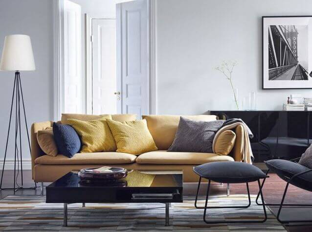
The ideal for a chic living room is to favor two shades maximum so as not to give an impression of overload. Gray is a must, you can combine it with a warmer color like mustard yellow or very trendy plum.
10. White and klein blue
In a contemporary living room, combine a neutral shade such as gray or white with a trendy and more vibrant shade such as Klein blue, duck or turquoise.
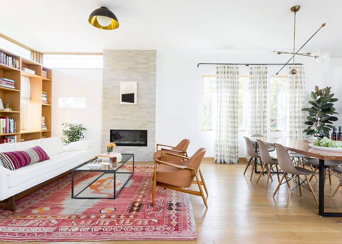
11. Black and brown tones
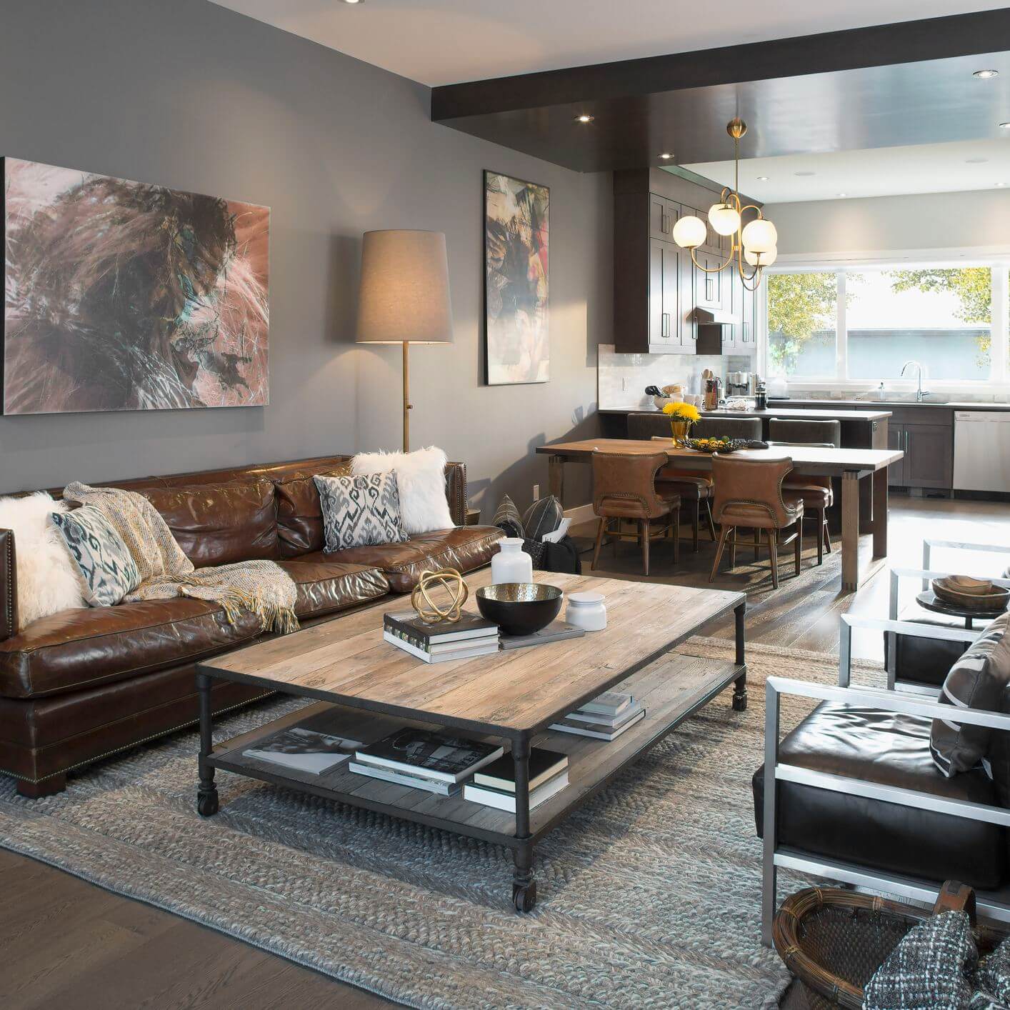
The industrial-style living room is reminiscent of New York lofts, so to be sure you don’t go wrong, bet on concrete-style gray associated with brown hues, it’s ideal to evoke the famous beams and leather armchairs. If you want a pop of color, consider brick red.
12. Pastel blue and white
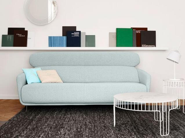
A Zen atmosphere living room requires a harmonious association of natural tones with soft colors such as very soothing pastel blue associated with white and cream.
13. Mandarin and electric blue
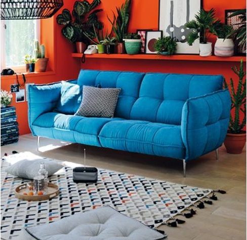
If you go for a living room that has pep, combine several bright colors. Blue blends perfectly with dark orange but be careful not to mix too many colors as this may overload the space.
14. Gray and soft shades
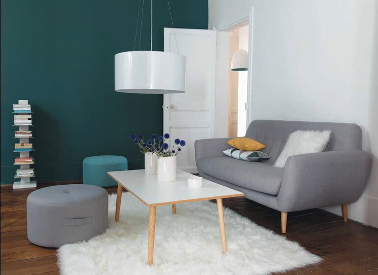
The Scandinavian style is characterized by a predominance of very light shades such as white and cream. If you want to energize the whole thing, consider brighter colors like duck blue or mustard yellow.
15. Pistachio green and white
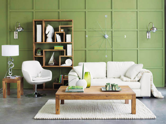
Green is the leitmotif for a country or nature style living room, but be careful not to use too bright green, instead bet on pistachio green associated with white which will bring light.
16. Powder pink and pastel shades
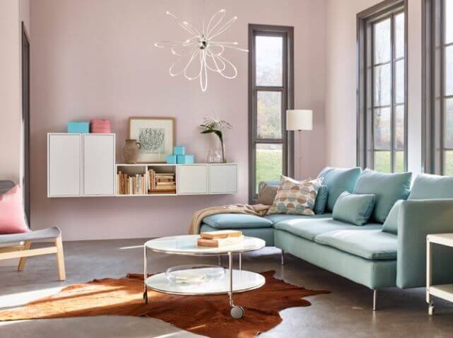
A girly salon is meant to be poetic; to install this atmosphere, opt for pastel shades such as powder pink, mint green with water or pastel blue.
17. Khaki and orange
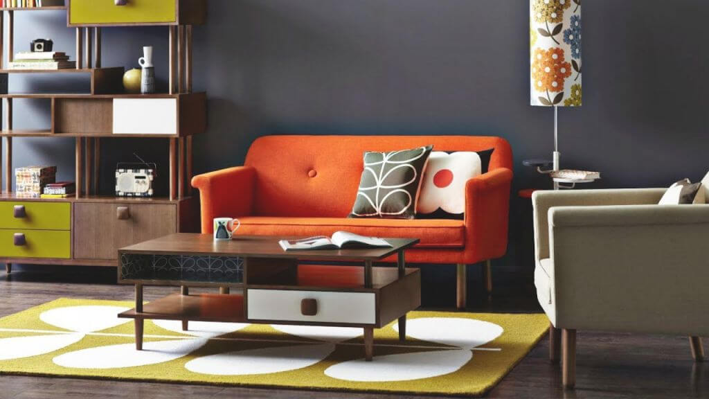
Who says retro says warm shades so for a successful style bet on orange and earth tones such as brown.
18. Green and cream
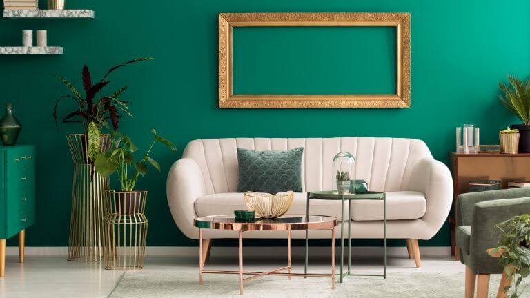
Green looks clssic and it can also give you a retro look with some modernity. If you mix it with the cream color this combo will look so elegant and beautiful and you can fill the room with artistic nature in these colors.