See tips on choosing the best wall color for your living room and techniques to make it even more stunning! Colors have the power to change people’s energy and mood. And they can still bring a sense of renewal, which matches the end of the year — a period that is usually for reflecting on what happened and setting goals for a new cycle.
Why not also think about changes to your home in 2022? To help you, our website gives you ideas on how to renew the walls of your living room to start the new year surrounded by new energies.
1- What are the best living room wall colors?
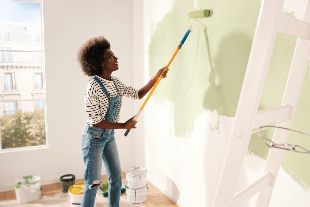
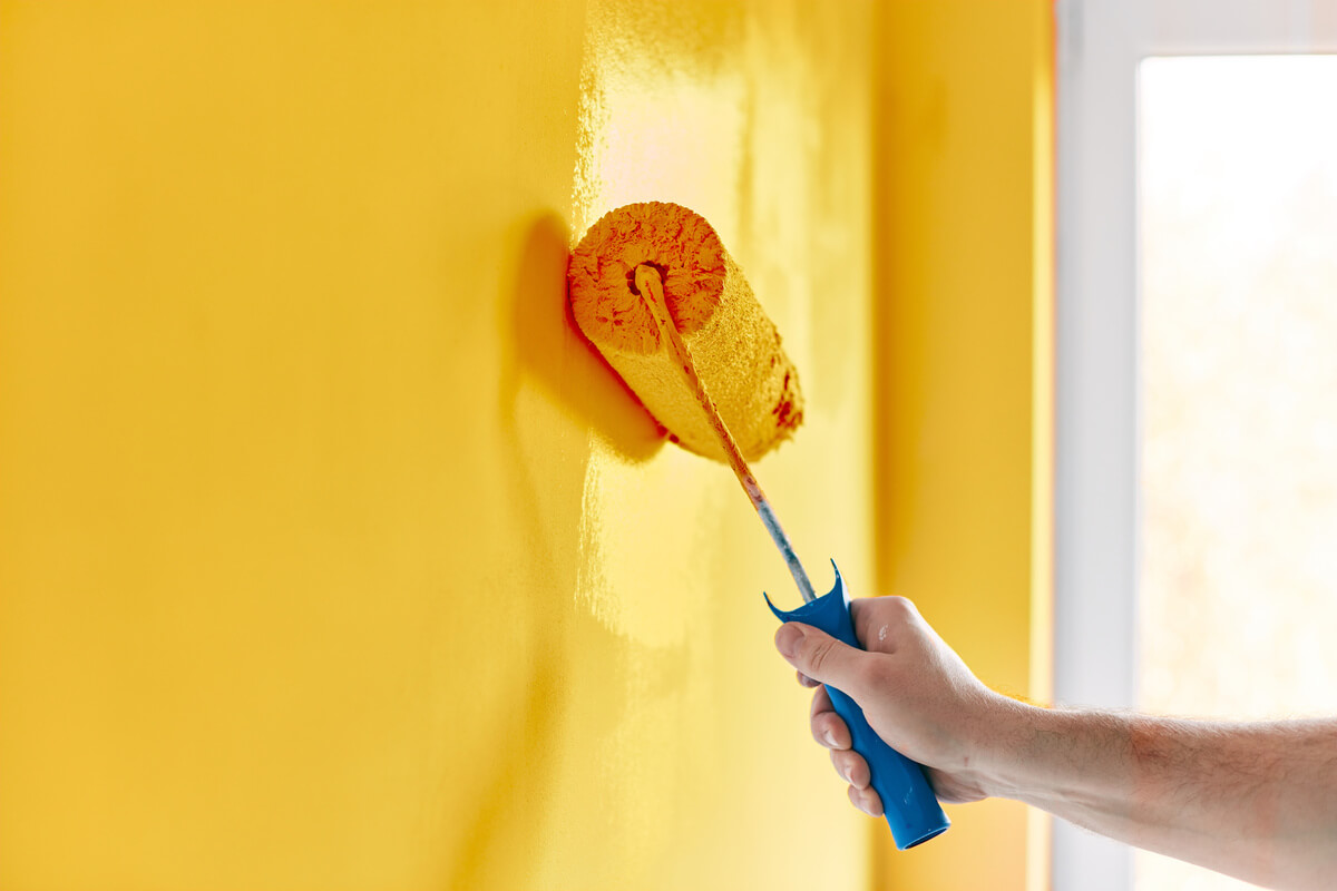 Paint roller with yellow paint against a wall
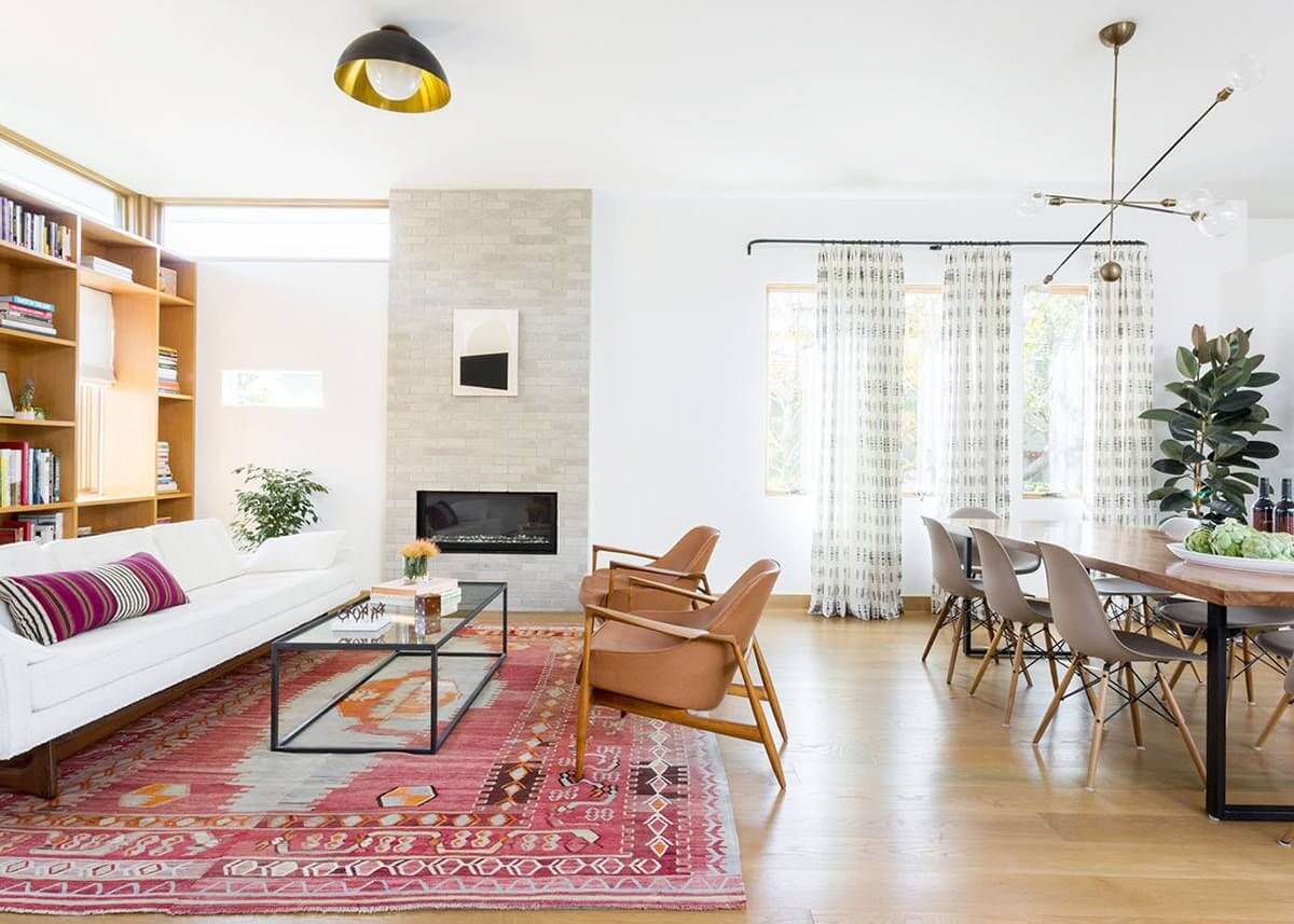
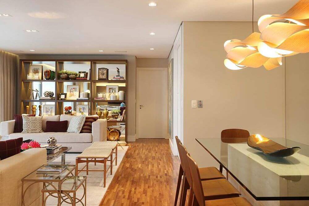
The living room and dining room are the main rooms in the house, where people gather daily, not only for meals but also to be in the presence of their loved ones at any time of the day.
We have some color tips for those who want to give a special touch to these environments and make them more, cozy and welcoming to receive friends and family or even to rest after an exhausting day.
Specific colors provoke certain feelings and can even change the perception of time, a strategy widely used in commercial establishments to make people want to stay in the place for more or less time. This knowledge can also be applied at home; check it out below!
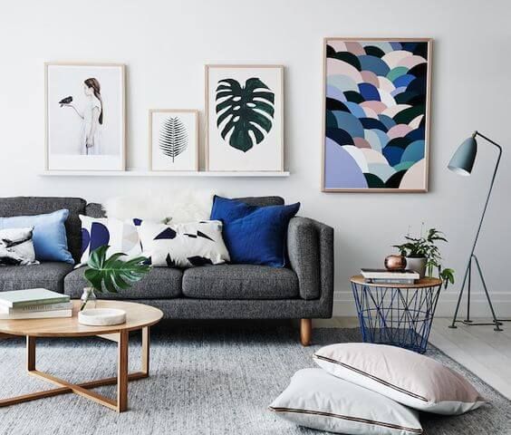
Paint color suggestion
Below we will explain the impact of each color on the environment, but remember that these are just tips; if you want to achieve a specific result, always consider your taste to make your favorite corner of the house your own.
2- Multiple shades of a single color
For those who love colorful rooms, but are afraid to exaggerate, the solution is to use several shades of the same color. The technique uses the same tone to compose the space from the lightest to the darkest.
It is possible to use any color, as long as the painting is done in a balanced and harmonious way. Therefore, the tip is to use 2 to 3 nuances. For the result not to be monotonous, combine effects, such as different textures and patterns.
Thus, you transform your monochromatic environment into a more creative, attractive, and colorful space.
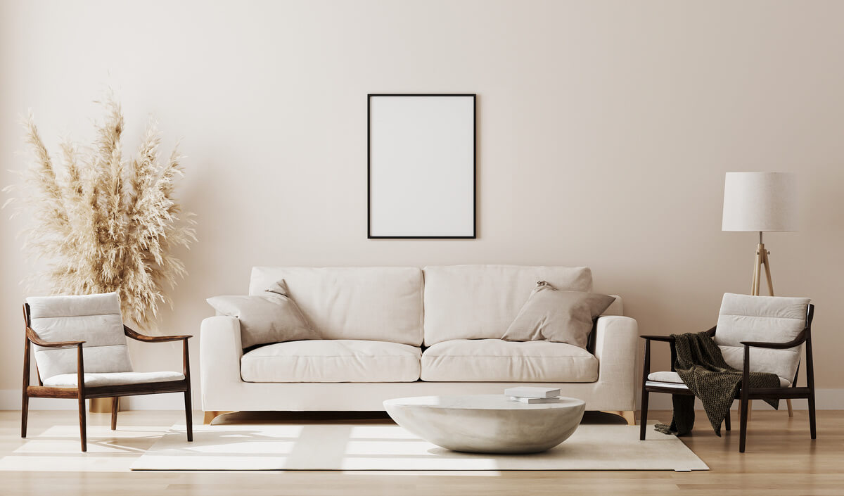
3- Neutral without boredom
Many people are afraid to bet on a neutral decor for the room, as they believe that these colors are “bland”. But these classic tones can, yes, make the environment super charming.
The neutral color palette is comprehensive and doesn’t just contain white and beige. Fendi, off-white, cream, ice, black, shades of gray and brown variations, among others, also make up the shades that can be used.
Timeless, these options create a peaceful environment, optimize space and give a feeling of spaciousness and clarity.
Neutral colors are also versatile because it is possible to use and abuse colorful objects in decoration with them. And, if you want to make the room even more charming, create textured walls or combinations with two tones, such as the classic black and white.
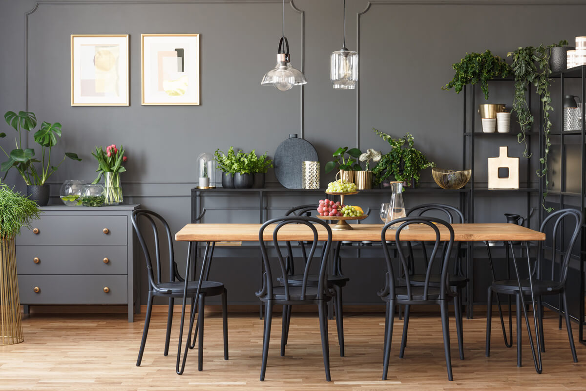
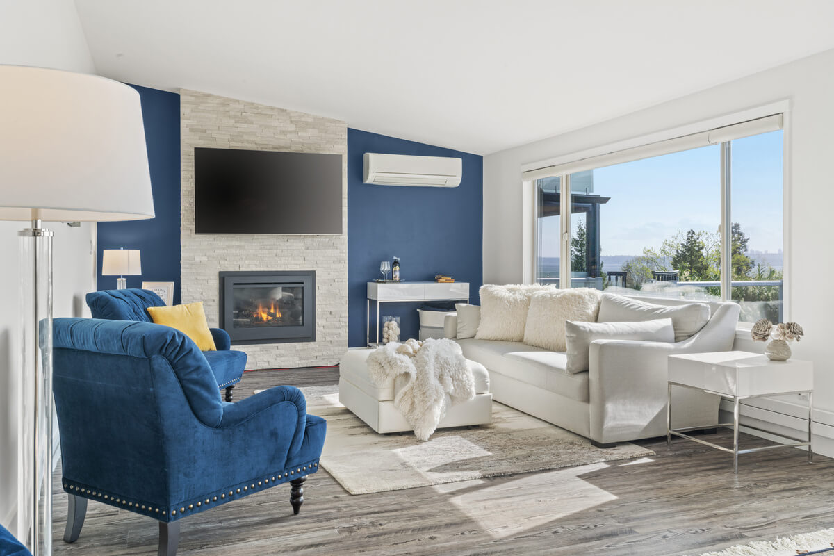
4- Dark color combinations
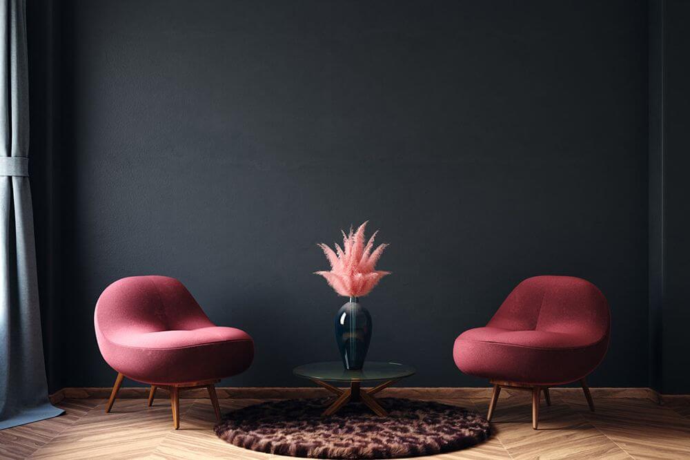
Anyone who believes that dark colors always give the feeling of a rich environment is wrong. Harmonizing sober tones can be a good bet for decorating your room if dosed in the right measure and used on the back walls of the room.
Navy blue and dark gray are great options to create a deeper space. The black color can also bring a lot of elegance and charm to the environment, especially if it is balanced with effects that soften the tone, such as granulate and velvet. Another classic option is matte burnt cement, which leaves the environment sophisticated.
Dark tones are great to contrast with the decor and furniture in the environment. But attention: when choosing a dark color for your wall, it is essential to observe the type of finish. The ideal is the matte paint, which has a velvety finish and guarantees more quality for your wall painting.
5- White, because the basics never fail
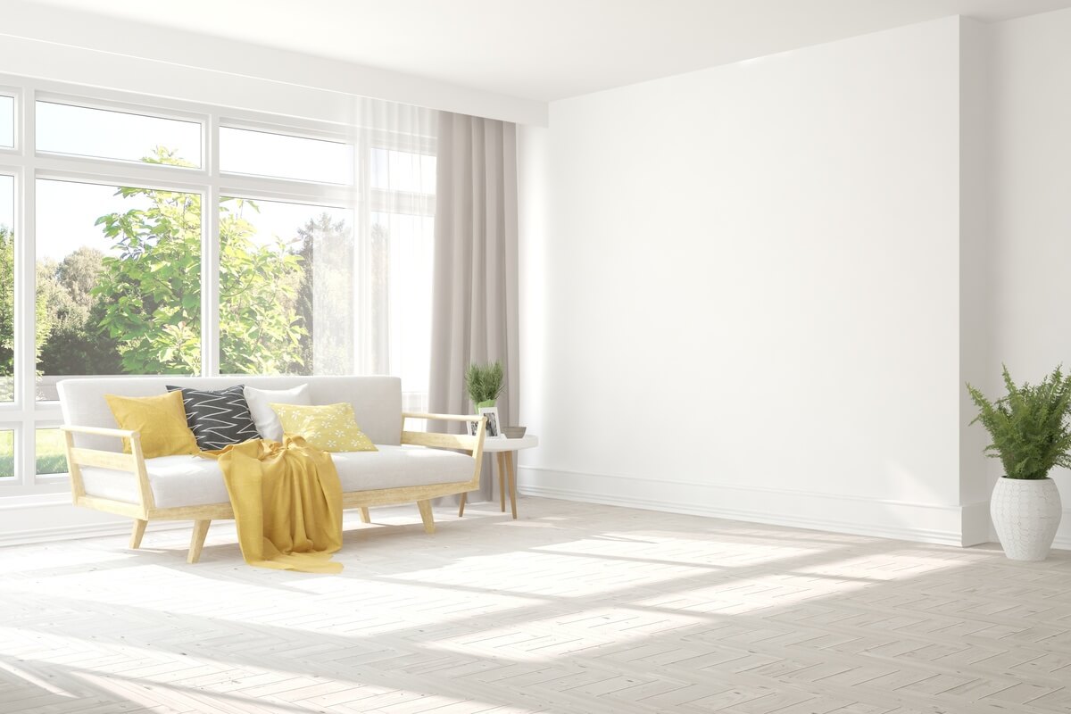
White is often associated with purity, calm, cleanliness, peace, and simplicity. It is a color used mainly in environments inspired by minimalist architecture and gives a feeling of more significant space in the room.
When choosing white for the living room or dining room, know that you will have a range of options when selecting extra furniture and decorations without worrying if the environment will be heavy or visually polluted. Another positive point of painting the living room wall in white is that you can choose upholstery in vibrant and flashy colors if that’s your taste.
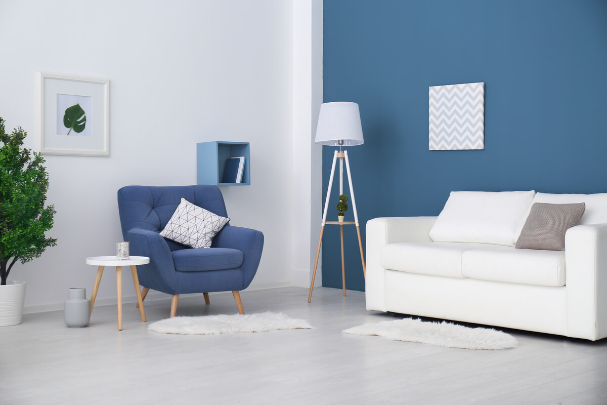
6- Shades of blue
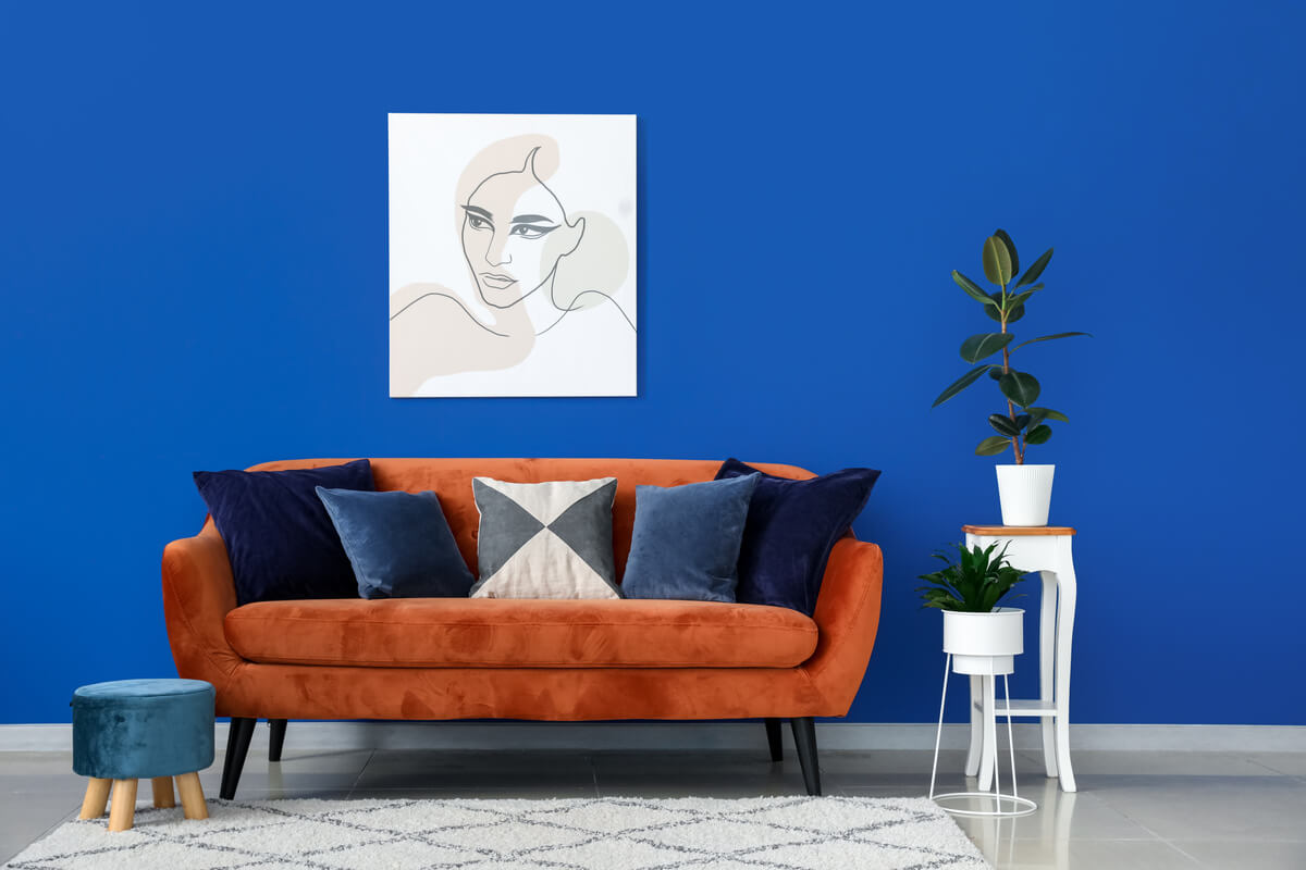
The color blue is related to the feeling of tranquillity, harmony, and serenity. Being the rarest color in nature, it can hardly be seen in plants and animals and generally in the sky and ocean. For this reason, blue was a rare pigment to be found in antiquity, being seen only in the nobility in its navy blue hue.
On the other hand, blue is a cold tone often related to sadness and melancholy in paintings and cartoons, so be careful when choosing a dark style and invest in the softer ones, especially if you want to make rooms monochromatic.
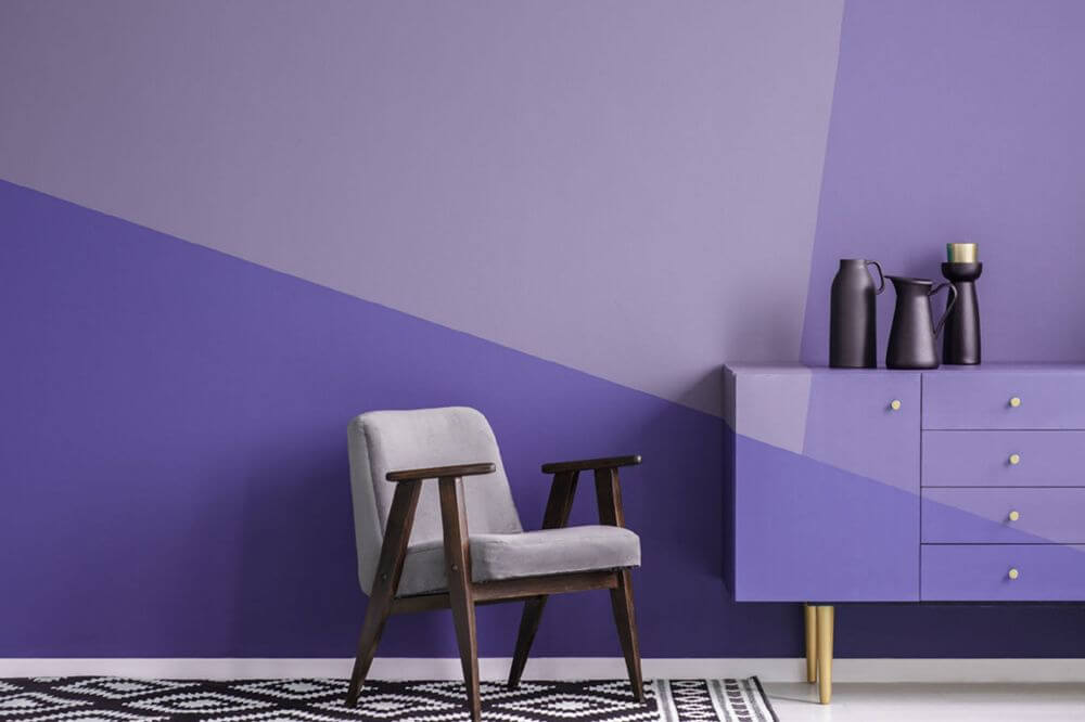
7- Shades of purple
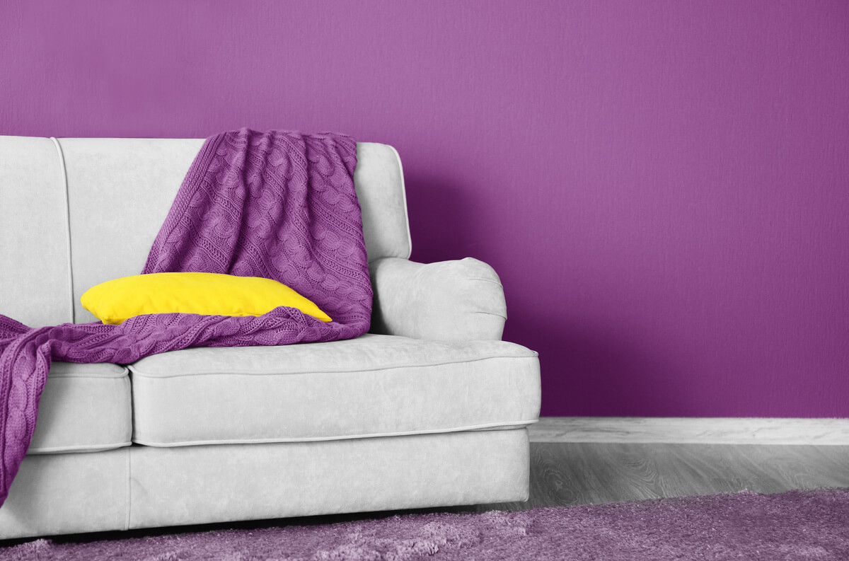
Purple is often associated with spirituality, mysticism, calmness, and introspection. Like blue, purple is a color linked to nobility and luxury: in Japan, for example, only the highest-ranking Buddhist monks could use it. As it is not a widely used color when painting living room walls, it can positively surprise your visitors.
If you want to leave the environment with a touch of glamour and sophistication, bet on the mix with silver or gold. However, if the intention is to make the environment lighter, it is better not to choose this color for the room; the white and gray colors will undoubtedly help you achieve this result.
8- Shades of gray
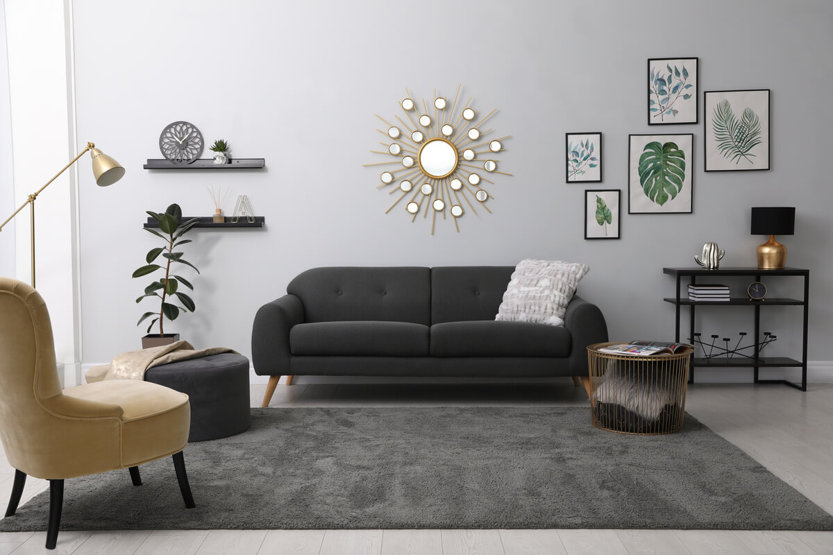
Gray is a tone that exudes more neutral than all others, as it does not reassure or animate; on the contrary, it serves to soften the other colors you want to use in the environment. Exuding elegance gives you complete freedom to combine it with different colors to achieve the desired result, be it simple, impactful, fun, or cozy.
Gray is the wild card of colors, so don’t be afraid to use it, whatever your shade. The look will be more modern with dark tones and more industrial with lighter tones.
9- Beige tones
Beige is part of the palette of neutral tones and white, gray, and even black. It conveys feelings of serenity, calm, and lightness, often chosen by people who want to have a classic and cozy room at the same time.
When choosing beige, you can invest in a more abused decoration if you want the environment to present a contrast of colors. However, remember that the idea is to choose only shades of beige and brown in the furniture to compose the same room, as a very drastic mix of solid colors with beige will leave the room looking messy.
10- Shades of pink
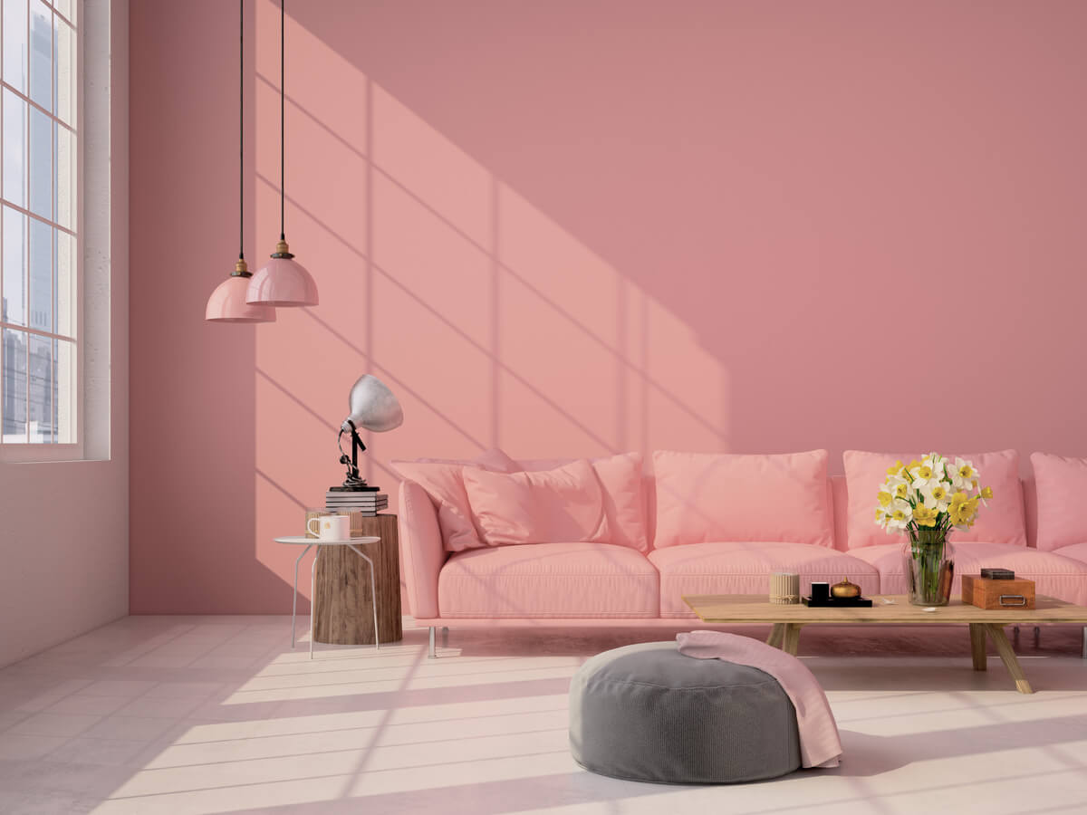
Pink in its softest tones is the color chosen by those looking for a room that exudes a sense of romanticism, delicacy, and softness. The pink color in a more assertive manner of the living room wall is related to sensuality and seduction. Please select the one that best expresses your personality and invest in pink: it is a unique and gorgeous color.
Soft shades of pink can be combined with gold to make the environment elegant and sophisticated, or even with shades of beige or brown to match a more classic style. When painting your wall a more vibrant pink, choose furniture in neutral colors and whites to match.
11- Shades of yellow
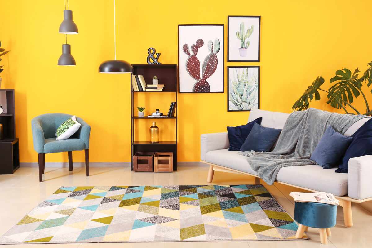
The yellow color is related to light, joy, and tenderness and is indicated for more closed environments to bring the feeling of lighting.
The soft shades of yellow are highly recommended for both dining rooms and living rooms, as they make the environment cozy, as they are shades of warm color. Brighter shades of yellow are not used in this environment because they cause anxiety, precisely the contrasting impact of what we are looking for in a room.
Invest in pastel colors, which are also a big trend!
Dining room paint color suggestion
The dining room is the environment where we get together with the family daily, both to have meals and to talk and tell how our day was, and therefore it must be cozy. Next, we’ll show you some unconventional colors that work in this room when you add them carefully.
12- Red
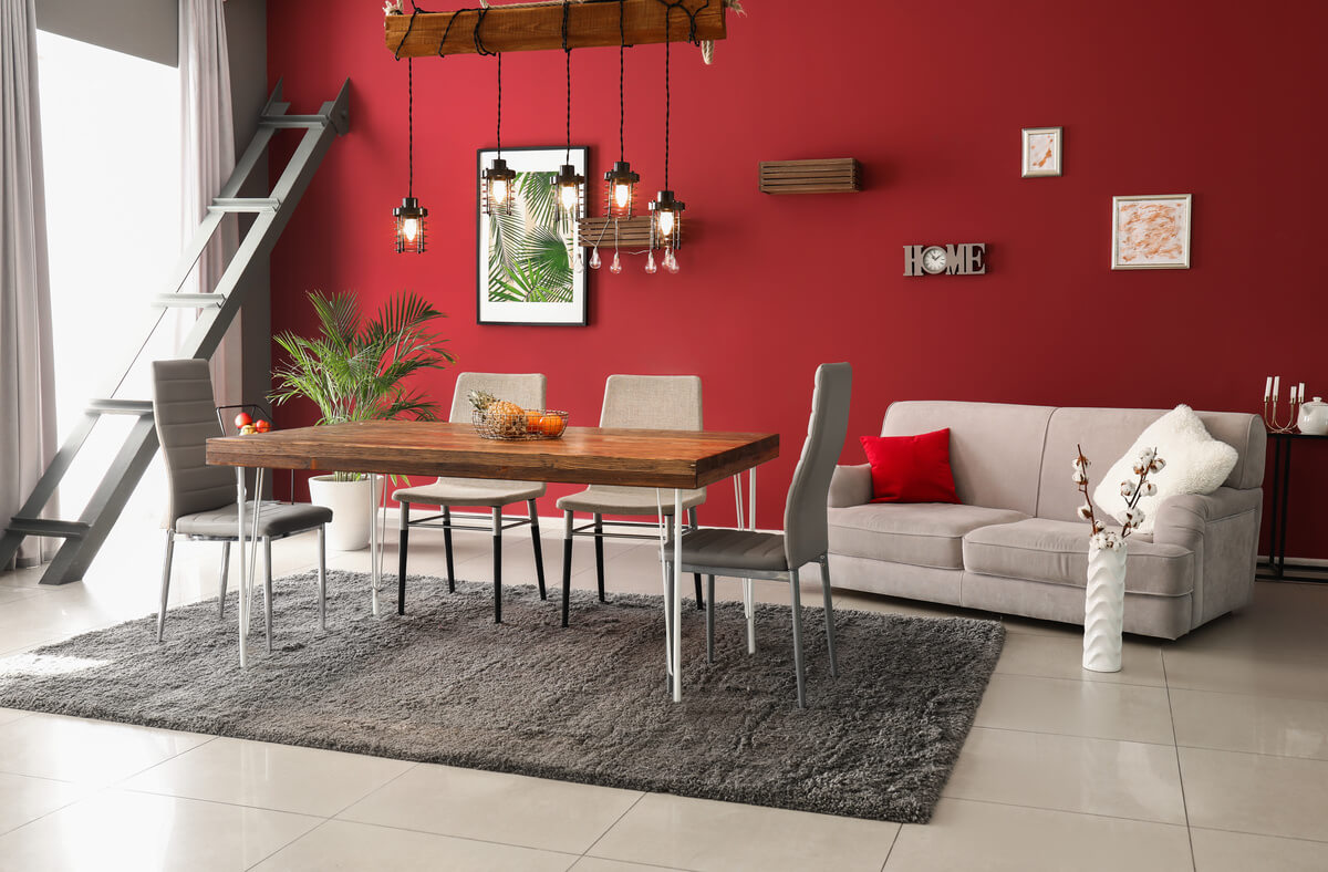
Red is a warm color related to emotions such as anger, rage, passion, power, or war. Using the ideal shades of red will make your environment sophisticated and cozy.
It is a color widely used in its most vibrant form in fast-food restaurants as it stimulates the appetite, and it is possible to use this sensation to your advantage when adding it to a dining room, as long as it is in soft tones, so as not to cause restlessness and anxiety.
13- Orange
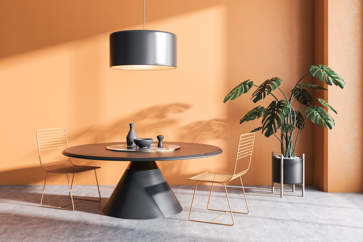
Orange is a warm color related to prosperity, vitality, and success, and because it awakens the appetite, like red, it is ideal for dining rooms. But care must be taken when choosing it, as its vibrant tones cause agitation. So, the tip is to focus on softer tones and bet on decorations with the soft autumn palette, characterized by more opaque tones of the other colors.
14- Light blue
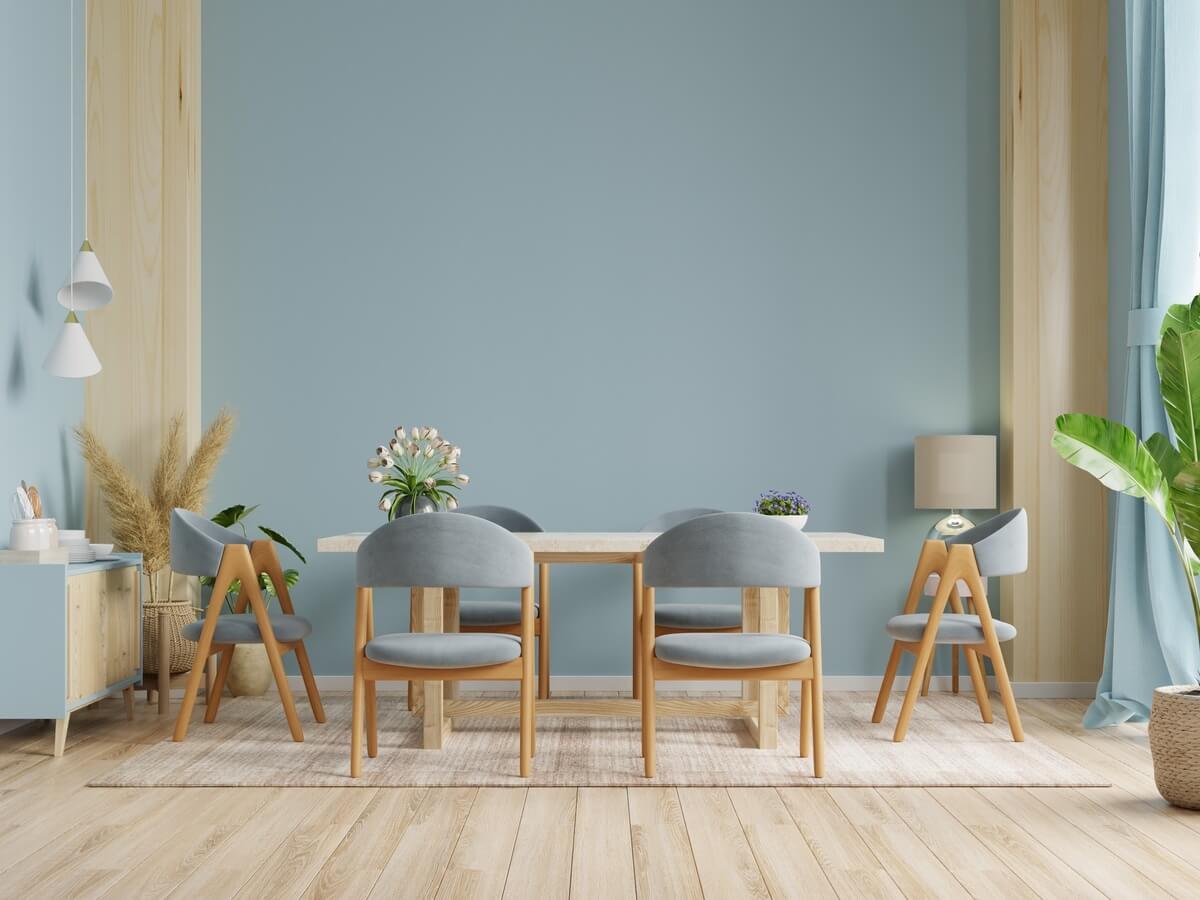
We mentioned earlier that blue is associated with royalty, but the softer tones of its palette bring a feeling of freshness and tranquillity. To prevent your dining room from looking like a doctor’s office when using these tones, bet on darker decorations with shades of gray lead: this combination will leave the environment sophisticated but without losing the initial essence of the room.
15- Black
You read that black can be used in dining rooms and the result is better than you can imagine! Because it is an intense color, often related to mourning, strength, and modernity, care must be taken when using it in the environment so that it does not get too heavy; the idea is to paint only one of the walls with the color. Invest in silver decorations to make the room sophisticated.
Color and painting tips to liven up the environment
The environment does not always need to be luxurious and sophisticated; some people have a cheerful essence and want to show it in their homes. For this reason, we brought some color and painting tips to make your environment very lively.
16- Opt for mid-tones
If you want to lighten the environment with some colors, the tip is to bet on medium tones. Softer tones from any color palette are used for other purposes, and more vibrant tones will have an unpleasant effect on the occasion.
Fast food restaurants, for example, use the strategy of tones that stimulate the appetite and, at the same time, cause anxiety and disquiet, precisely so that customers do not want to stay longer than necessary as this is not the expected effect in a room in your house, bet on medium tones.
17- Shades of green
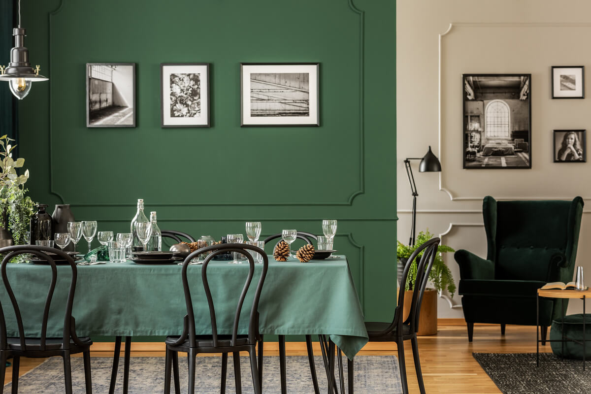
Green is the color of vitality, hope, and, freedom, often chosen to compose classic environments, combining very well with beige and brown tones.
To give a tone of joy in the room, our tip is to choose techniques more similar to turquoise and invest in colorful decorations. Don’t be afraid to match: the green wall is a joker for decorating with colorful furniture. Mix with orange accessories and even the purple color palette to compose the environment, your creativity is endless, and the look will be sensational!
18- Flower paintings
How about getting out of the monotonous and investing in floral paintings on the walls? Transform conventional environments into rooms with stunning personalities! There exist several choices on the market for all tastes, and you can choose between the practicality of a flowery wallpaper or even hiring a painter to decorate the wall.
Don’t be scared to recreate around with shades; remember that nature is vast, and there are many flowers to be inspired by. Your room is sure to have new energy.
In doubt about how to leave your environment wide? Invest in these tips:
Some techniques allow an environment to appear larger, including choosing colors, correct lighting, and using mirrors in inappropriate places. Expand your room without needing any renovation with the painting tips we will give you shortly.
19- Use two shades of colors
To make your living room look wider, invest in a light, neutral tones like beige and white. There is a specific technique to lengthen a room in height or length, which consists of painting or not painting particular walls to achieve the expected result.
You can also use the same tone for both the walls and the ceiling to enlarge a room, with white being the most suitable color for this effect. To lengthen the room, use a darker shade than the ceiling to paint the walls. Two-tone walls are very successful in decoration, mix your favorite colors and invest in innovation!
20- Use light, cool tones
Cold colors have the power to lengthen an environment and bring with them a sense of tranquillity; however, their excessive use can leave an aspect of coldness and insensitivity. By using it carefully, you will be able to achieve the desired effect, and your living room or any other room will look spacious.
Bet on these tones to visually expand your room, and they are easily combined with any decor.
21- Avoid prints and drawings on the walls
Prints and drawings on the walls should be avoided if you want a room with a magnifying aspect, as they make the environment more compact.
If you insist on having decorative images, but still don’t want to give up a large environment, you can buy some paintings to decorate the walls; there are several options for all tastes.
22- The best tips for painting your living room are here!
Colors directly influence those in a specific environment, whether in their behaviors or emotions, so choosing them well is essential to achieve the desired result. Today we learned how each color communicates with the world and the different sensations they can cause together or separately.
Remember to listen to your heart when decorating a room; after all, a luxurious and sophisticated space is useless if you don’t feel comfortable. If you have been interested in the subject, be sure to follow us, as we will always bring tips about home and decoration for you to be inspired more and more.
So, did you like the tips? Take advantage of the arrival of these tips to renew your environment!