In the living room, the decor should not be chosen at random. For a harmonious and trendy space, certain rules must be followed. Do you want to repaint your living room? Discover our 20 tips for choosing the right colors for your living room.
1. Take into account your environment
When you decide to revamp your living room, you have to observe the smallest details. For example, the volume of the room is very important when it comes to repainting it. If you have a large enough space, you can easily decline several shades. On the other hand, for small spaces , opt for a single color so as not to overload the room.
2. Pay attention to the brightness
Not everyone has the same light in the living room. However, it is an important factor that will modify the color chosen in the room. Avoid white if your living room faces north, at the risk of changing it to gray, instead, take pastel. Conversely, if your room is facing south and therefore more naturally lit during the day, opt for warm colors which will be really sublimated by the light.
3. Learn about the symbolism of colors
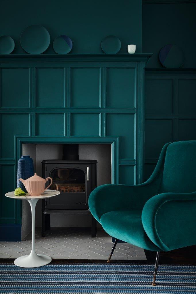
Not to be overlooked in your future living room, the symbolism of the chosen color. Indeed, all colors do not have the same impact psychologically speaking. The warm shades evoke the joy of living with, for example, red, for passion and orange for creativity. In contrast, the cooler tones have a more zen character with, for example, a refreshing blue or a natural green.
4. Take into account trends
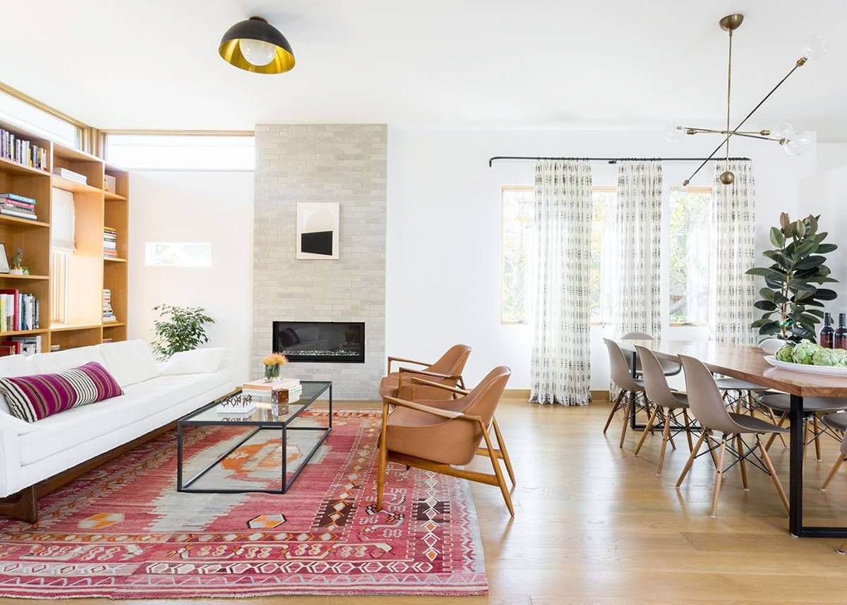
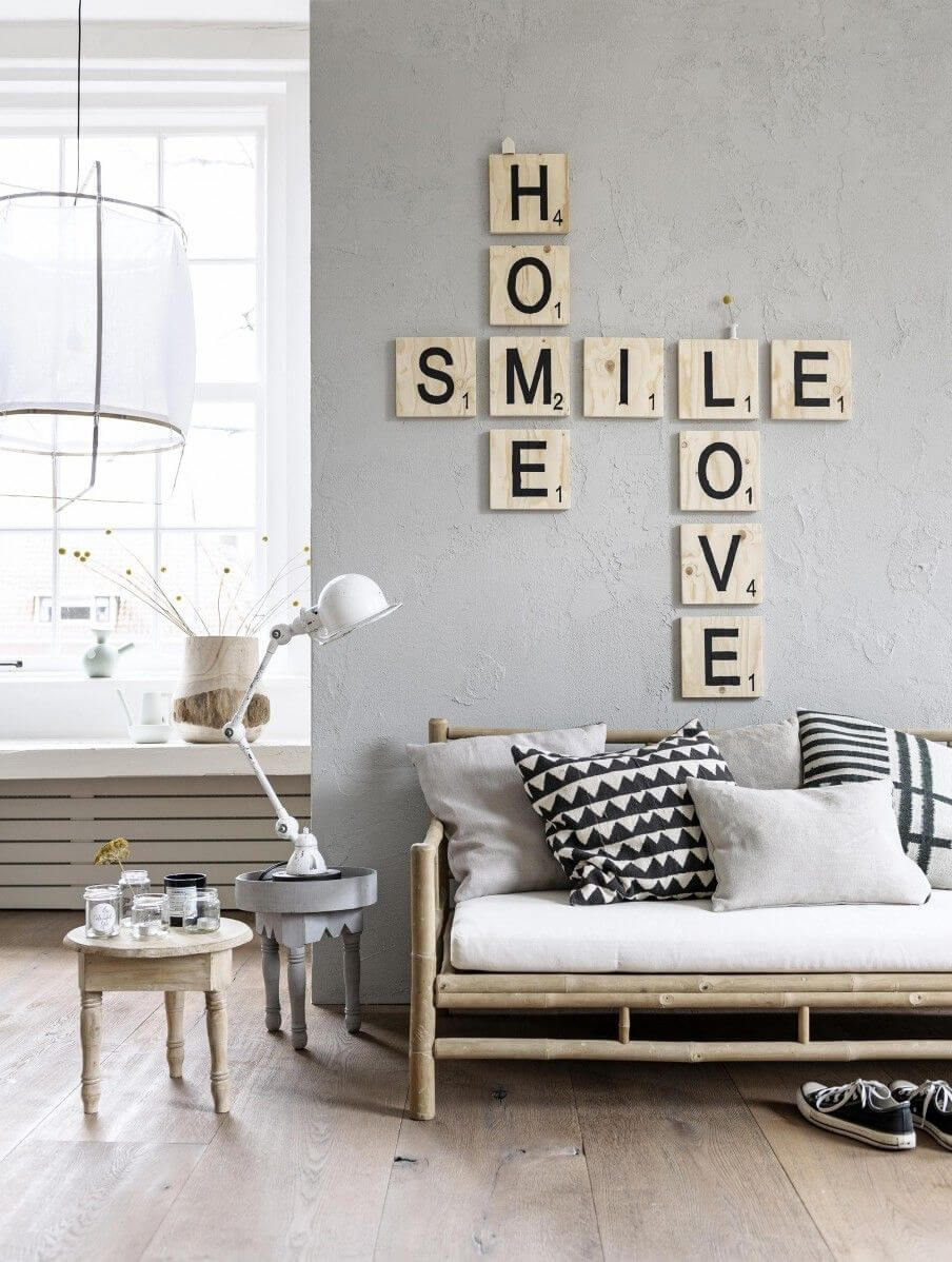
The most visited room, the living room remains, with the kitchen, the nerve center of the house. To suit the tastes of the whole family, sober tones are often preferred. Good news, the trend is natural. Beige or sand colors to mix with wooden furniture, the trendy living room is uncluttered. And if you like going out of classics, with an industrial or vintage decor for example, you will be seduced by the mocha, chocolate or even red hues.
5. Test on the wall
To realize the final color rendering, it is very important to test a sample of the desired color on the wall. To do this, place the paint on an A4 sheet and tape it to the different sections of the wall you want to paint. Observe her for a whole day.
6. 3 colors max in the room
Ensure the well-being of your loved ones by avoiding at all costs turning your living room into a rainbow. As a general rule, paint professionals advise not to exceed three colors in a single room.
7. Harmonize colors
To stay consistent with the decoration of your living room, be sure to harmonize the colors. Choose shades or select colors that sit side by side on the color wheel.
8. Light colors to make the room bigger
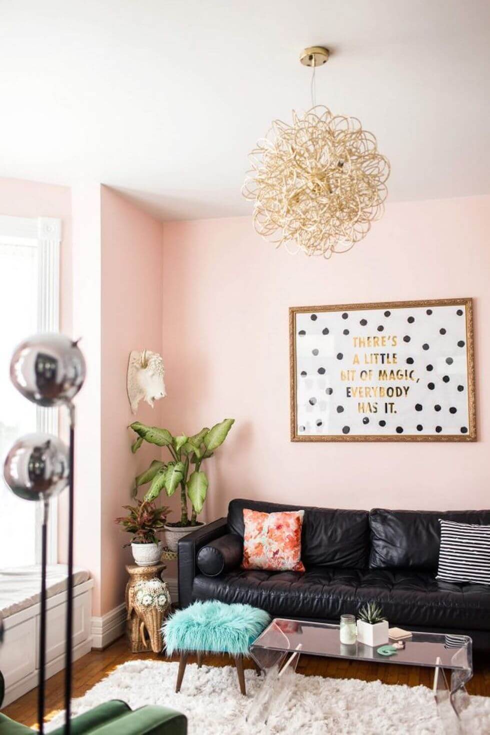
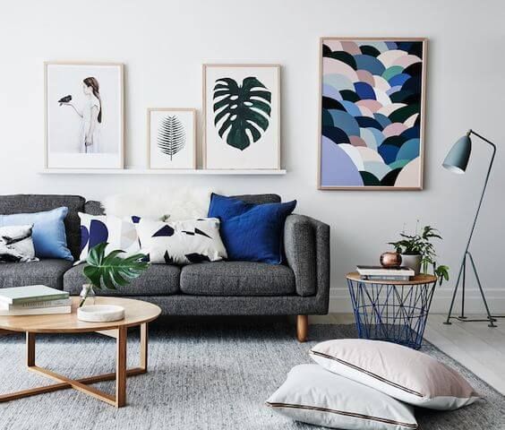
Give the illusion of a larger room and gain in brightness thanks to cool and pastel colors such as white, beige, powder pink, light blue or even pale green.
9. Warm colors for a cocoon spirit
To rest your eyes and your mind, we are inspired by decoration from the Far North: the Scandinavian style. We apply without hesitation icy brown, pearl gray and shades of blue.
10. Flashy tones for a modern living room
If you want a more modern and designer look, you can opt for rather bright tones to brilliantly energize your living room. From electric blue , lime green or the red ocher mat will do the trick.
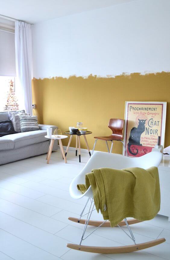
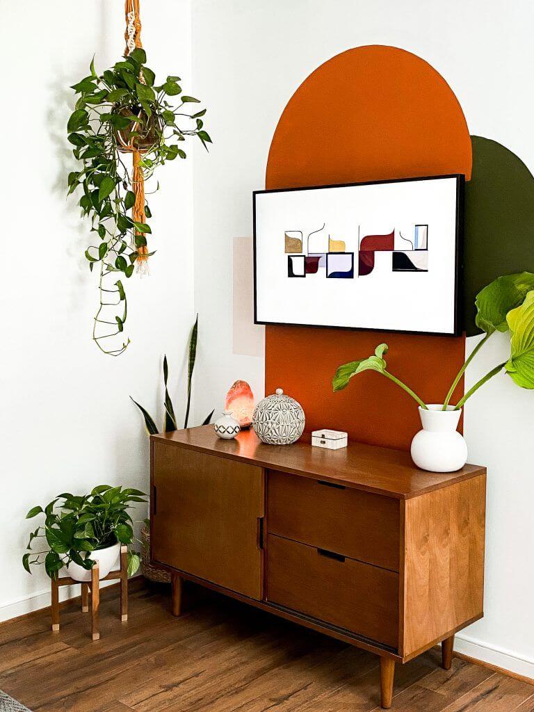
11. Get started in creating geometric shapes
Painting allows you to let your creativity speak , easily! We particularly adore the painting arch which delimits a space : a library, the TV, the planted area. It comes in more rainbow or seventies versions. You can also superimpose squares and circles, enough to create a trendy and designer wall.
12. Combine a deep color with white
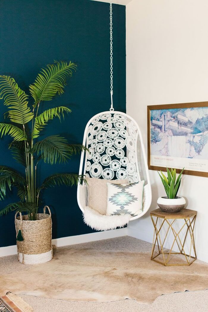
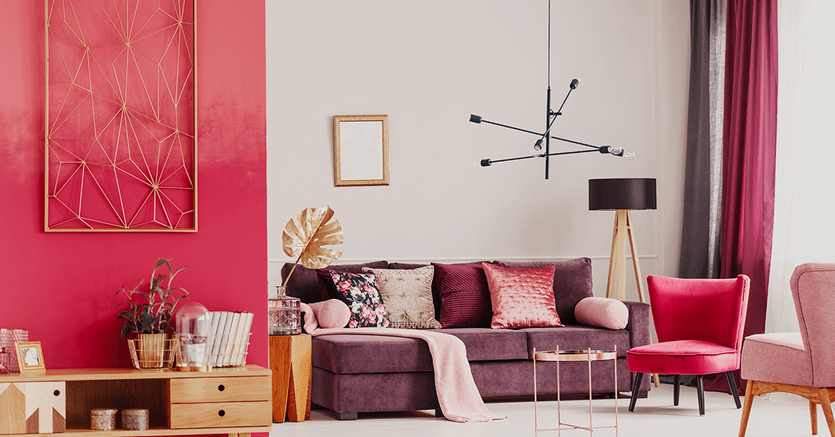
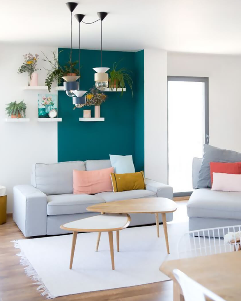
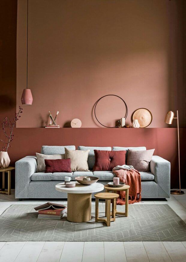
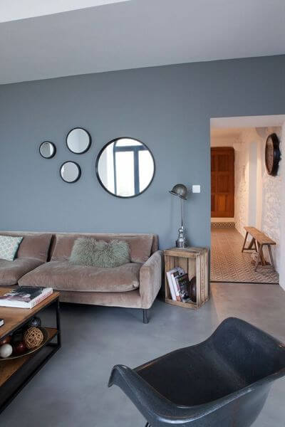
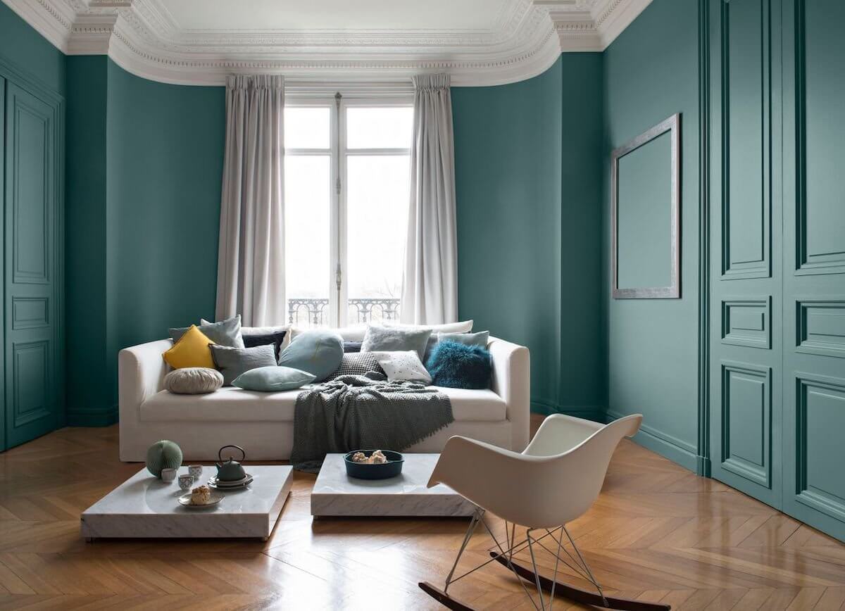
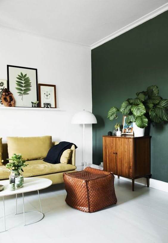
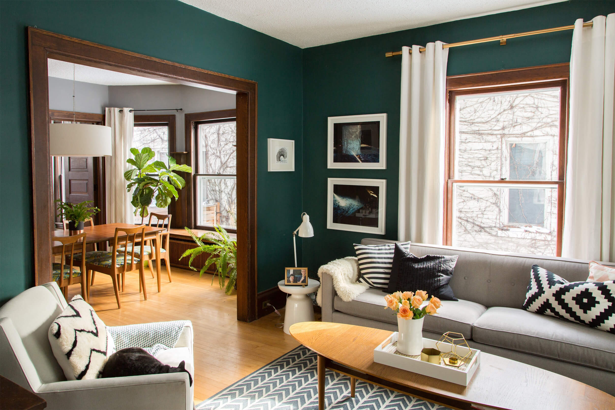
The duo of white and a dark color is a sure bet. The contrast they bring to each other is resolutely charming. This allows both to visually expand the living room while giving a certain depth to the room. The trick is to place the dark shade, like ocean blue or pine green, on one wall. Behind the sofa or behind the TV , this color will be welcome to give an unparalleled charm to the living room.
13. Taking into account its orientation
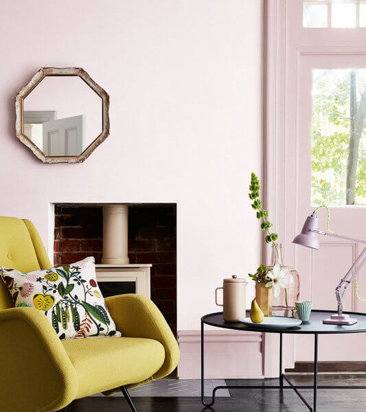
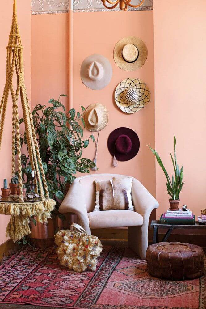
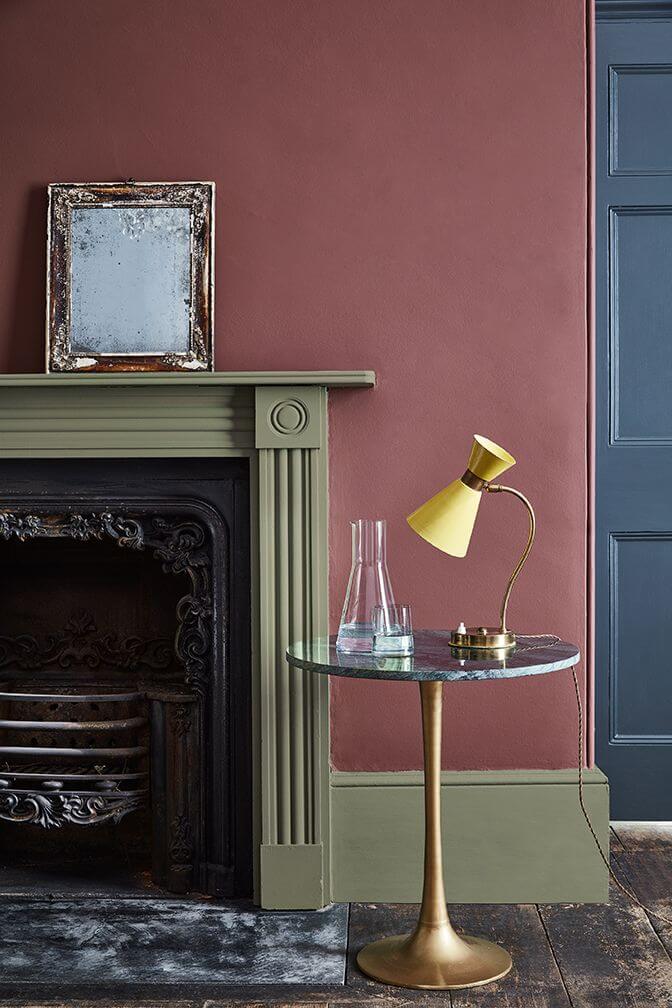
The color is chosen above all according to the orientation of the living room . To warm up a living room exposed to the north , you can bet on a paint of a warm color such as old rose, spectacular and very trendy especially when combined with a pearl gray . You can also choose more neutral shades but just as bright as taupe, beige or off-white. To soften the atmosphere of a living room facing south , opt for soft shades such as honey yellow or peach pink . And, good to know, we prefer matt paints that absorb light better rather than glossy paints that reflect it.
14. Taking into account its configuration
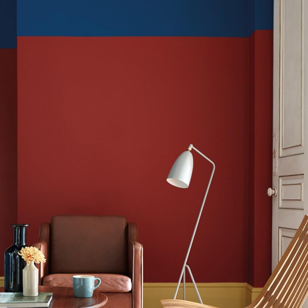
The color of the living room is also chosen according to the floor space and the ceiling height. To visually move away a ceiling that seems too low, you can paint it in a lighter color than the walls or underline it in black. To mark an opening, choosing a bright color, here red, can be a good idea. Be careful, however, to use it sparingly so as not to fall into the total look.
15. Set the mood to set the tone in the living room
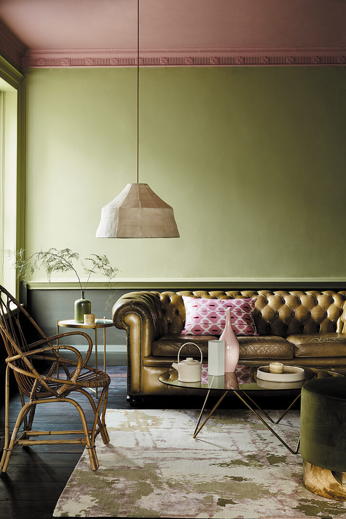
You have to define the atmosphere you want to create in the living room before instinctively moving towards the color chart. Of pastel colors like powder pink and ice blue to associate with a citrine green for inspired living Scandinavian ; lead gray and brick red to accentuate the industrial spirit of a contemporary living room; or even bright colors such as apple green, grapefruit or blood orange to punctuate the decor of a vintage-style living room.
16. Learn how to properly dose the color in the living room
No more than three colors ! Look to shades of similar hues to contrast in fading on carpentry and woodwork, such as pine needle green and eucalyptus or sky blue and acapulco turquoise. And beware of the overload so as not to suffocate. In living rooms where there are already curtains , furniture and objects in bright colors, it is better to turn to metallic shades like grays with a hint of green. The decor will be better highlighted and the walls will not bring an overdose of color.
17. Bring color with decorative accessories in the living room
To revive the living room decor without repainting the walls, we focus on decorative accessories with color. The cushions , decorative items, curtains, lamps or colored furniture alone can wake up the decor in the living room. Bet on textiles, it is the best tip to avoid choosing a color for the walls of the living room. And if you have opted for this solution, choose accessories of similar colors.
18. Think about wallpaper, the other solution to color paint in the living room
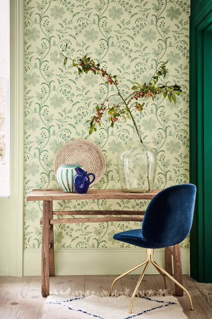
The wallpaper, which is no longer a member covering but a decorative element, offers itself as an alternative to color paint. In a contemporary living room, it is placed behind the sofa or in the dining area to identify spaces, differentiate the atmosphere and give style.
19. Focus on what you love

Choose colors that you like when selecting your interior paint . If a color makes you happy, you’ll love seeing it everyday in your home. Not sure what your color tastes are? So, cut photos from magazines that you like. Also choose postcards, photos or fabric samples. Then, lay them out on a table and try to find a common color for all of them. Consider this color as your starting point.
20. The color wheel
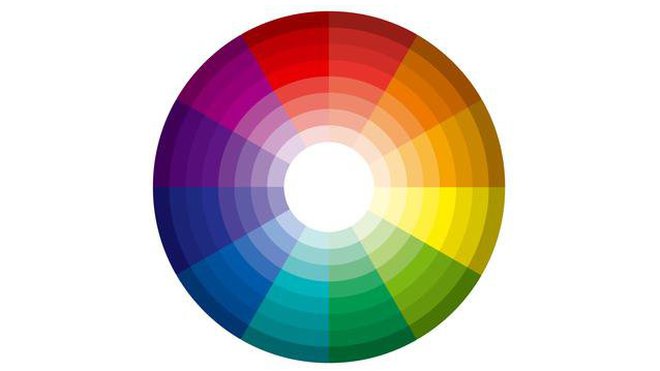
Don’t hesitate to use a color wheel. Select overlapping colors to create analogous patterns. Also, it is possible to choose opposite colors on the wheel, to form very impactful complementary palettes.