See a list of ideas to dare without making mistakes. Red is powerful and full of personality – and as Fáfá de Belém would say, it is from the red, red, reddish, reddish vermilion that the heart lives. Known for bringing life to the decor, it should be applied with caution and wisdom – especially in red rooms.
With that in mind, our website Flawssy has prepared a list of 15 ways to use red in the living room, organized from the most daring, which mixes large amounts of color with yellow and wood, to the safest, where a single colored sofa is capable of transforming the atmosphere. See below and get inspired!
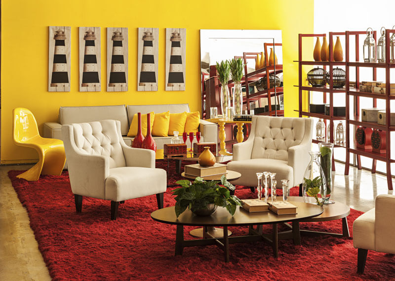
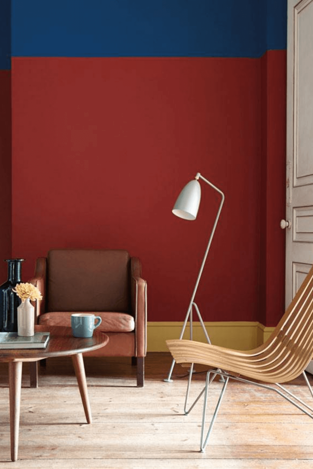
1. Red impact wall
When used in abundance, red brings visual warmth to a room, like this vintage-style living room. In this case, coziness and boldness seem to have been the keywords during the creative process, as the color is accompanied by yellow, also capable of injecting instant energy into the decor, and wood, whose natural nuance evokes immediate comfort. As if the red on the wall wasn’t enough, it also appears on the rug, side tables, decorative objects on the sideboard, and old television. The result is remarkable in every aspect!
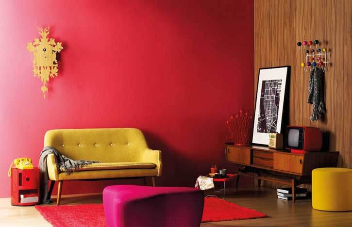
2. Dual primary colors
As we saw in the previous living room, the combination of red and yellow is explosive. It results in an undeniable visual impact – and impact is the watchword of the architect Brunete Fraccaroli, creator of this vibrant living room, part of a decorating show.
Here, red appears to compliment the boldness of yellow, the leading tone of the environment. Neutral furniture creates a sober counterpoint amidst the chromatic profusion.
3. Vintage, warm and ruby atmosphere

In the house of Costanza Pascolato, an icon of Brazilian fashion, most of the furniture was inherited from the family, who moved to Brazil in the 1940s. As the items brought many nuances of wood and various Persian rugs, in which the warm tones are protagonists, she chose 14 shades of red for her living rooms. The result is powerful, classy, and very chic!
4. Red in the midst of classic furniture
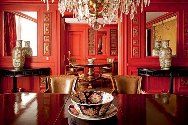
In the case of these combined rooms full of works of art, neoclassical furniture, and crystal chandeliers, red appears as a counterpoint to the tradition of the elements. It modernizes the environment, completely covering the sophisticated walls full of boiserie. The result is extravagant and impact! The rest of the apartment, created by Jorge Elias, mixes different personalities and times, subjugated to the blue, white, and red color scheme.
5. Red prints on the curtain and cushions
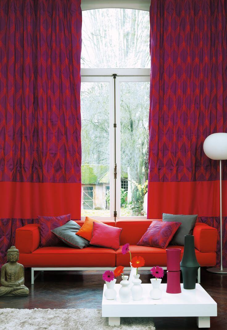
The mix of red and purple can be risky, but if done well, it works very well. The duo works very well in this living room, part of a collection of ideas to warm the house in winter. It appears in the elaborate pattern of the curtains and pillows, the square and monochromatic sofa, and the flowers on the table. The black floor and white coffee table bring serenity to the bold combination.
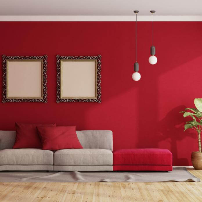
6. Red on the bicolor wall
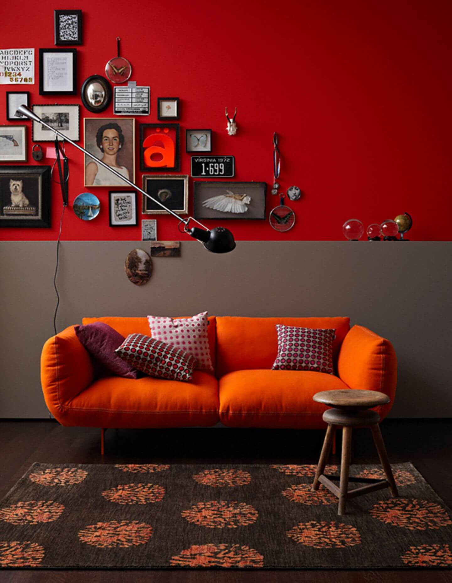
Betting on two colors for the same wall is a decoration trick that has come back with everything! In this living room, gray and red were chosen. In addition to the fact that one tone is sober and the other vibrant, a combination that achieves visual balance, the diagonally arranged frames cover exactly the red half, making it less exaggerated. The sofa’s orange, a complementary color, brings unexpected freshness.
7. Red and pink in the pop room
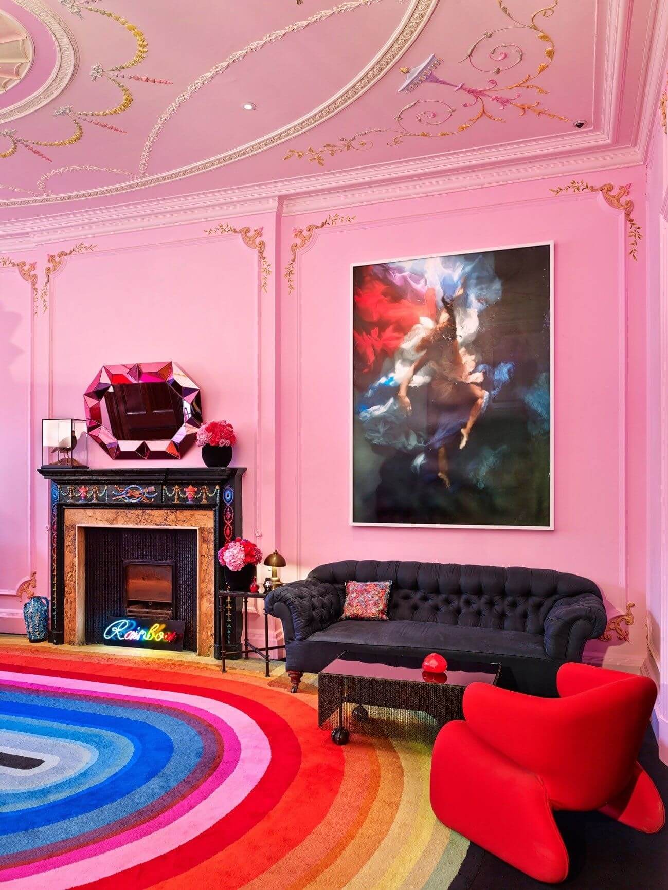
Pink, in a way, also belongs to the red family, right? Knowing this, London-based jeweler Solange Azagury-Partridge chose the two shades (and several others, in gradient, on the rainbow rug) for her office, one of the rooms in her multicolored store full of exciting details. The pop and sweet ton sur ton create a dreamlike atmosphere and permeate every detail, from the floral arrangements to the nuances used in the artwork on the wall.
8. Sober and elegant red
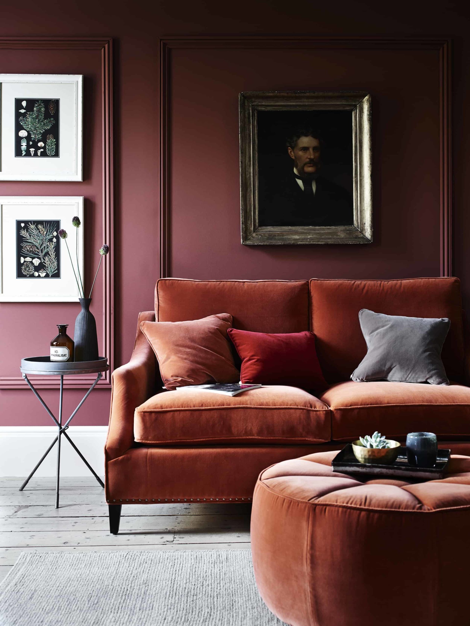
With boiseries and vintage paintings, this classic living room brings with it red in a more earthy nuance, used in the velvet of the sofa and the pouf, which suggests comfort. By coloring the walls with a more desaturated tone, it evokes sophistication. The ton sur ton is even more elaborate when embracing two pillows with two more shades of red. As a welcome counterpoint, the floor and carpet appear ash, preventing the result from becoming tiring.
9. Three colors on the same wall
As we mentioned above, the bicolor walls are back, however. The novelty is that they also brought their most eccentric version: the tricolor walls. In this eclectic living room, packed with exciting furniture, red appears elegant and desaturated on the wall, in the company of blue and yellow, in a subdued triad of primary colors. The result, which is far from being caricatured, is bold, pop, and sophisticated.
10. Red on the armchair, wine on the wall
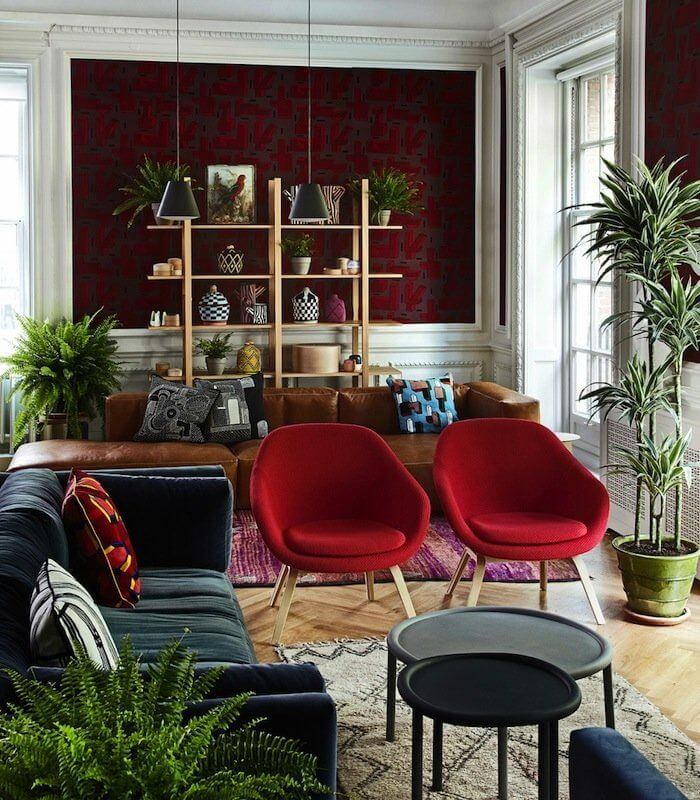
Various shades of the red parade through this townhouse’s living room in London. The scarlet colors start from the darkest ones, present in the geometric wallpaper, pass through the contemporary armchairs and reach the handmade rug, which is more purplish. While one of the sofas is a chromatic counterpoint and bets on black suede, the other complements the warm palette with brown leather. The white boiserie adds lightness to the composition, the same result achieved by the various plants that populate the space.
11. Red and cement in the living room
This living room, part of an Uruguayan farm created by Diego Montero, shows that red is the perfect color if the objective is to highlight decoration elements. In the space entirely covered by the gray of the burnt cement walls and the concrete floor, vibrant colors appear in the doors and windows and in the seats that confront different styles.
12. Spot red in bold pieces
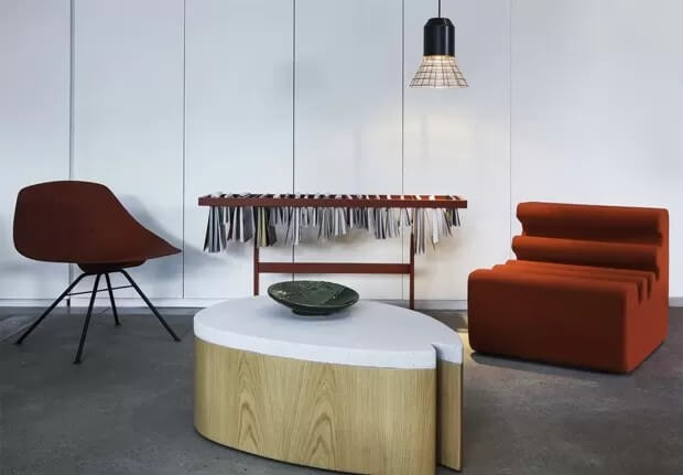
Red is a color that instantly injects energy into the decor. Combined with sleek lines and bold furniture, the result is even more impressive than this contemporary living room. The white wall and cement floor counterbalance the impact caused by the table.
13. Red and wine on concrete
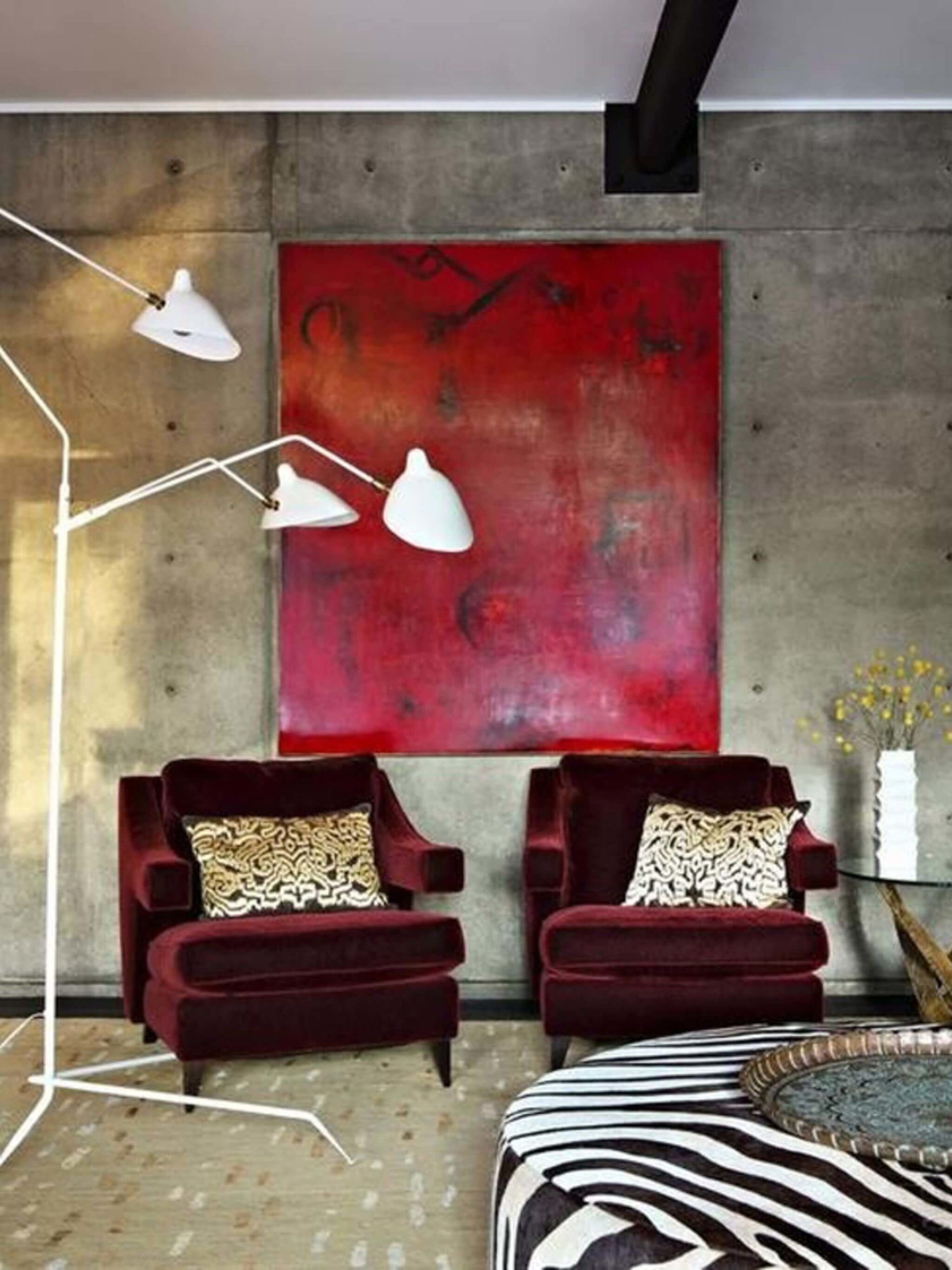
In a modernist environment like this, red appears punctual and adds life to the monochromatic and sophisticated decor. In a stronger tone in the work of art, it decomposes darker and more desaturated in the velvet of the sculptural armchairs.
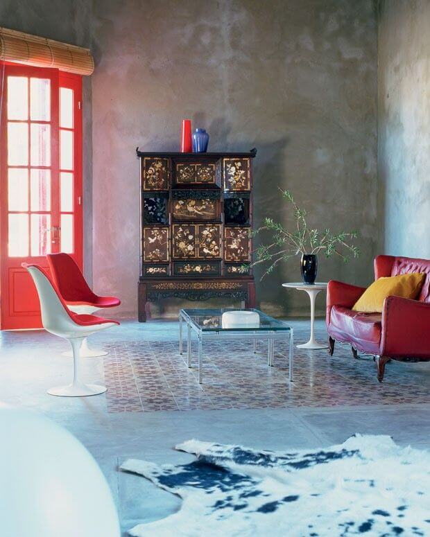
14. Paint the entrance door red
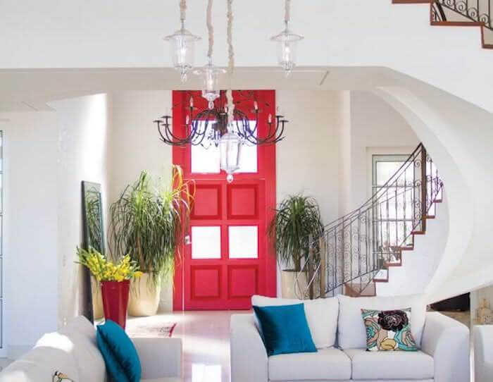
For obvious reasons, the house from which this living room came was named Casa da Porta Vermelha—painting the front door with a tone that recalls North American townhouses and creates a point of color right at the entrance.
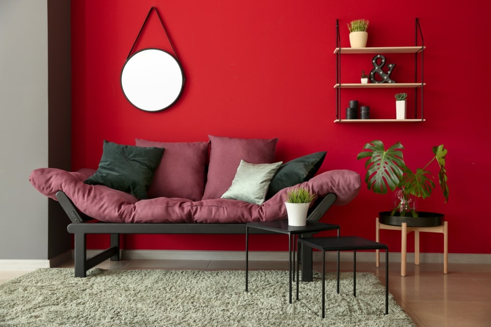
15. Choose a red sofa
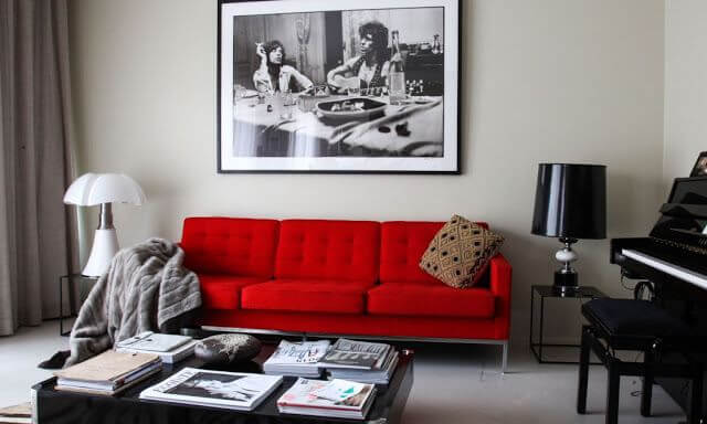
If you want to be bold but are afraid to go overboard, choosing just one colored piece of furniture is the solution. In the all-black and white living room above, the arrival of the vibrant sofa was able to, in and of itself, add life to the space.