Mix and match: this almost magical expression has been blooming for several years in the decoration sphere. The idea: decorative associations to win. Gain in style, in personality… In short, that’s what we all want for our interior!
But the mix and match most often evokes a juxtaposition of disparate decorative elements which is not necessarily to everyone’s taste. If you prefer a softer environment, no problem: there are almost endless possibilities to associate colors, styles, patterns or shapes while maintaining harmony.
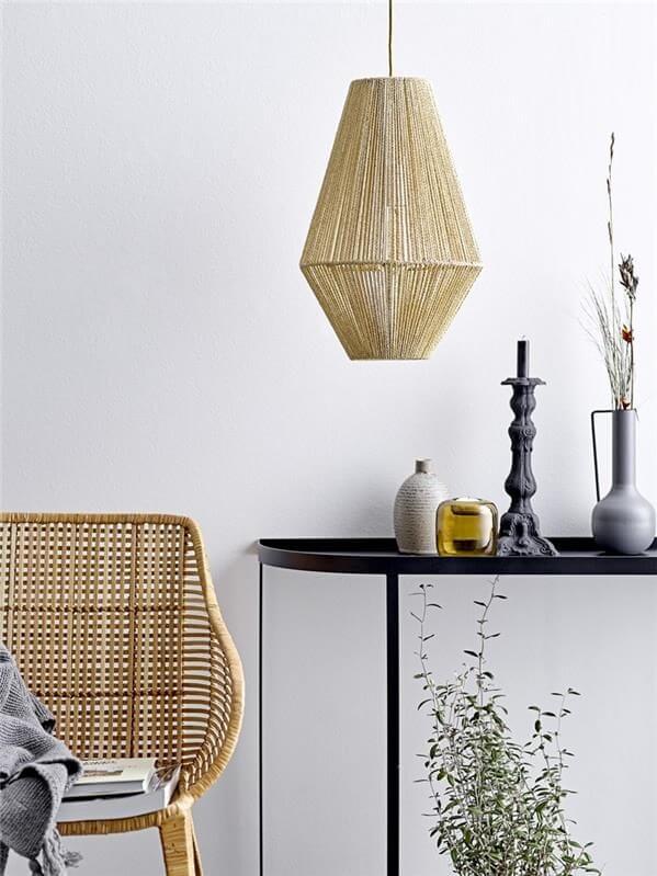
1. A timeless key color
A very trendy dark yellow pendant light emerges here on a neutral and natural palette: white, beige and black.
2. A trendy key color

Another question arises before making your choices: do we want to favor the softness of the atmosphere or rather structure our universe by more or less marked contrasts ? From the answer that everyone wishes to give to this question arise three possibilities for creating their color associations.
If the objective is to privilege softness, we opt for the monochrome , which consists in declining a single color in shades more or less light or dark. Here, there is no risk of making a mistake, harmony is always there.
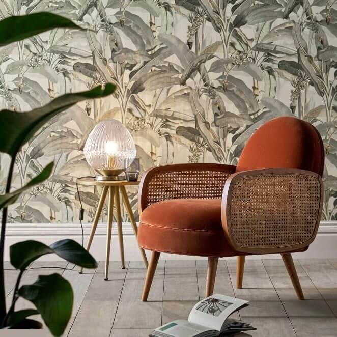
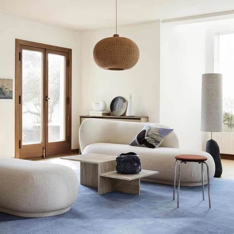
3. The harmony of beige: a beautiful neutrality
To avoid any monotony, you can add a touch of a contrasting color : a marriage always winning!
4. A pimped shades
To enhance the decor by adding more color, we can play on the harmonies, but without taking any risk by using two, or more rarely three, similar colors. This type of harmony which revolves around a key color is said to be analog . While success is assured, some criticize this option for its relative lack of dynamism. But of course, everything depends on the key color: a harmony around orange, for example, will not lack pep!
5. The harmony of yellow towards cold tones
As for the shades, to add a touch of pep, it is always possible to add, in touch, a contrasting color. To engage in the games of contrasts. But it can be more complex. The easiest harmony to use is to associate two opposite points of the color wheel. This is called using complementary colors.
6. Complementary colors that match
Orange and blue: complementary colors that create a strong contrast while preserving harmony
7. Complementary muted colors to soften the atmosphere
As a general rule, care is taken to dose the quantity of each of the two or three colors chosen so that they do not cancel each other out or collide. As for example by painting a wall in your favorite color, and placing in front of a light element of the complementary color, such as a cushion, small piece of furniture, lighting or any other accessory.
8. Associate a strong color with touches of colors
Always in a spirit of contrast, to widen the play of colors, one can also associate with the main color the two colors which are just on either side of the complementary one.
9. Three colors, but carefully chosen
Another way to create contrasts is to associate a so-called “warm” color with a “cold” color.
10. Warm yellow and shades of blue, the perfect match
But whether we are talking about associating “complementary colors” or “warm / cold” shades, the association rules do not change : either we create the contrast by using two opposite shades, or we opt for a more light, by associating two similar shades.
All this without forgetting that color specialists recommend limiting associations to two colors , and very exceptionally three , the use of a third being generally limited to a few keys chosen near the secondary color.
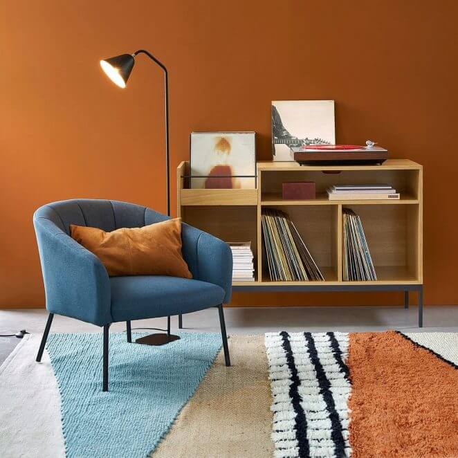
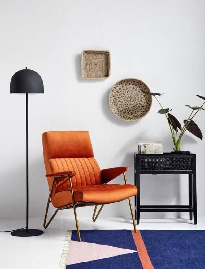
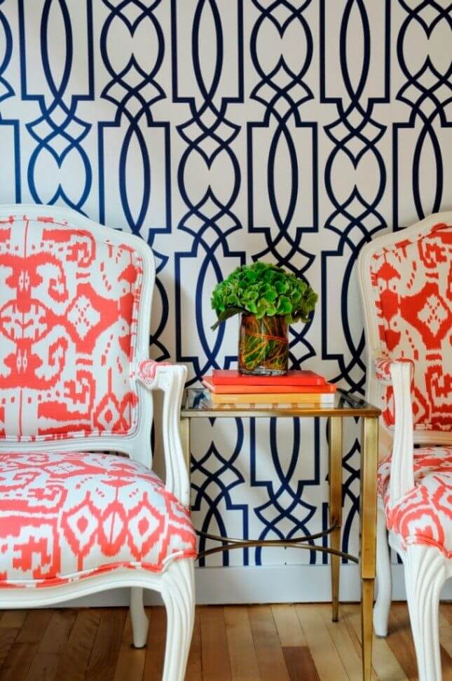
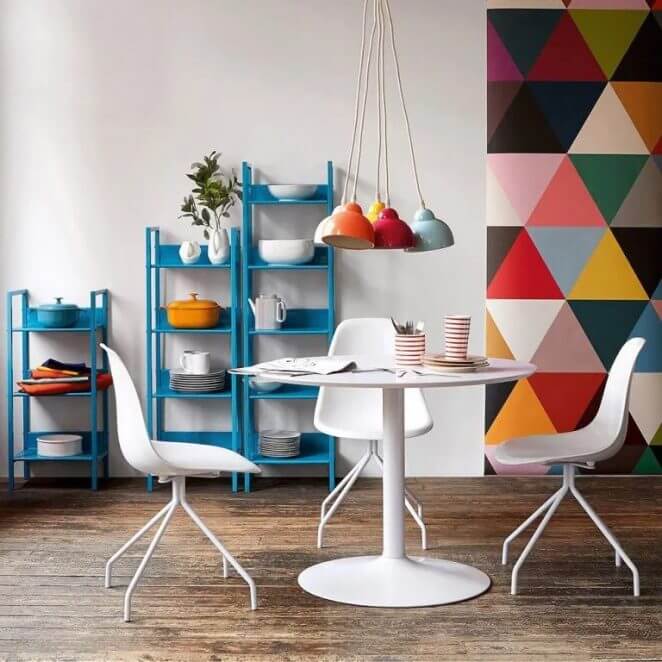
11. Orange, blue, and a touch of pastel pink: a trendy marriage
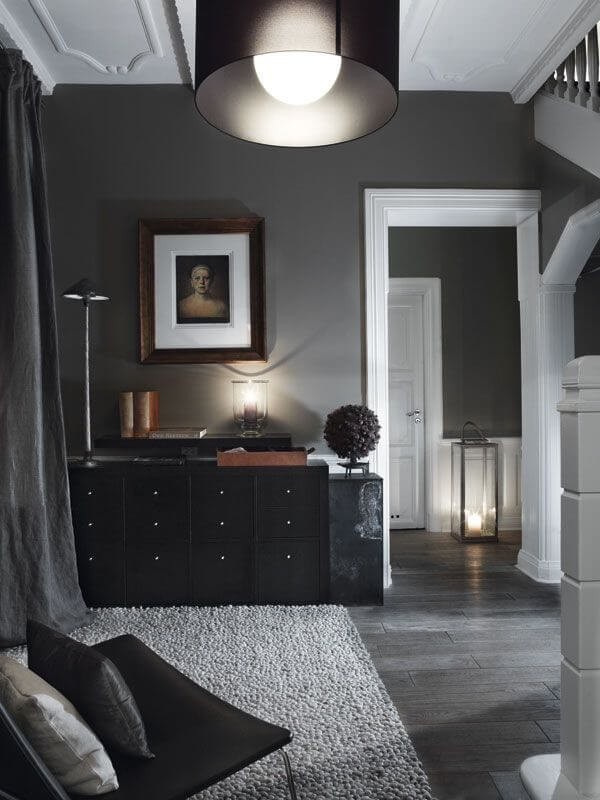
The use of black in color associations is a special case. Black, in fact, is not recognized as a color because it results from the total absence of luminosity. But black has a major role in decoration, because it has the gift of bringing out all the colors , the clear ones, but also the bright shades.
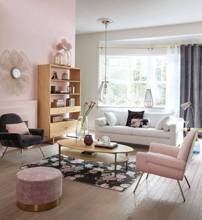
12. Pink gains strength on a black background
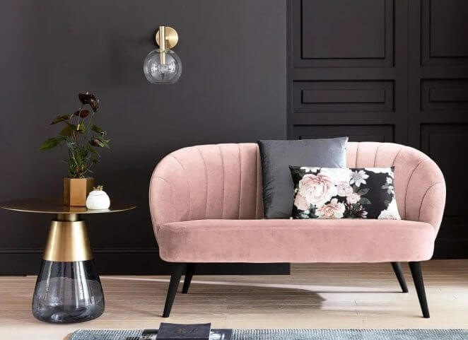
Black background, anthracite cushion, black feet: the style and softness of the pink velvet of this bench are superbly highlighted
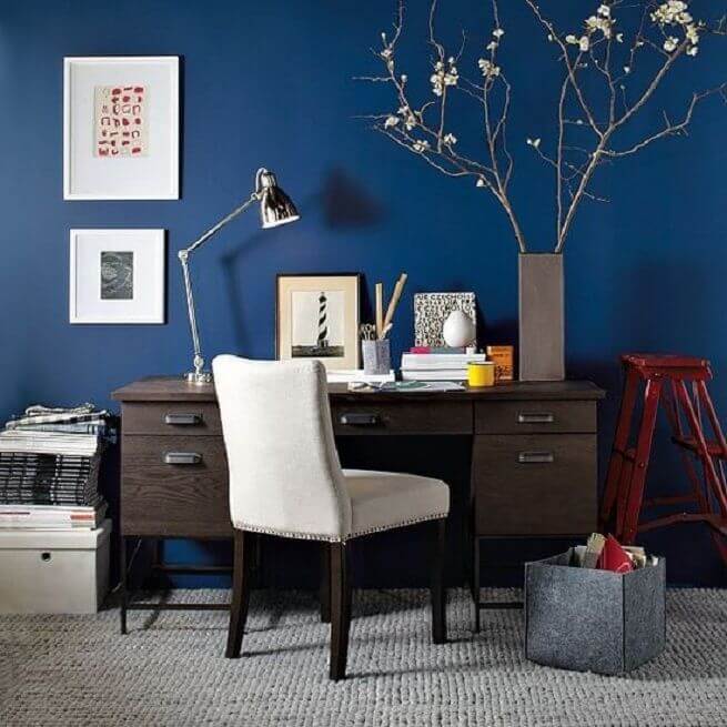
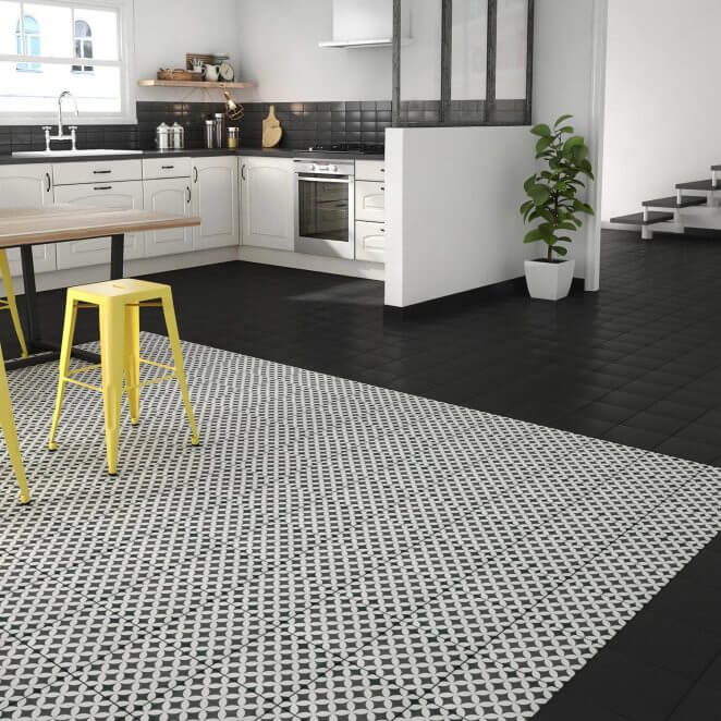
13. Black highlights yellow
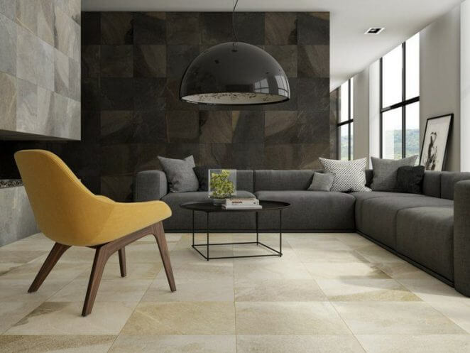
A mustard yellow element placed in a black or anthracite environment illuminates the decor.
14. Black structures the volumes
Black creates strong lines that stand out against neutral hues like beiges.
15. Black gives strength to neutral decors
It gives chic, elegance, but it is also characteristic of certain styles.
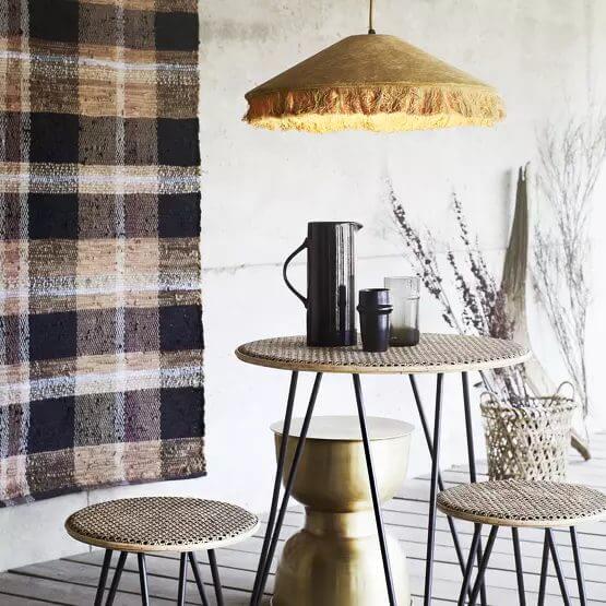
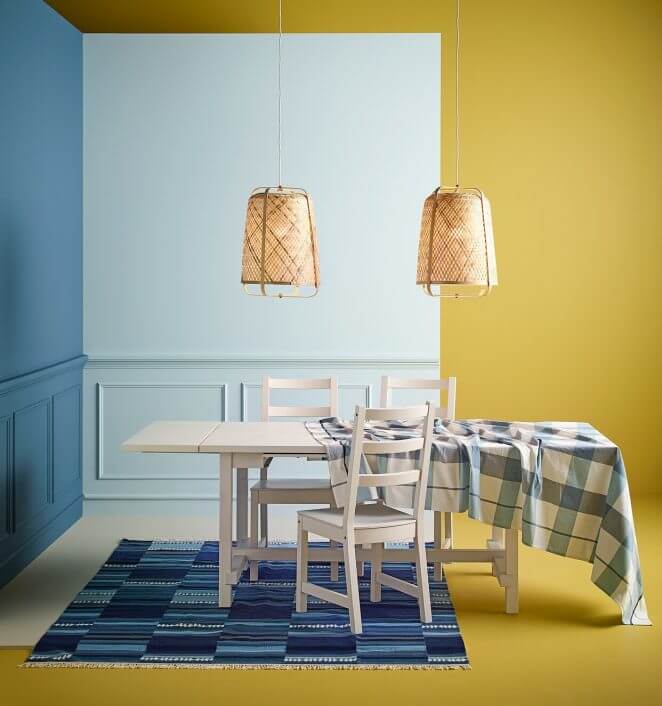
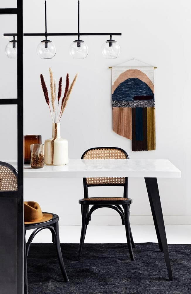
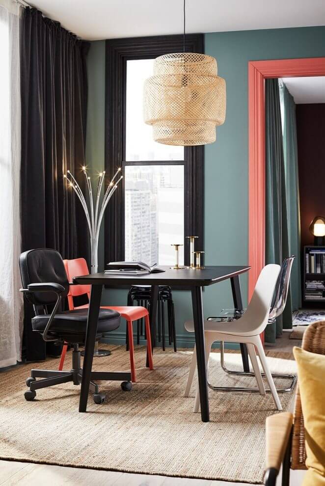
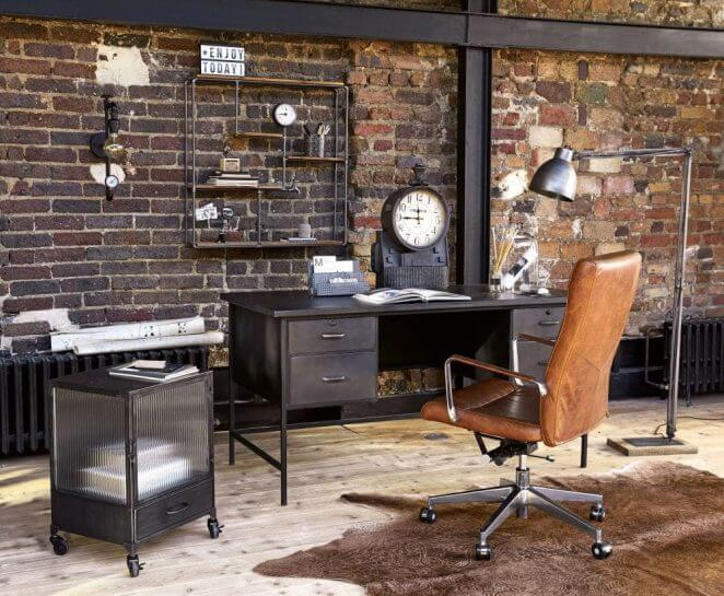
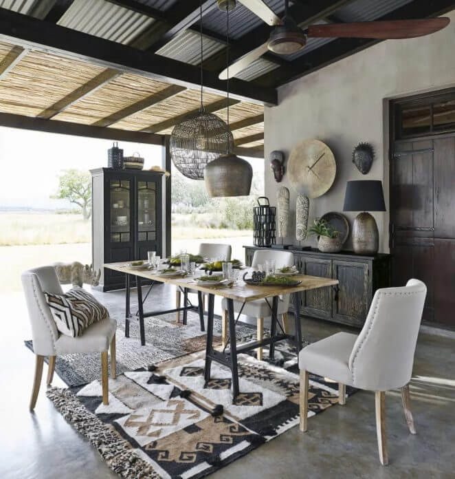
16. Black gives chic to industrial-style decors
The industrial-style decor gains in elegance with the presence of black, as here the color of the carpet, table legs, chairs and suspension.
17. Black is inseparable from the baroque spirit
In monochrome, associated with grays, it takes on softness.
18. Associated with grays, black becomes lighter
Associated with grays, black becWalls, rugs, cushions and curtains come in grays that “swallow” the harshness of black furniture. The presence of white nicely illuminates the marriage of gray and blackomes lighter.
19. Black and red: a marriage full of vigor
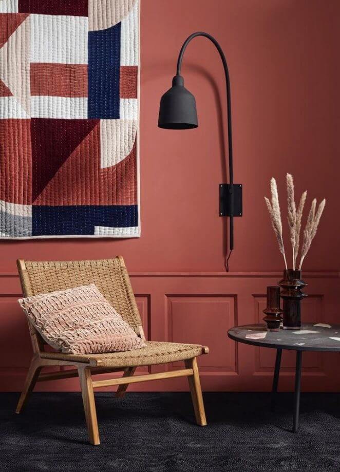
Associated with red, the theatrical effect is assured, with a nuance of baroque spirit.
20. Adding a muted color dampens the power of the red and black wedding
In more or less strong touches, black undoubtedly raises the most neutral decoration.
21. Black touches on a pastel background to catch the eye
Like black, white is essential in decoration. It illuminates the rooms, enlarges the space, brings an atmosphere of zenitude, it is also timeless, goes well with all styles … In short, you can use it (almost) without moderation.
22. White softens color contrasts
We often imagine that white is cold, “clinical”, but on condition that you choose the materials and the possible colored touches, it can also be very soft.
23. White and natural materials, a warm atmosphere
Black and white are of course also at the heart of the issue when it comes to color associations. This marriage of opposites is one of the great classics in decoration. He comes back regularly in the trends and he is there in all styles.
24. Black and white for a contemporary atmosphere
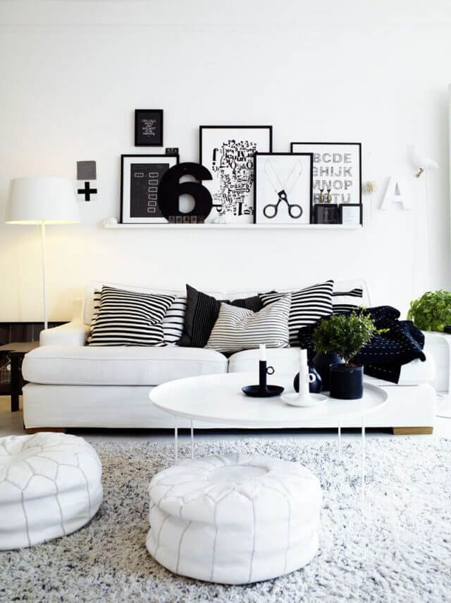
Plains, stripes, mottled effects: black and white have a strong impact on their own.
25. Black and white for a retro spirit
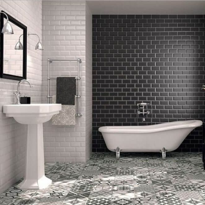
A classic and always elegant version of the black and white wedding: the retro-inspired bathroom.
26. Black and white for a revisited country style
A rustic atmosphere comes alive with a nice touch of modernity with the combination of black and white.
27. Gray and natural colors, a warm neutrality
Gray is particularly useful for playing with contrasts without weighing down the atmosphere. In particular, it allows you to add a bright color while preventing it from taking on too much importance. It also goes well with all trendy shades and always brings a touch of serenity..
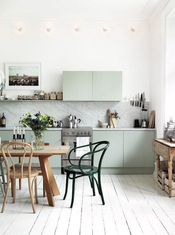
28. Gray and muted tint for a sober elegance
A partition all in sobriety with the association of gray and a soft and muted green, all in very light shades.
29. Gray and bright yellow for the punch!
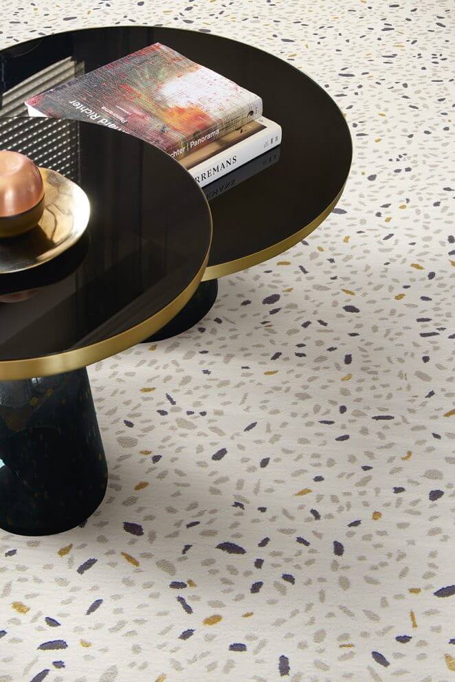
Gray has no equal to avoid the impression of excess when you want to play a clear color!
30. Gray and pastel for delicacy
Gray avoids the sentimentality that pastel colors can evoke.
31. Gray and shades of blue: chic with rigor
The coldness that we associate with blue is softened by the presence of gray, the blue/gray association giving a strict elegance to the decor
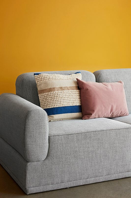
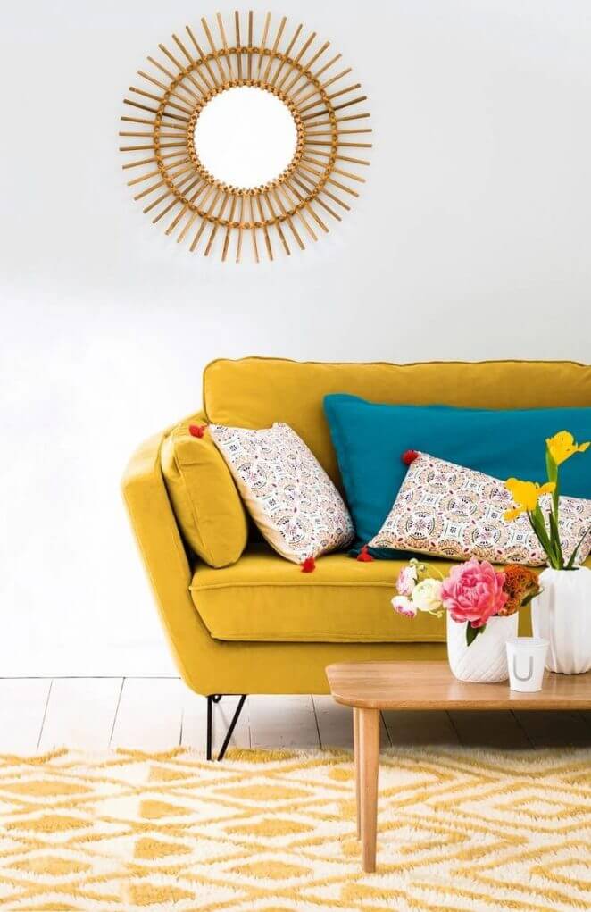
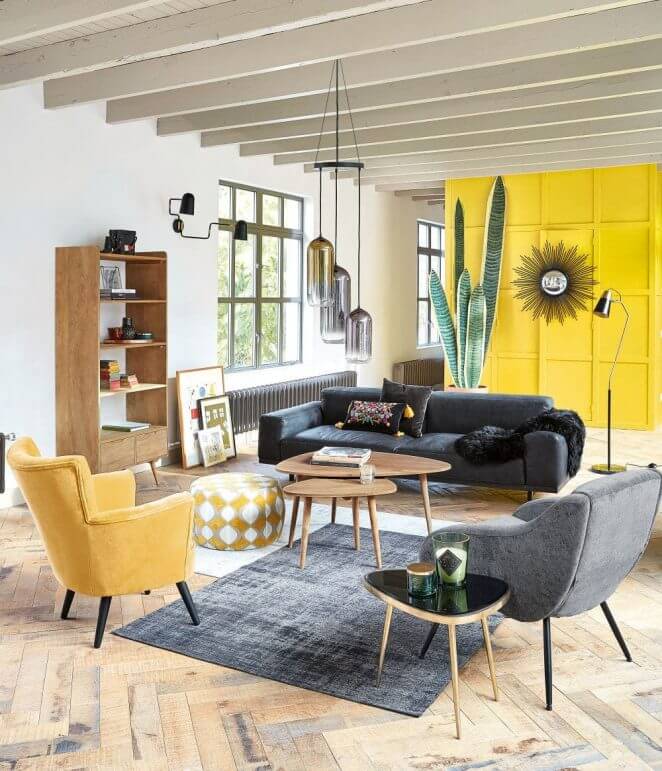
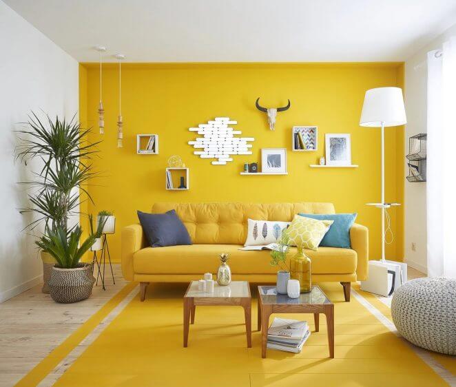
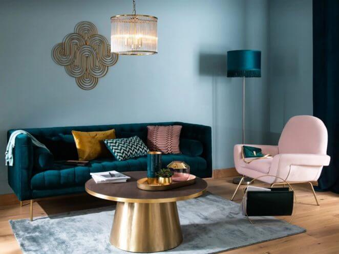
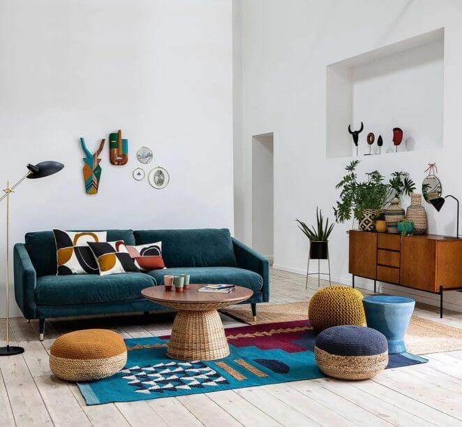
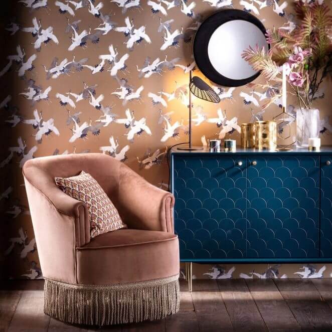
32. Duck blue and yellow in the living room
A colorful set that is sure to place the living room in the trend of the moment.
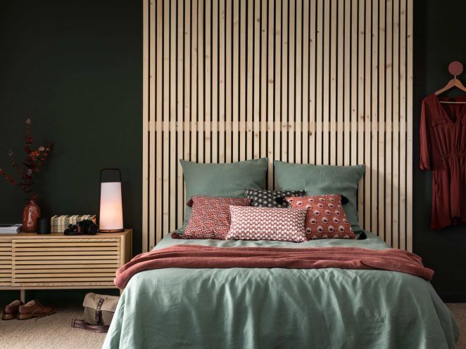
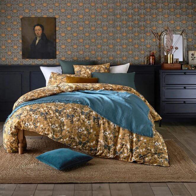
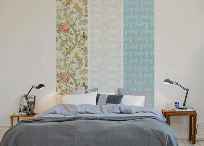
33. Duck blue and yellow in the bedroom
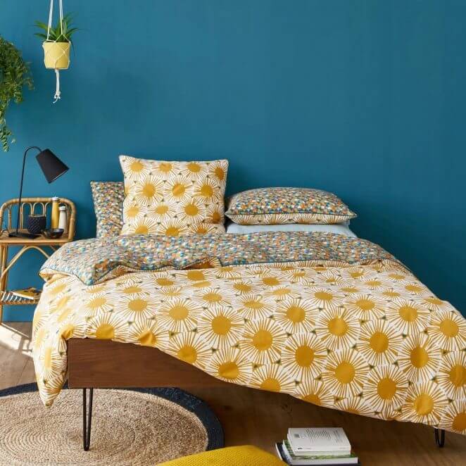
The impact of duck blue on the large surface of the wall is balanced by the bed linen with dark yellow patterns
34. Yellow and light shades of blue: an invigorating marriage
The color of the carpet associated with a solid yellow wall, with two blue touches and the presence of white which perfectly balance the volume.
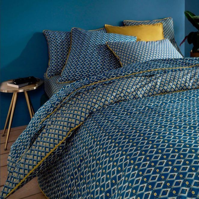
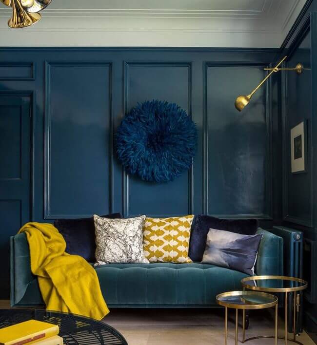
35. Shades of dense blue and golden yellow: chic and trendy
Pink and yellow. As in the blue/yellow marriage, we notice that if the shades of pink vary, the trendy yellows in this year are most often dark, pulling towards gold or mustard.
36. Dark pink and golden yellow
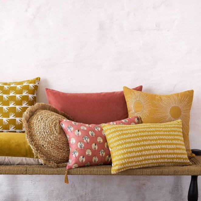
An accumulation of cushions that immediately brings the decor up to date.
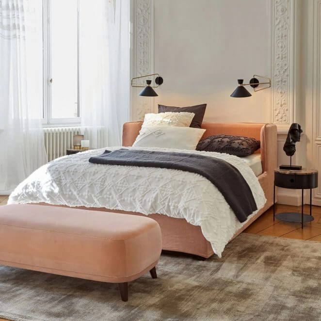
37. Pastel pink and mustard yellow: a very current marriage
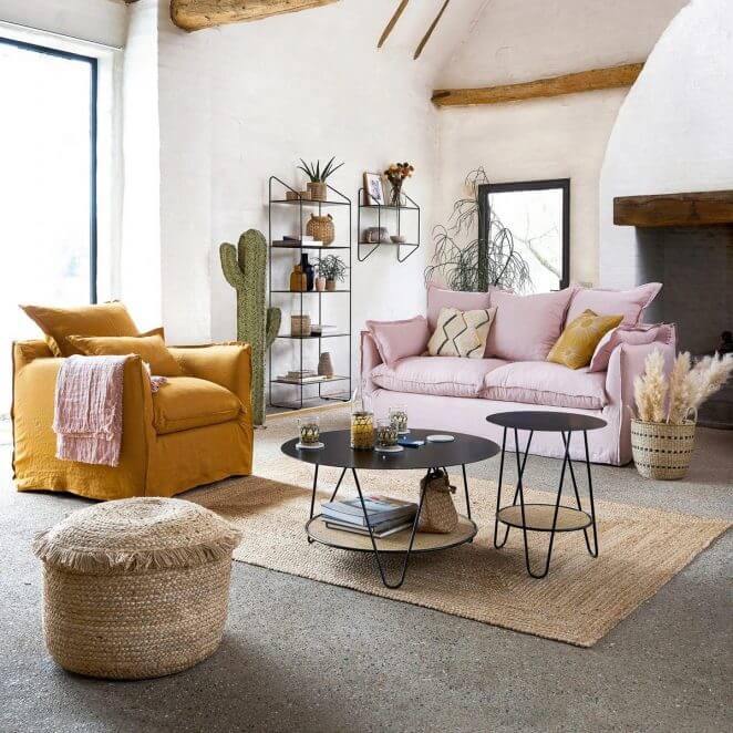
The pastel pink and mustard yellow combination is quite unexpected, but seems to have a bright future ahead of it.
38. Pink and blue green: top trend!
Pink and blue green. If duck blue or peacock blue are particularly trendy this year, pink is still appealing. Partners, they are on the rise in 2020.
39. Muted colors for a chic touch
It should be noted that this year, muted colors are very present in the decoration palettes. A trend that facilitates agreements and delights the most careful among us! These allow you to associate three colors without taking any risk.
40. A warm rusty tint warms the blue
A soft shades of blue take on vigor associated with the warm color of a cushion.
41. Red and green: for Christmas!
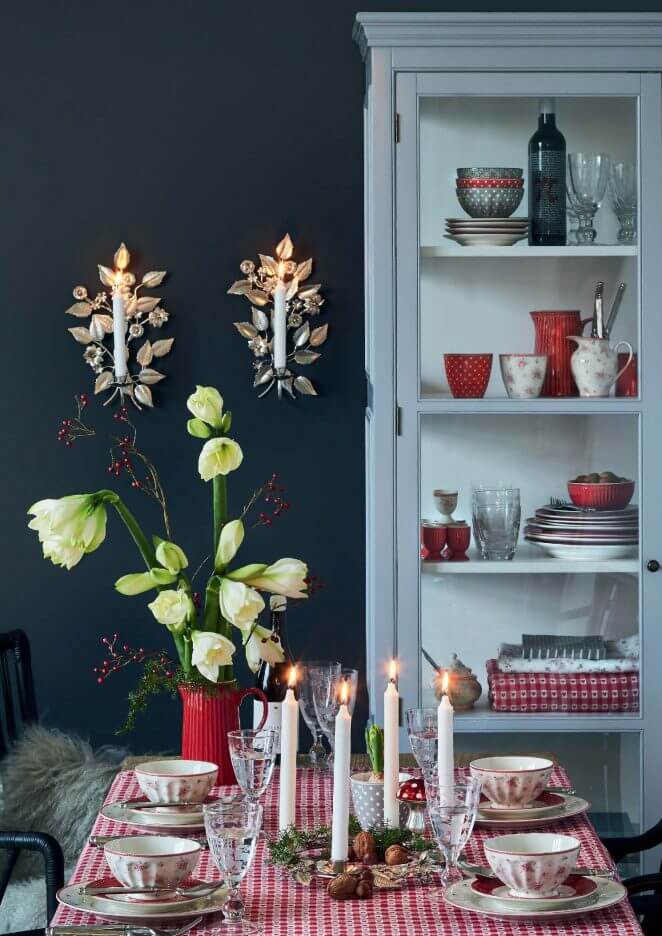
Red and white checkered tablecloth, bright red tableware, a bouquet dominated by green, itself recalled to the table by a fir branch: the atmosphere is sure to evoke the month of December.
42. Black and gold: the festive and sophisticated touch
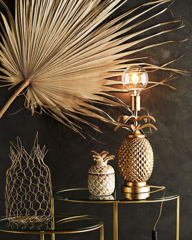
All it takes is a few golden objects placed on a black background to create a festive atmosphere.
43. Ocher and blue for an evocation of Provence
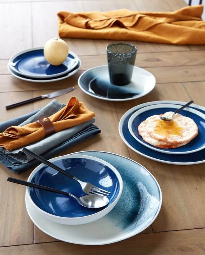
Very evocative, a table set in the colors of Provence.
44. Blue with a red touch to support the marine note
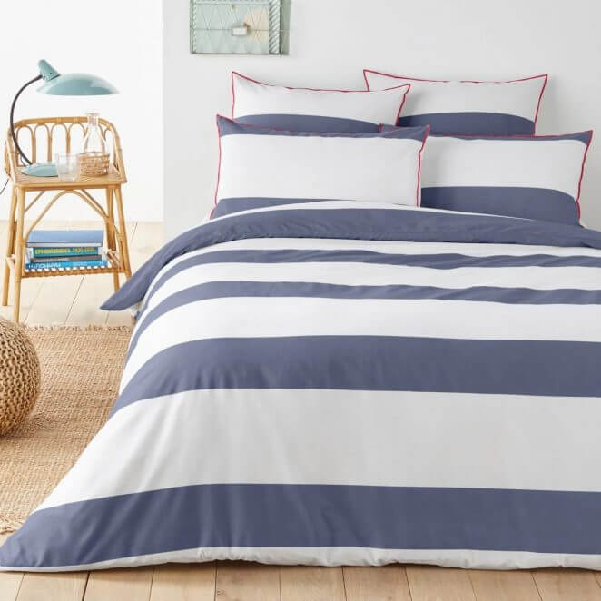
To breathe a “seaside” air into the house, choose shades of blue to which we add, if desired, a touch of red for a very navy atmosphere, or yellow to brighten up the house.
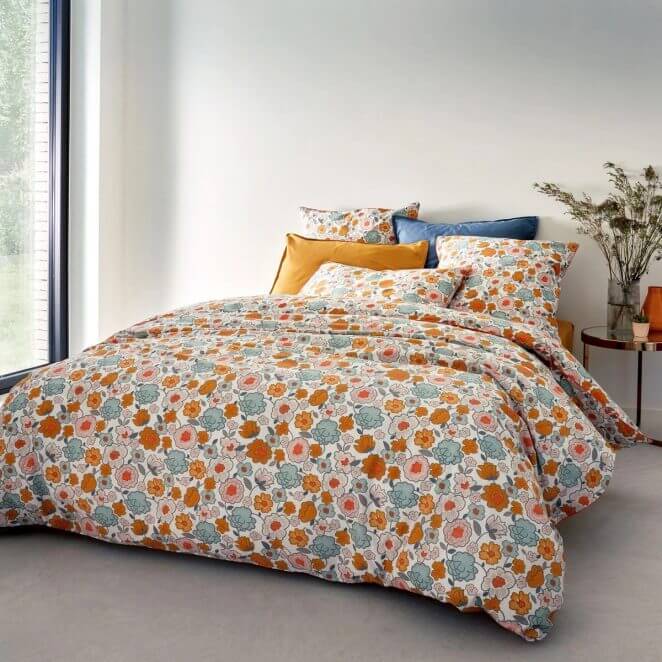
45. The wallpaper dictates the colors of the bed linen for a beautiful harmony
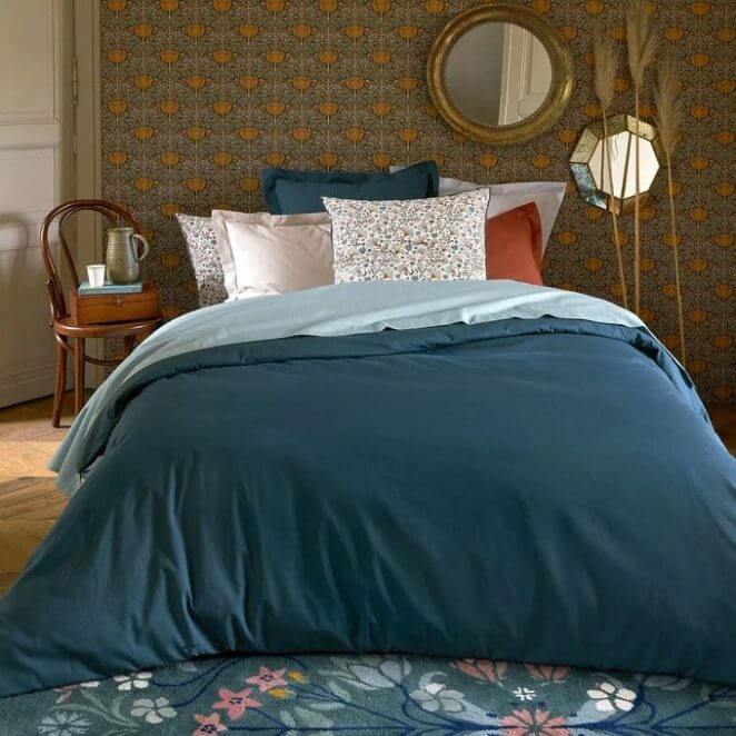
The ocher hue that dominates the patterns of the wallpaper is repeated in touch with a cushion, while the duvet cover displays in large areas the muted background color of the wallpaper.
46. A vase serves as a base to combine the colors of the living room elements
The blue/green and yellow stripes of a vase discreetly installed on the low sideboard inspired the choice of colors for the sofa and ottomans
47. Untreated wood, wicker, metal
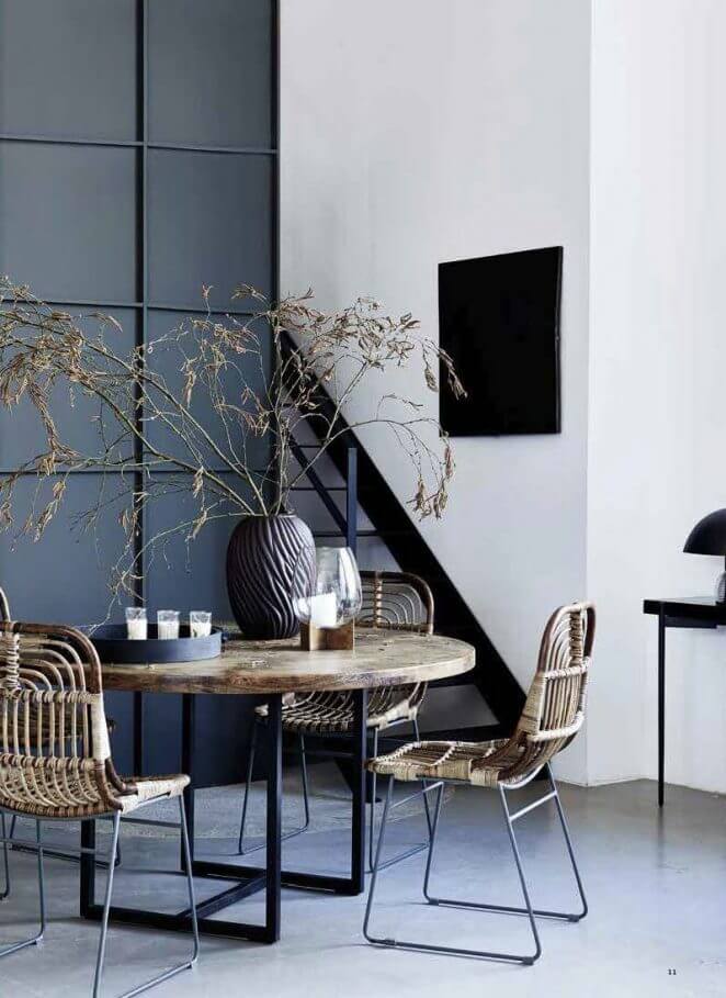
The metal tempers the rusticity of raw wood and wicker in a very current marriage
48. Metal and wicker
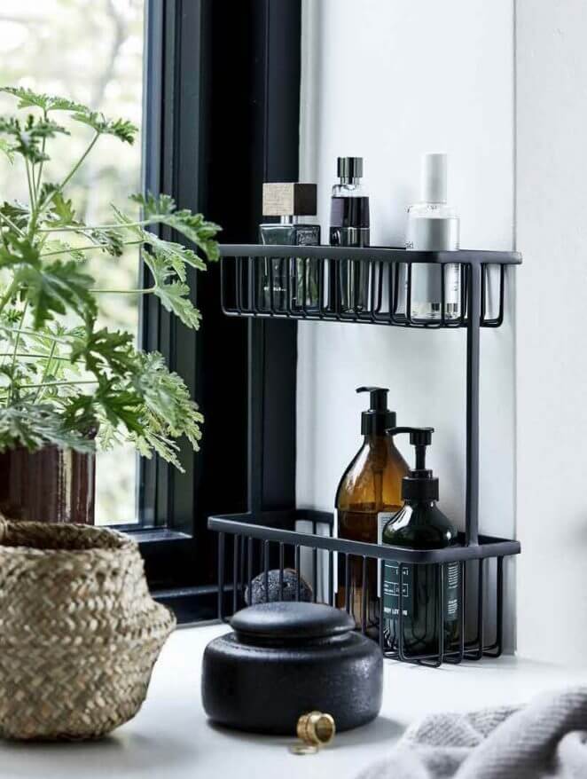
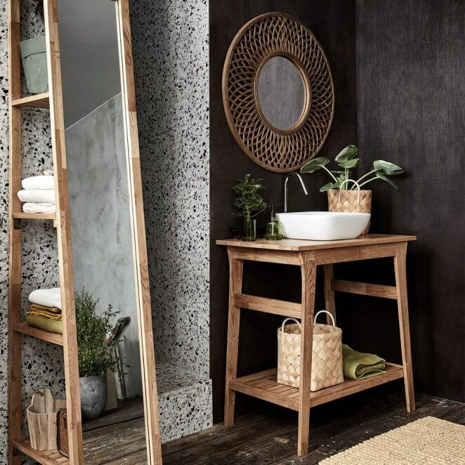
In this bathroom, a small metal storage unit is next to a wicker basket for an atmosphere that is both natural and modern
49. Metal, natural materials and velvet
The coldness of the metal is offset by the softness of the textile and the authenticity of the wicker, at the same time that we play here on the matt and shiny contrast.
50. Wicker and velvet
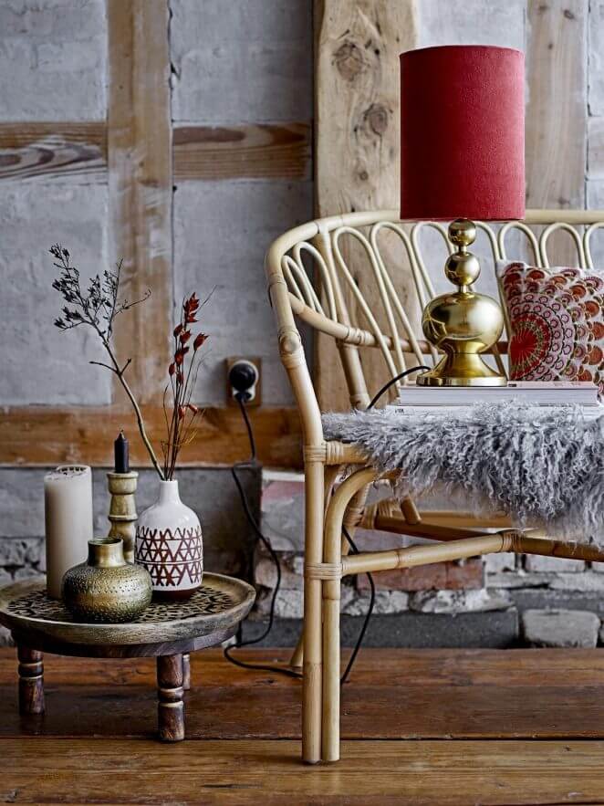
The simplicity of rattan and the refinement of velvet and gold metal come together with style. The lamp also combines the hot/cold contrast in a beautiful balance.
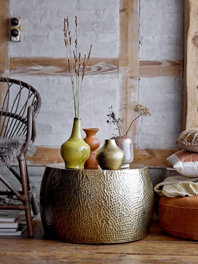
51. Gold metal and sandstone
Rusticity and elegance go hand in hand with the association of sandstone and metal.
52. Wood, rattan, velvet, leather
Several materials equally share this decor, but play in unison for an atmosphere that is at the same time sober, modern and warm.
53. Leather and canvas
Cushions dressed in a heavy weft canvas highlight the smooth and shiny appearance of the leather.
54. Paper, cane, wood and metal
Black metal is second to none for bringing out the soft simplicity of natural materials.
55. Mat and shiny marriage
The combination of materials on the same object multiplies its decorative impact.
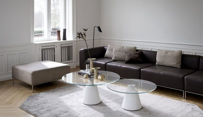
56. Marble, metal, rattan
Superb and subtle marriage: the wired spirit of the coffee table perfectly echoes the lines of the rattan, while the materials of the two elements rely on the contrast.
57. Leather and metal
Leather to warm metal in an industrial setting. A classic but still winning combination.
58. Cannage and velvet
Combined with velvet, the cane takes on elegance and an inimitable vintage look.
59. Lacquer, wood, knit
White lacquer for modernity, knitting for softness, wood for the spirit of nature
60. Fur, metal, rattan
The chalet ambiences are not the only ones to benefit from the presence of fur. It also works wonders on a garden-style metal armchair
61. Terrazzo, velvet and wood
The terrazzo patterns carry a vintage spirit that goes perfectly with the velvet.
62. Terrazzo and gold metal
Available on a soft carpet, the terrazzo patterns lose their raw side and warmly welcome the golden metal.
63. Terrazzo and wicker
A marriage that always hits the mark: that of terrazzo and natural materials such as wood and rattan.
64. Wood and Plexiglass
Tradition meets modernity with the combination of wood / plexiglass. The transparency of this one also has the advantage of lightening the decorations where the wood dominates.
65. Oak and walnut
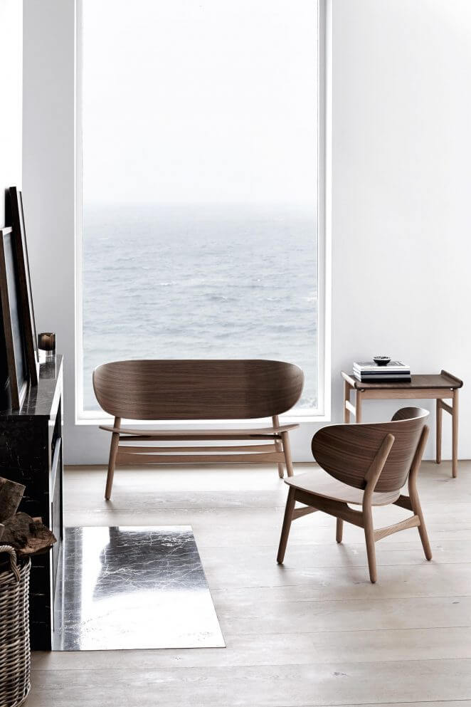
The association of wood species is a complex game masterfully created by designer Hans Wegner
66. Le Mah Jong, an iconic sofa
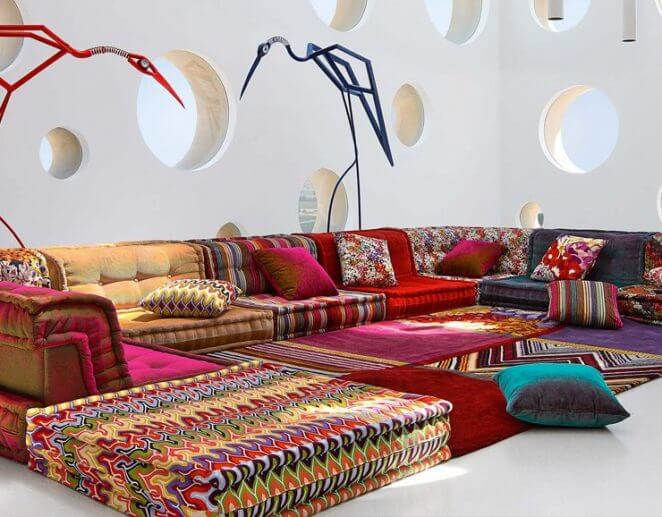
The Mah Jong sofa by designer Hans Hopfer for Roche Bobois is the benchmark for pattern weddings.
67. Several patterns, but one color
The crossed lines of a large rug are nicely combined with the light pointillist patterns of the wallpaper in a seamless play of black and white.
68. A colorful pattern associated with matching solid colors
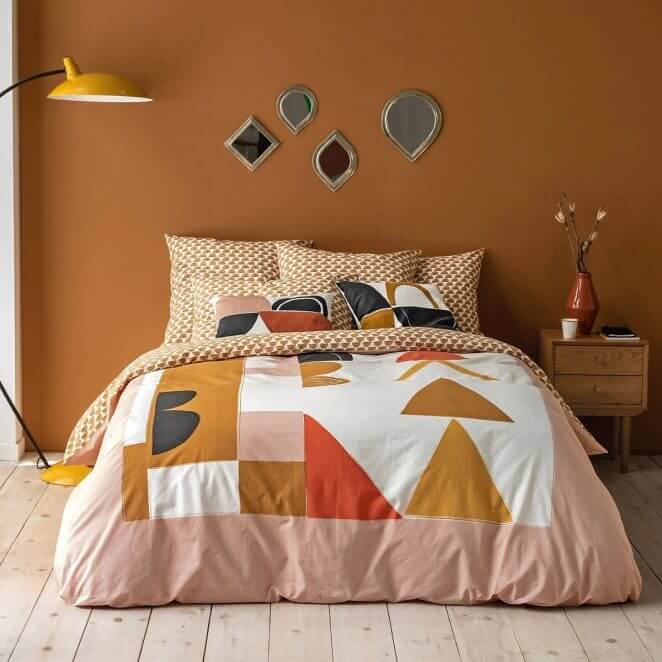
If the patterns cover a large area, avoid adding them to accessories such as cushions or plaids. The solid colors make it possible to attenuate the effects while preserving contrasts which animate the volumes.
69. Two patterns using the same main color
This bed set combines two patterns, one large and the other discreet, the smaller one taking up the ocher hue that dominates the larger one.
70. Several patterns harmonize with several colors if they are matched
We ensure harmony if we mix patterns by unifying the colors, as in this atmosphere where the pinkish hue which serves as a background for the flight of the storks is found on the cushion which also sports blue-green lines matching the buffet color
71. The use of the same colors makes it possible to combine two different patterns
Blue and ocher are associated in the patterns of the wallpaper as in those of the bed linen. The same colors are used in plain for a perfect harmony.
72. Several patterns of contrasting sizes and styles, but one color
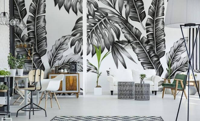
XXL jungle motif, diamonds, stripes and finely perforated metal make up a decor unified by the use of an (almost) total black and white look.
73. The pros play sometimes daring associations
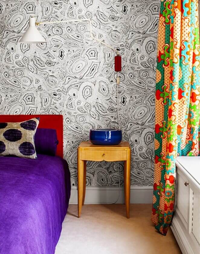
Wax, polka dots and marbling are expertly combined by decorators Laplace & Co in this room in the apartment.
74. Mix and match on a defined surface
The wallpaper composition is here wisely limited to the width of the bed behind which it is placed as a headboard.
75. Contrasts, but very studied
Styles, colors and patterns play on contrasts. The association respects the use of complementary colors and there is even a graphic detail present in the two patterns: the diamonds, a little distorted.
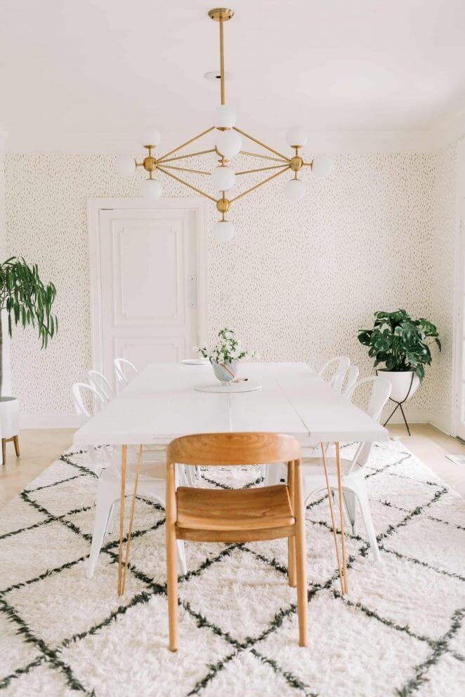
76. Rustic and design: a breath of modernity
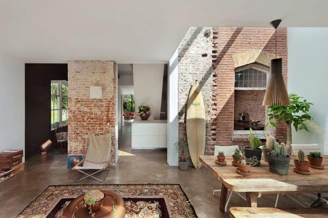
Old carpet, raw wood table, exposed bricks to respect the history of this old renovated house. Immaculate white on the walls, a beautiful Secto Design pendant light, and open spaces to breathe modernity.
77. Art Deco and Scandinavian
The rounded lines of the black furniture, the pendant light and a decorative object mingle with the pure geometric design of a typical Scandinavian-style candlestick and the neutral color of the wall.
78. Art Deco, ethnic and Seventies
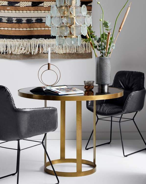
The curves and gold are associated in the design of the table as in that of the suspension but in contrasting styles, while behind, a wall carpet brings an authenticity of ethnic influence to the staging.
79. Scandinavian and minimalist for lovers of rigor
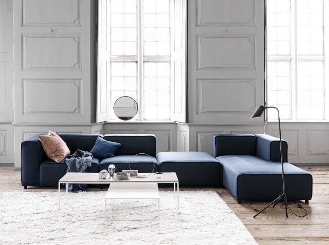
The pure and simple lines of the sofa and the coffee table are highlighted by the very limited number of objects that make up this decor.
80. Scandinavian spirit with bohemian and Art Deco touches
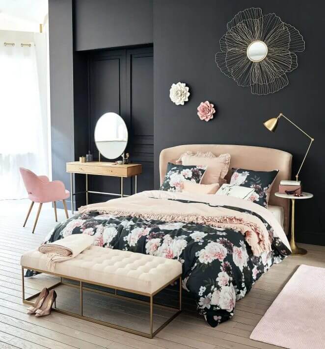
A sober dressing table with geometric lines blends in this bedroom with the curves of the headboard and the quilting of the bed bench, all animated by a bohemian spirit brought by the bed set with large pink flowers on a black background
81. Vintage and exotic
A vintage chic atmosphere takes on another dimension when it incorporates some exotic notes of exotic spirit.
82. Recuperation and ethnicity in a sustainable spirit open to the world
If we want to play with eclecticism without making a mistake, we can bet on the fact that the different styles are mostly available in several versions. This allows beautiful associations that enliven the decor while undoubtedly preserving harmony. The vintage style provides nice examples of this type of variation.
83. Vintage industrial, countryside and design: a beautiful marriage for three!
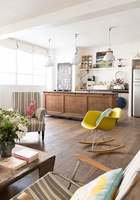
The “rustic vintage grocery store” atmosphere is lightened without being hampered by the presence of an Eames design rocking chair from the 50s. A mattress that is both rustic and understated serves as a link between the elements.
84. Mismatched, but soft!
The chairs surrounding the table are mismatched but respect the softness of the atmosphere.
85. Mismatched and colored: a clever mix
If the mix of colors primarily impacts this decor, we notice that the harmony is there, thanks to the homogeneous style of the chairs.
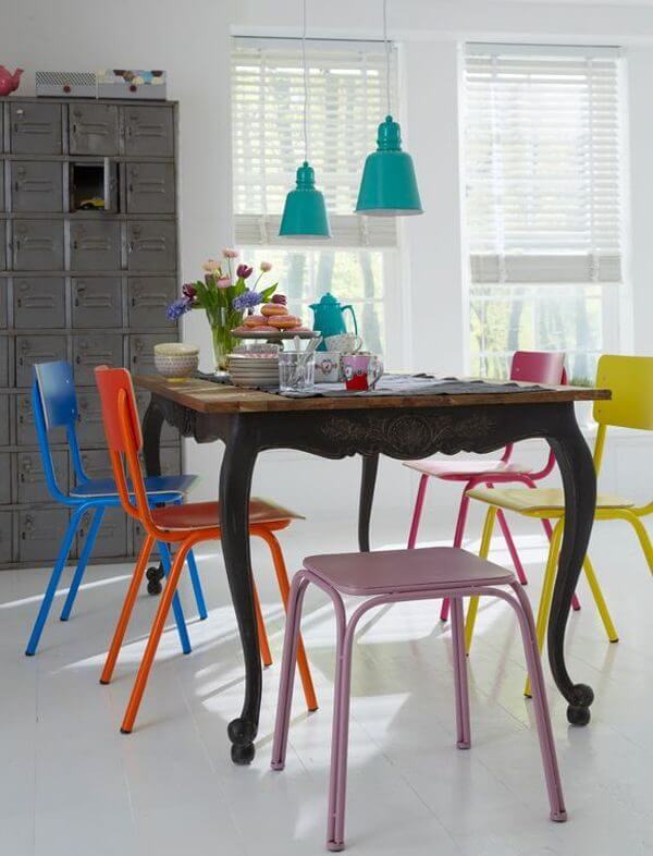
86. The Seventies are sure to evoke pop colors
Strong colors and geometric patterns: the Seventies play good humor.
87. Soft colors and vintage style also make a beautiful wedding
We often tend to want to brighten up vintage atmospheres with dense or strong colors, but pastels also suit them very well if we are looking to create a soft and serene universe.
88. Classic charm: rustic dressed in muted colors
Dark blue, dense red, dark wood: rustic atmospheres are traditionally little contrasted.
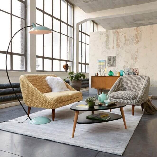
89. Bright colors warm an industrial interior with style
This loft is brightened up by bright colors that don’t disturb its industrial spirit, but definitely personalize it.
90. Rounded and rectilinear shapes enhance each other
The play of forms here highlights each object despite the neutrality of the colors.