On the heights of Sèvres, close to the forest, this family apartment extends like a watchtower, with a breathtaking view of Paris. You have to climb the three floors of a small modernist building from the 1960s to take the measure of it. The large bay windows offer the 110 m2 city at your fingertips. It is a privileged situation that does not displease its owners, who have lived there for ten years. The couple’s two children were very young when moving in, so the home was designed practically but not necessarily optimized. Fifteen years later, a renovation is needed to breathe new life into the interior and correct what needs to be updated. The project was entrusted to interior designer Jean-Michel Tarallo, from the Etat de Grâce studio.
“Searching for evidence through light and circulation, functionality and aesthetics, always taking care to provide quality in the details.” Such is the philosophy of interior designer Jean-Michel Tarallo. This renovation project in Sèvres is no exception to the rule: in opening up the entrance hallway and the original kitchen, the living room of the family apartment gains in light and an impression of volume. Efforts are concentrated in the island’s heart through a yellow block – which opens or chooses to close the kitchen – linking all the spaces. Above all, the solar color radiates and gives life to the living room. The area’s periphery is not forgotten, however, with a series of wooden panels containing a large amount of storage, imperatives for the family Echoing the past of the building, the founder of the studio Etat de Grâcemakes the interior a modernist signature.
1- Objective light in the living room
Separated into two parts – a north-facing day area a south-facing sleeping area – the dwelling lives to the rhythm of light, especially since the interior designer opened the partitions. “What transformed the apartment the most was the removal of a load-bearing wall between the entrance and the living room,” says Jean-Michel Tarallo. By also enlarging the passages to the kitchen, circulation is intended to be more fluid. Thus redesigned, it allows “as soon as you open the front door to have a perspective on the kitchen window, and on the right, on the large bay window of the living room,” adds the professional.
2- New profile for the entrance to the apartment
To achieve this large opening between the entrance and the living room, an IPN takes up the efforts of the original carrier. With two different heights now, the interior designer has found a clever way to correct them with the help of a divider cabinet that extends into a screen-like radiator – to intimidate the entrance.
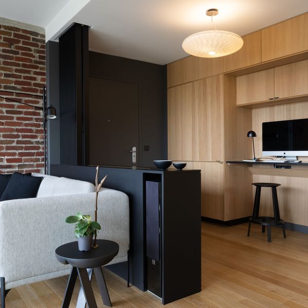
3- A work of continuity in space
Once the front door passes, the impression of space is felt at first glance. The large linear with wooden facades has a lot to do with it. Full height, it not only incorporates a desk and extends into the kitchen to finish its course in the living room. It thus ensures continuity in space as much as it optimizes it to the nearest centimeter. Behind its facades, the access door to the sleeping area of the apartment is concealed, marking a clear separation between the two worlds.
4- The corridor of the rooms: from shadow to light
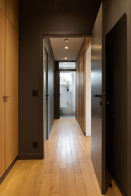
Far from being neglected, the transition from the day area to the sleeping area is ensured by a corridor, primarily optimized after intervention by the founder of the State of Grace agency. The pro has created a multitude of full-height cupboards and marked the corridor with color. “Darkening a dark space strengthens its character,” he adds to justify the use of this deep tone. A game of chiaroscuro then takes place between this circulation area and the rooms it serves.
5- The library links the dressing room and the master bedroom
This library with rounded edges as a visual transition between the dressing room in the dark part and the bright bedroom. A guarantee of softness is reinforced by light wood, which blends the storage units into an ethereal decor.
6- A room like in a hotel
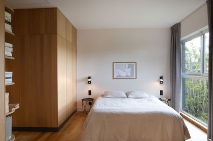
The owner’s room retains its initial volume. However, the interior designer had simplified the layout before the work was convoluted and not optimized. Accustomed to working on this type of establishment, Jean-Michel Tarallo decided to treat the space like a hotel room. The layout is comfortable, uncluttered, but warm. The semi-made-to-measure furniture seems to levitate, the plinths being treated in a dark color, “which gives a detachment effect,” a certain lightness to the whole.
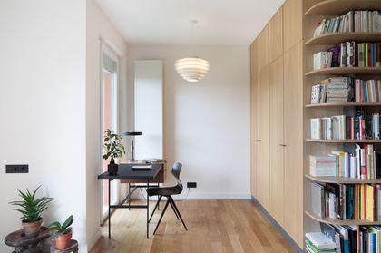
7- A beautiful office space faces the window
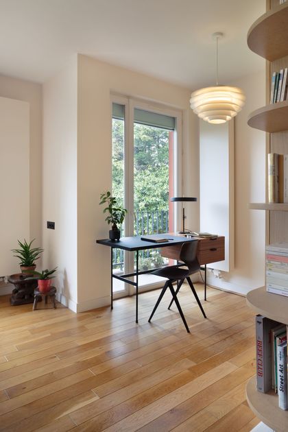
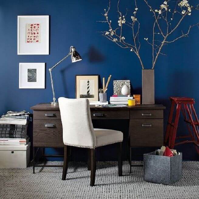
As in the most comfortable suites, the sleeping area has a generous office facing the window and balcony. Guided by their interior designer, the owners opted for this desk with a resolutely retro line, accessorized in the same aesthetic vein.
8- A cleverly concealed piano in the entrance
Instead of the old load-bearing wall separating the entrance and the living room, Jean-Michel Tarallo designed this space separator piece of furniture, a pretext, if any, for the integration of an electronic piano. The latter was crowned in the middle of the entrance, so the professional found him an envelope to his measure.
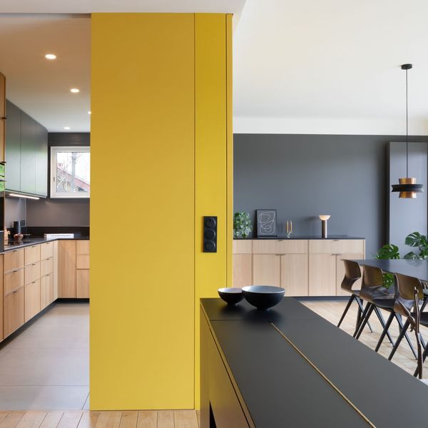
9- Yellow, the flagship color of the project
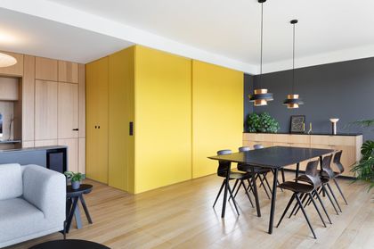
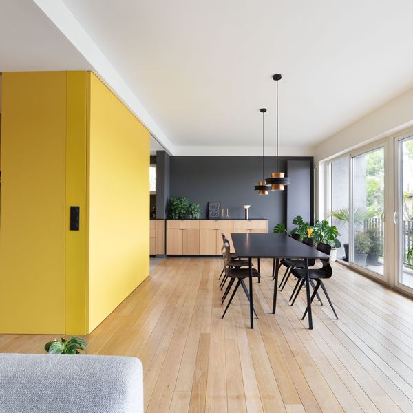
If the owners had a desire for color for this renovation, “it took us a long time to agree, remembers the interior designer. The color came after the materials in the end.” The brick wall on the living room side already existed, as did the light parquet. Wood has established itself as the material of choice for sketching the contours of the new layout. All that remained was to inject the color that would hit the mark. Applied in the island’s heart, a bright tint was needed to infuse cheerfulness into the living room. This punchy yellow works wonders, the room being exposed due north, “it reverberates the heat,” adds the pro.
10- Another office slips into the entrance
Multipurpose; the entrance also accommodates an office space ideal for telecommuting. The element is integrated into the peripheral furniture with softness, equipped with numerous storage spaces which serve the whole family.
11- The colors play on contrasts in the living room
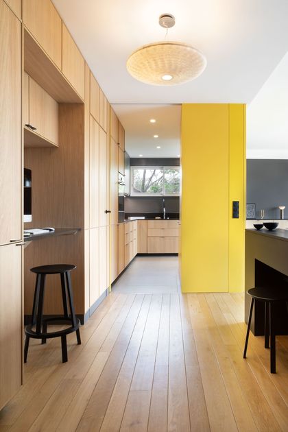
At the bottom of the room, the wall is marked by anthracite gray paint. This is ” a non-color that allows spaces to be contrasted,” confides the founder of the Etat de Grâce studio. Thus, the entry is more profound as it surfs on this dark tonality, the same for the kitchen, which alternates with gray yellow wood.
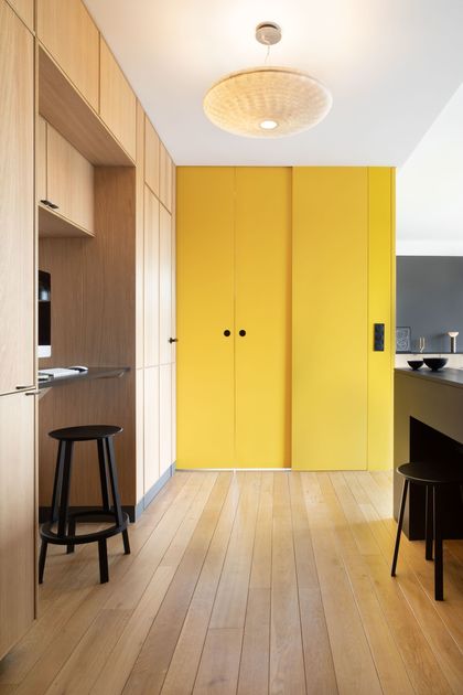
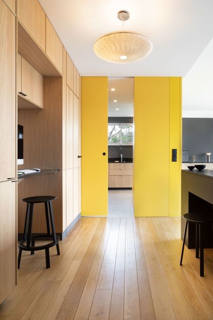
12- Behind the sliding doors takes shape the kitchen
With a desire to modulate the living room according to wants and needs, the kitchen opens partially, and it closes completely thanks to the central module tinted with yellow. Sliding doors with brick partitions and wall-mounted also free up space since they disappear once opened.
13- The redone kitchen becomes the heart of the apartment
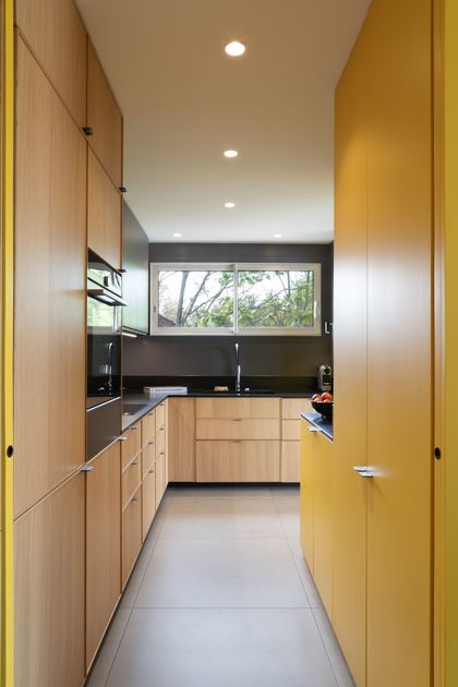
“The kitchen was demolished and rebuilt, even if the layout is almost identical, confides the interior designer. It was raised by 5 cm, so it had to be done ground level.” In short, significant work has changed the floor covering favor large waxed concrete effect slabs multiplying the volume and light. The kitchen itself is designed using off-the-shelf modules re-adapted to the semi-tailor-made space.
14- Made-to-measure composition for the dining room
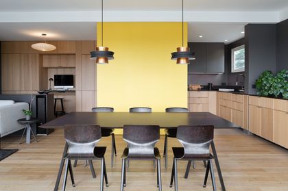
To match the width of the wall, the dining room table is made to measure. The dyeing of the walnut wood from which it is made makes it possible to find the color of the chairs, which are reissues. Forming a harmonious composition, the 60s pendant lights sit above the dining area in a modern retro atmosphere.
15- The yellow monolith at the crossroads of spaces
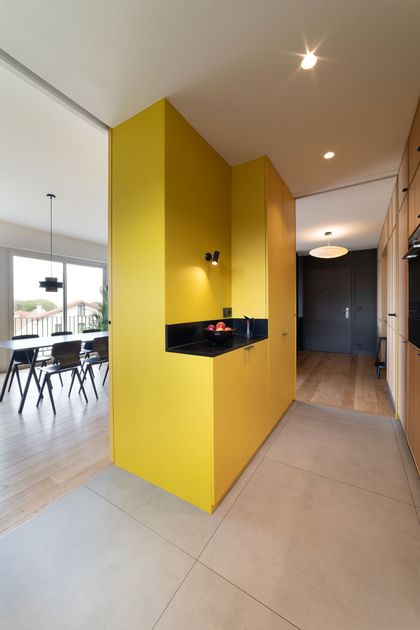
At the intersection between the entrance, the kitchen, and the dining room, the yellow monolith becomes the epicenter of the project. Jean-Michel Tarallo opted for a leather-finish granite that pushes elegance into the details as a worktop.
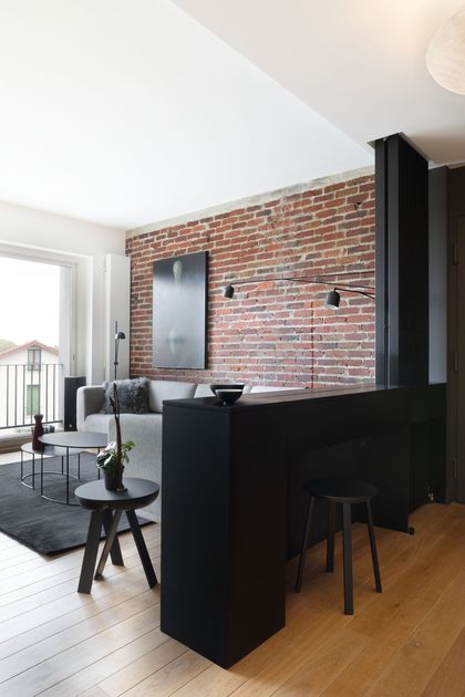
16- The raw wall goes bare in the living room area
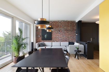
The owners updated this brick wall on the living room side during the first renovation. In phase two of the project, they wanted to keep it many years after moving in. Raw in appearance is the ideal support for showcasing a work dear to the couple.
17- Zen and bright atmosphere in the master bathroom
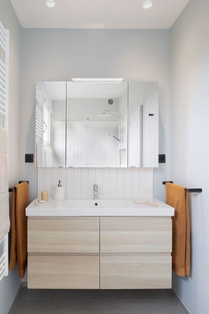
In the extension of the master bedroom, the shower room surfs on a Zen and bright atmosphere, without being white; however, a touch of light gray dresses the whole. The furniture is lightweight, suspended within a volume, undoubtedly not extensible but comfortable.
18- Reflections on the shower side
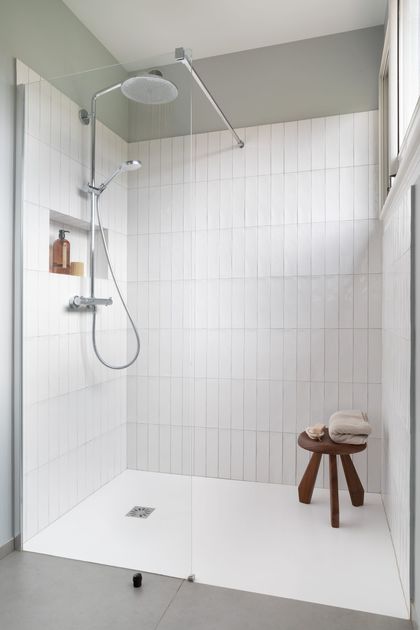
In replacing the original bathtub, there is now a large shower covered with white zelliges. This material with multiple reflections captures the light from the only window in the space to better multiply its effects.