There are color combinations that are usually seen much more than others to decorate our house. Lately, with the influence of Nordic decoration, everything is white mixed with light wood, with an occasional touch of gray. The black and white pair or neutral colors are usually the most popular options.
The fear of not getting the colors right (or of them going out of style) slows us down a bit when choosing the tones of our decoration. For those who want to go a little out of the ordinary, we have 15 unexpected color combinations to decorate your home. Cheer up with some of them!
1- Orange and water green
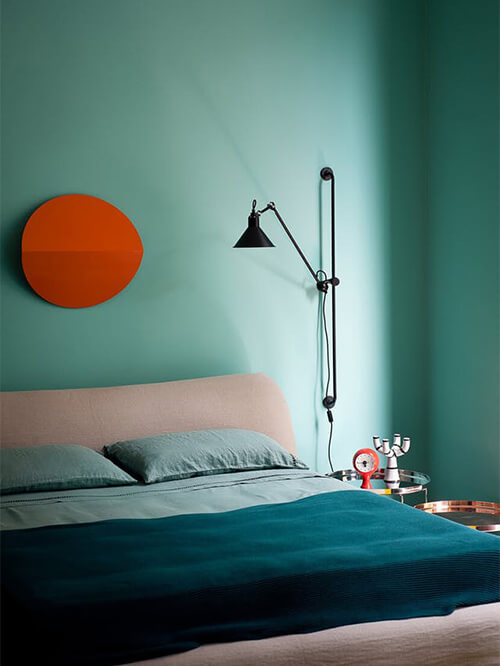
Different shades of water green and muted pink have been used in this bedroom. The warm orange of the wall decoration complements these tones and gives us a clear point to focus our eyes. Of course, it also brings joy to a room that can be seen as somewhat gloomy with this predominance of light tones.
2- Muted orange and pastel blue
The same colors in different shades create an entirely different effect. A color combination in which blue acts as the primary color and orange comes into play with textiles. A smoother mixture than the previous one also gives excellent results.
3- Blue with mustard yellow
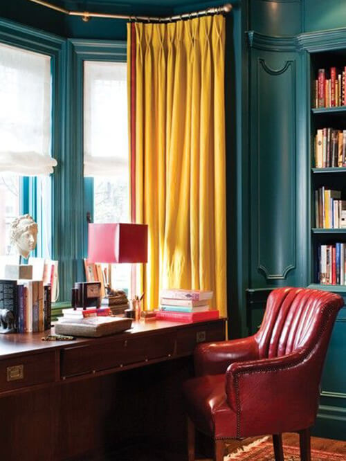
Yellow and blue are complementary colors, and in their simplest version, they can be a somewhat essential combination. Still, the nuances we choose for each color will make the difference. In this room, the shade of blue on the walls goes very well with the mustard yellow of the curtain. The house’s architecture is also decisive for us to like this sophisticated space so much.
4- Rooms are painted in pink and mauve
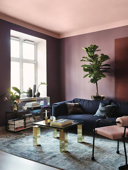
Two colors within the same range that we do not usually see together, pink and mauve. As with red and pink, we can see them together in textiles, but it is not standard on the walls. In this room, they work, thanks to the combination of modern furniture and coordinated colors. A lighter shade has been used on the ceiling, which gives the room a feeling of height.
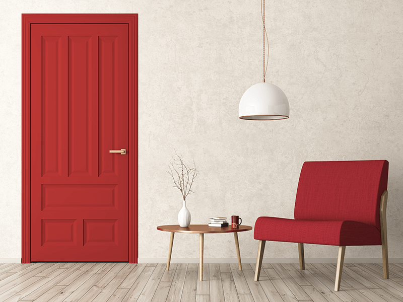
5- Blue and red decoration
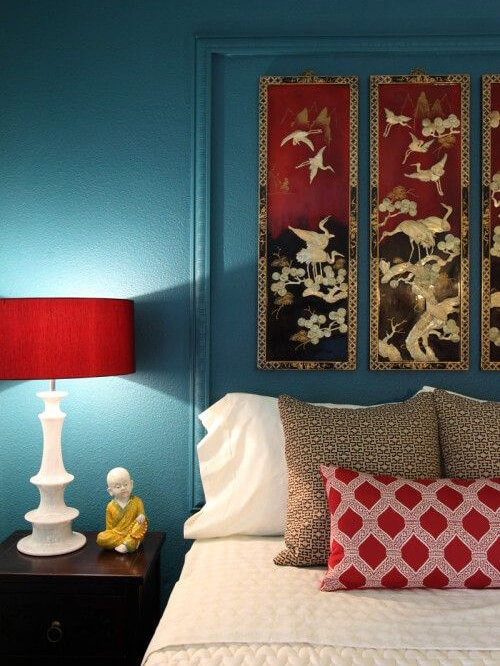
A combination of colors with oriental air works in a very harmonious way. The saturation of both colors is critical for them to fit without competing with each other and the tones chosen in this bedroom do it correctly. While blue is a relaxing color, red is the exact opposite, an energizing color. The balance between the two in the bedroom will also affect our rest!
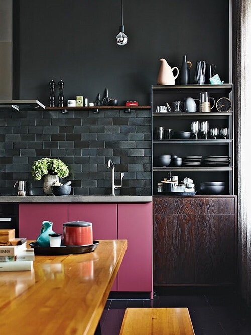
6- Pink and navy walls
Pink and blue were already chosen together as Pantone colors of the year in 2016, specifically Rose Quartz and Serenity blue. They also continue to work well in different shades, as in this kitchen with pastel pink and navy blue. The navy blue, in this case, adds sophistication to the pink wall and stands out in a particular way, thanks to the tiles’ glossy finish with the matte background of the wall.
7- Black and mint color wall
The combination of black with mint green seems inspired by those chocolate bars filled with mint slices or even ice cream. As with chocolate, mint brings freshness to a wall that could be too dark without this counterpoint. Black adds contrast and, as always, elegance in a mix of colors with a vintage feel.
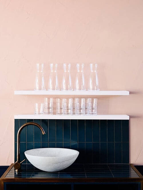
8- Combination of ocher and dusty pink paint
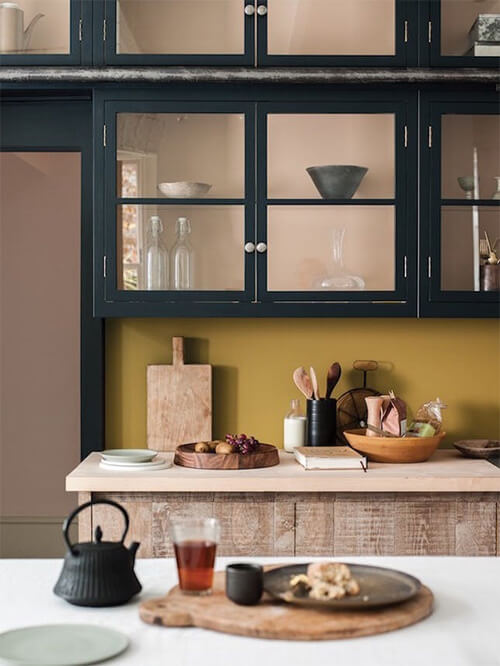
We love dusty pink, and lately, it is being seen quite a lot as a color for the walls. It is a color that, without being neutral, works well in many spaces and combines well with many dark tones, such as the blue that we also see in the image. To create an unusual mix, use pink with an ocher tone and create contrast.
9- Olive green and pastel blue
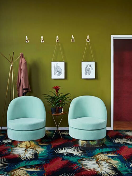
Greens and blues are colors that fit very well as long as we hit the tone of both. In this case, the darker olive green is refreshed with the clarity and cleanliness of the pastel blue of the seats. The garnet also shares this space with great success. The rug, which incorporates various shades, acts as a link.
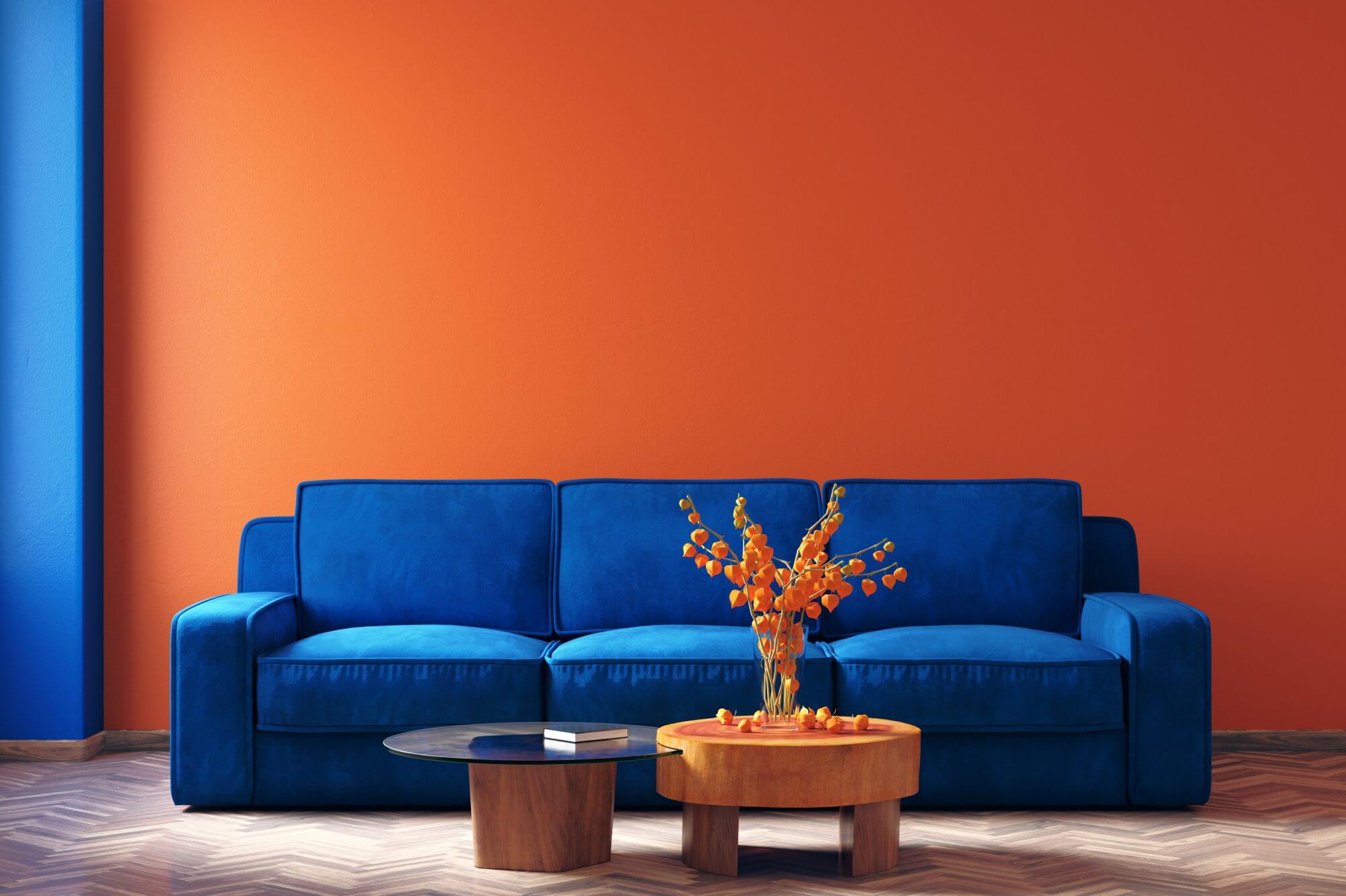
10- Dark blue and bright orange
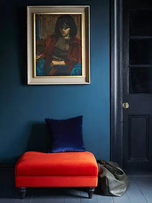
Orange is a complicated color for decoration, significantly depending on the tone. Duller shades like tile orange are more commonly seen, but what about neon orange? Of course, I don’t think we see it as a dominant color in many places, but it can be perfect in small doses. With navy blue as a backdrop, this orange ottoman matches perfectly.
11- Walls painted in purple with red
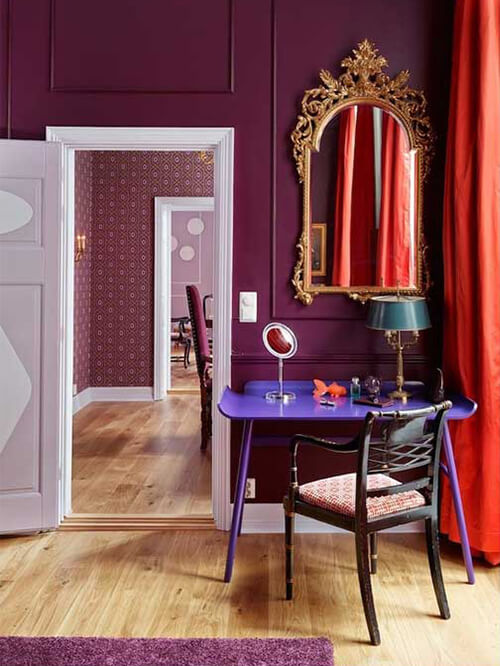
Purple, red… if you add black and orange to the mix, we have a perfect space for Halloween. How did they get it to look this good? With the light wood floor and the interior carpentry in white, together with the plinth, the darkness of the other colors is compensated. Red has been used in small amounts to keep purple as the primary color, and the result is luxurious and vibrant.
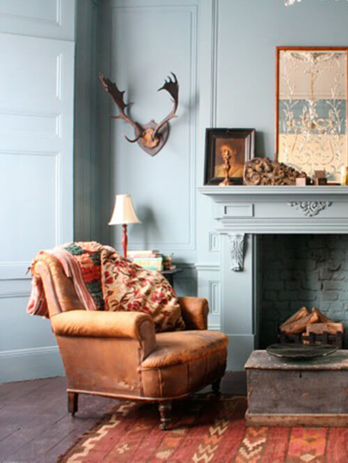
12- Brown and gray painted walls
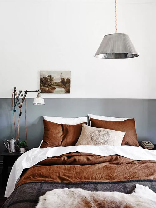
Although neutrals are usually combined with other more robust colors, the mix of gray and brown in this bedroom is perfect. The coldness of gray is offset by the warmth of brown, creating a very relaxing and stylish balance.
13- Lavender and teal
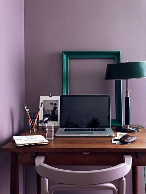
The lavender color reigns in this room, from the walls to the chairs. The bluish-green is introduced in small details to relieve our view of the lilac, and they combine very well! In this study, they have used lavender without much restraint, but we can use this combination of colors and white to make it more bearable.
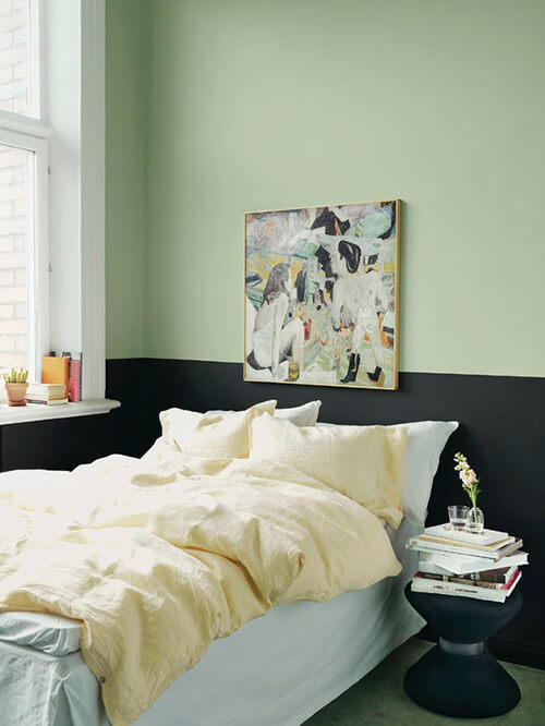
14- Pastel green and mauve
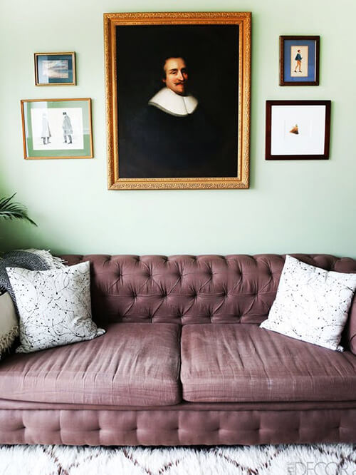
Two slightly saturated colors do not compete with each other. They create a refreshing combination in which the green offsets the dustier shade of mauve. The mixture is much more subtle than others we have seen, so it can also be more versatile.
15- Bright pink and black paint scheme
Black combines very well with pink in different shades, but we are more used to seeing it with pale or dusty pink. The bubblegum pink stands out very well against the black background in the following photo. The walls are black, the tiles, the floor, and the dishes! The bright pink of the cabinets draws all our eyes and adds a playful touch to an otherwise gloomy kitchen.